 | This page is an archive. The contents have been moved from another page for reference purposes only, and should be preserved in their current form. Discussion or voting on this page is not current. Any additions you make will probably not be read. |
Big Triumphant Penis
- It looks fine to me. Except I don't have a beard. Sir Modusoperandi Boinc! 04:46, June 8, 2011 (UTC)
- Looks good to me. But maybe you could convert it over to a PNG? Also, link your sources. --
 17:02, June 8, 2011 (UTC)
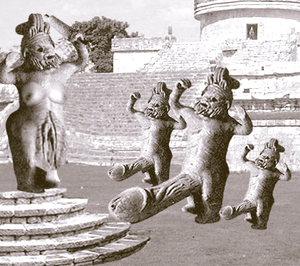
This Classical statuary, discovered in ruins long since destroyed to make way for a strip mall, florist, and superstore hair-and-nail salon, reenact the hierarchy of the culture's sacred rites, which were commonly held by their men to be an allegory for entire fated course of man's life.
Impressive phallus, erm, I mean... picture. But if your aim is to wander about thrusting it about at passerby for their en masse adoration, you are sorely, spongily mistaken: if you conduct a probing Tineye search, your idol would present itself to be unoriginal. I expect that the submitter is already aware of this fascinating deception, and merely wanted to "flaunt what he's got". If this is the case as it stands hanging out - the throbbing, pulsating, heavily vascularised truth, as it were - there are other places for that. We could flog the offender before the mast, but then again he's already been beaten by centuries.
Rather than making fun of a serious medical condition, however, he could instead do something original, just as I have made a pathetic, unfunny - and ultimately, technically flaccid - attempt to do here, warts and all. -- KUN VFH POTM VFP(IMAGES⇔TALK) 00:47, June 22, 2011 (UTC)
The situation room
- I don't get it. That said, the plaque is shiny wrong - look at the door handles. Relative to them, it's backwards and too bright, so if you flip the background and tone it down to match the image, it should help. 1234 ~
 20:02, 22 May 2011
- As for not getting it, have you ever herd of jersey shore, the TV show? The man in the room always called his abs "a situation", therefore, he adopted the nickname "The situation". As for the other things, I'll see what I can do. --
 22:51, May 22, 2011 (UTC)
- Nope! But that... ah, okay. Also, another thing - there's a reflection on one pane but not the other - if you put the reflection over the guy, it could look pretty cool, but you could also just remove it from the other one. Either way, consistency would help. 1234 ~ 22:59, 22 May 2011
- Okay, I'll try to do the window pane thing. But I just got finished fixing the other stuff. How's it look? -- 23:20, May 22, 2011 (UTC)
- Here's a shock; looks like the file didn't update properly. >.< 1234 ~ 23:24, 22 May 2011
- GODDAMN WIKIA! -- 23:44, May 22, 2011 (UTC)
- It looks like the actual image updated, but the thumbs haven't. You might want to click on the actual image to see it. -- 23:54, May 22, 2011 (UTC)
- Okay, so I added glass in front of him, and it even looks like the image updated properly, so you can see! Hooray! So, what do you think? -- 22:23, May 24, 2011 (UTC)
- Ah, better... the plaque still really stands out a lot, though. 1234 ~ 23:37, 24 May 2011
- How about now? Better? Worse? Cheese? You tell me. -- 00:23, May 25, 2011 (UTC)
- Now it has a weird border around it... *shifty eyes* 1234 ~ 00:27, 25 May 2011
- Weird border gone! -- 00:39, May 25, 2011 (UTC)
- Wooo, better. 1234 ~ 00:50, 25 May 2011
- Thanks! Anything else? -- 01:11, May 25, 2011 (UTC)
- Maybe blur the sign? And possibly make it darker? I mean, what you did helped, but it still really stands out. Also, someone else's input on this whole thing would probably be of more use now. *glares around* 1234 ~ 03:05, 25 May 2011
- Make it darker!? I was making it lighter this whole time! *Head explodes* -- 03:45, May 25, 2011 (UTC)
- Eh... unrelated, please don't use jpegs. Seriously. Every time you save this, it gets more distorted... use pngs. 1234 ~ 07:58, 25 May 2011
- Jpegs are just fine. Some of my best friends are Jpegs. Sir Modusoperandi Boinc! 14:12, May 25, 2011 (UTC)
- Okay, so I converted it to a png, BUT IT WON'T FUCKING UPDATE CORRECTLY! So it might not look that great. Anyway, so, Modus, what do you think of the image? -- 16:04, May 25, 2011 (UTC)
- The left side of the dude (image left, not his left) has a thick black line that probably shouldn't be there, unless he actually has a border on one side. Sir Modusoperandi Boinc! 16:29, May 28, 2011 (UTC)
- How's that? -- 15:31, June 6, 2011 (UTC)
- Not funny. Also, too small. -- The Zombiebaron 19:04, May 25, 2011 (UTC)
- Not funny as in you don't get the joke, or not funny as in, you get the joke, but it's just not funny? -- 15:30, May 28, 2011 (UTC)
- I get the joke but I don't find it funny. It's a terrible pun involving a character from a terrible TV show. -- The Zombiebaron 19:43, May 28, 2011 (UTC)
- I agree completely (with the part about the show being terrible). God do I hate that show... -- 19:45, May 28, 2011 (UTC)
Stupid Cats
- The chopsticks are awfully pixelly. The edge of the bowl, too. Sir Modusoperandi Boinc! 02:10, May 17, 2011 (UTC)
- Perspective of the... er, broth is a little off, too - since we're viewing from an angle, the apparent distance between the edge of the liquid and the rim of the bowl should be a fair bit less on the near side. 1234 ~ 02:22, 17 May 2011
- Also, it's painfully obvious that the chopsticks are chopped to look distorted as they go into the water. You might want to do something about that... -- 00:43, May 18, 2011 (UTC)
- Aye, and again, consider the perspective - are they really going into the liquid directly at the edge of the container? If the edge of the liquid on the chopsticks is further down the chopsticks, that would also make them look more realistic. 1234 ~ 02:11, 18 May 2011
- Actually, I was just looking at the image, and I would go one step further and say that it's actually bleedingly obvious that the chopsticks were chopped into the photo. What I mean is, the chopsticks look two dimensional, while the rest of the image looks three dimensional. -- 04:34, May 18, 2011 (UTC)
- If you tried to pass it off as an ancient painting (or basically any form of non-photographic art) then it'd be a hell of a lot more convincing, methinks. Because I can't see this picture becoming convincing looking as a photo.~~ Sir Ljlego, GUN [talk] 04:44, May 18, 2011 (UTC)
- Wait. Those are chopsticks? They don't look like chopsticks. Maybe a spoon next to the soup bowl would be more appropriate. -- The Zombiebaron 08:15, May 18, 2011 (UTC)
- Yes, what a great idea, Zombiebaron! A spoon, or maybe a fork? Either way, do chop sticks really make sense for whole cats? -- 14:23, May 18, 2011 (UTC)
- For the love of god...why can't I get this much attention and critique and feedback with my articles!?!?!!?!? Okay...thanks a lot for the comments so far (more are welcome). I was very aware of the flaws...I lost the original versions so I can only begin with the first uploaded version. I was considering making the water muddier (to look like broth). The chopsticks I thought gave a cool effect with the distortion in the water, and I did consider a spoon. If three people have a problem with the chopsticks then Ill take them out and add a spoon and a couple side dish bowls, Korean style. Ill depixilate the edges of the bowl, make the water level symetrical, then apply the filter to the water, readd the laurier, chives, oil bubbles and then readd the shadows. I wont go so far as to turn it into a painting. Thanks again guy for all the ideas. Now...ehm...go give me ideas for Democracy is not permanent, Mahjong, Stupid Cats and Cool beans!?!?!?!?!?!?!?!?? --ShabiDOO 17:28, May 18, 2011 (UTC)
- But reading and thinking about articles takes more effort than just looking at an image... and people are so lazy. 1234 ~ 22:34, 18 May 2011
- The liquid is awfully watery. I'd want some tomato or something with my cat soup... (catsup?) Could there be a few more bits of chopped veg and a cheeky liquid effect? And a tablecloth background would really add to the impact. If it's to my satisfaction I shall tip 25%, waiter. -- Hindleyite Converse • ?pedia 18:51, May 20, 2011 (UTC)
Moses with Ipad
| Please Help this Picture
|
When Moses finally reached the top of Mount Sinai he was surprised to find God had left him the holy Ipad; complete with the ten commandments, the angry birds app, and all! Image credit: Magic man
Nominate - discuss this image
|
|
Me and my friend made this. What does anyone think? -- 01:06, March 28, 2011 (UTC)
- Can you make the ipad look like it's painted? (Also, 2,000 × 2,708 is unnecessarily big. It's 2 1/2 meg, and bigger than monitors) Sir Modusoperandi Boinc! 04:11, March 28, 2011 (UTC)
- Er... I actually did make it look like it was painted; you can't really tell, but I did. It was either make it look too painted, or make it look... Not so much painted; I chose the latter. But I'll see what I can do. -- 04:15, March 28, 2011 (UTC)
- Yeah I agree with Modus. At full-size the iPad totally doesn't fit in with the rest of the image. -- The Zombiebaron 04:20, March 28, 2011 (UTC)
- You're right... -- 04:50, March 28, 2011 (UTC)
- Okay, I made it smaller. Now I'm working on making the Ipad look more painted. -- 13:53, March 28, 2011 (UTC)
- I hope it looks better now. What we did was we did a free select of a section the exact same shape as the Ipad, and we copied it. Then we pasted that over the Ipad but we switched the blend mode of the layer to lumosity, so it wouldn't effect the colors. Then we lowered that layer's opacity so it would be faint. We did this in the hopes that we could get the right texture. What do you guys think? -- 02:09, March 29, 2011 (UTC)
- Hey! We didn't come here for your life story! Sir Modusoperandi Boinc! 03:27, March 29, 2011 (UTC)
- Sorry. But what do you think? -- 03:28, March 29, 2011 (UTC)
- I still don't think it looks right. I do, however, think that it's a minor quibble. So minor, in fact, that only a bastard would've brought it up in the first place. I think you can see where I'm going here. Sir Modusoperandi Boinc! 03:36, March 29, 2011 (UTC)
- Do you think it needs to look more painted? -- 03:41, March 29, 2011 (UTC)
- I think it would look better more brush strokey, yes. Alternately, make Moses more iPad. Sir Modusoperandi Boinc! 03:52, March 29, 2011 (UTC)
- I hate to keep saying this, but we did that too. We tried to make him look more life like, and the Ipad look more painted. We wanted it do be somewhere in the middle. Anyway, gotta get off now. Bye! -- 03:58, March 29, 2011 (UTC)
- Actually I tried to do a quick fix before getting off; I added a canvas texture. Does that help or just make it worse? -- 04:05, March 29, 2011 (UTC)
- The iPad is very crisp and shiny, the guy not so much. You've toned it down, but perhaps even more? Add some actual brush strokes, perhaps - make it less straight and even. The canvas could be good as it helps tie the entire thing together, but it really shouldn't need that, either, you know? Meh, worry about the strokes first; that'd be a final effect. 1234 ~ 04:40, 29 March 2011
- Okay, we added brush strokes. Is it better now? -- 02:41, March 30, 2011 (UTC)
- Can't tell, unfortunately. Wikia's servers are crap and have been refusing to display new versions of files today. 1234 ~ 09:41, 30 March 2011
- So it's still the last version? -- 14:50, March 30, 2011 (UTC)
- Mhm. May take a few months for the thing to update, too. May never update... 1234 ~ 01:42, 31 March 2011
- GODDAMN WIKIA! -- 01:53, March 31, 2011 (UTC)
- Exactly. 1234 ~ 02:36, 31 March 2011
- Well, if it ever does update, tell me what you thing. -- 02:59, March 31, 2011 (UTC)
- Or you could reupload it under a different filename. 1234 ~ 03:01, 31 March 2011
- It's here. -- 03:08, March 31, 2011 (UTC)
- Mmm, different, yes... better... maybe. The edges are still strangely sharp and straight. 1234 ~ 03:16, 31 March 2011
- You think so? I thought we'd done a good job... -- 03:19, March 31, 2011 (UTC)
- You have. It could be better. And honestly, the canvas really shouldn't be necessary, but... eh. 1234 ~ 03:30, 31 March 2011
- I know the canvas shouldn't be necessary, but I like it. So... Fuck off. -- 04:08, March 31, 2011 (UTC)
- How rude. And when we're trying to help you and all, too... 1234 ~ 04:40, 31 March 2011
- To be fair, I've just been leading Magic Man terribly astray, down, down, trapping him in a shame spiral; a well of neurotic despair. Also, Moses is too small compared to the ipad. Sir Modusoperandi Boinc! 06:22, March 31, 2011 (UTC)
- You're not supposed to let him know that, mon! Suspicion is bad enough, but now he'll know for next time! 1234 ~ 06:51, 31 March 2011
- Lyrithya, I didn't say for you all to fuck off, just you. Modusoperandi, goddammit... -- 14:16, March 31, 2011 (UTC)
- Oh, so you're only an arse to me? Lovely. I'll just not even try to help, then. Everyone else does such a better job anyhow; I don't know why I bother. *mutters indignantly* 1234 ~ 16:33, 31 March 2011
- Exactly. -- 03:50, April 7, 2011 (UTC)
Miracles
What is the point of this image? Everything adds up, so how is it a miracle...? Just because they got good grades? --173.26.160.36 03:55, March 4, 2011 (UTC)
- I agree. What is the point of this image? -- The Zombiebaron 04:26, March 4, 2011 (UTC)
- You should delete it. 1234 ~ 04:29, 4 March 2011
- I concur with all of the above. Except the image, I don't concur with that. -Dame

 21:22, March 18, 2011 (UTC)
- What image? *shifty eyes* 1234 ~ 00:06, 19 March 2011
Charity
Except for the fonts (and maybe those too), that looks like something they'd really do and say. O_o 1234 ~ 14:02, 19 February 2011
- This is my definition of humor with a cause: make fun of a charity's slogan only to promote it! --Scofield 14:19, February 19, 2011 (UTC)
- I don't get it. 1234 ~ 14:29, 19 February 2011
- The "No, Seriously" bit was the joke. But then again, now you know for certain that these many children actually do die from water-borne diseases. It's a win-win. --Scofield 14:34, February 19, 2011 (UTC)
- Oh... not really sure how that's funny, but anyhow, if you want to add text to the end, it might look better if it was a little less wide, no more than what was already there, and also perhaps move the whole text thing up so it's more vertically centred. 1234 ~ 15:17, 19 February 2011
- Yeah, it's the fonts. Generally, if you can't match the additional type to the original exactly, it's good to mask out the original text and do both the new and original in one typeface. Sir Modusoperandi Boinc! 00:13, February 20, 2011 (UTC)
Thanksgiving Revolution
So... yeah. First off, what are captions for? And what's this silliness about images getting titles? Why do they have to get titles? What use have they, even, for the things?
Their from Tom Mayfair is Picture Commmunist Revolution in this 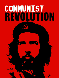
- The changed text isn't the chunky "stamped" text of the, um, original. I don't know how much of a difference that really makes. On the other hand, besides the changed text, there's nothing Thanksgivingish on the 'chop. Swap the beret for a Puritan-style hat, rr the hammer/sickle for a turkey, maybe? Sir Modusoperandi Boinc! 05:29, November 14, 2010 (UTC)
Frying pan
{{reef|Frying pan crop.png|500|Frying pan|"Don't do that. I'll hit you with a frying pan."|Lyrithya}}
So... yeah. First off, what are captions for? And what's this silliness about images getting titles? Why do they have to get titles? What use have they, even, for the things?
That aside, this image... um. It's supposed to be a lady swinging a lichen-encrusted frying pan, if you can't tell, but the swing just looks odd and the lichen doesn't even look like lichen on this monitor, although this monitor sucks, so... eh, anyhow, any ideas? And anything else terribly wrong, or not so terribly wrong, for that matter? Thanks in advances. ~  *shifty eyes* (talk) (stalk) -- 20101028 - 21:16 (UTC)
- Get used to things "not looking quite right". Alignment is one of those things that will rarely match up perfectly with found imaging. In this case, it's pretty close. Closer than your discomfitingly lopsided eyebrows, but that can't be helped here. That's between you and your forehead. But I digress. It's the lichen that stick out. Or, in this case, don't. It's not reaching in to my heart and pulling "lichen", y'know? Also, why lichen? Sir Modusoperandi Boinc! 06:37, October 29, 2010 (UTC)
- Silly imaging. Foo.
- The lichen was just... because... well, why not? Okay, terrible reason, but how do you think the lichen could be made to stand out more, actually definitely be lichen? It's important to me. ~ *shifty eyes* (talk) (stalk) -- 20101029 - 13:45 (UTC)
- I dunno. Maybe try bigger or denser lichen...lichens...lichi. Sir Modusoperandi Boinc! 16:26, October 29, 2010 (UTC)
- Bigger or... er... hmm. *wanders off* Thanks, I think. ~ *shifty eyes* (talk) (stalk) -- 20101029 - 17:39 (UTC)
- Since I don't know why the pan has lichen on it, my lichen or lichen-to-pan related 'chopping advice, by definition, will be limited. Sir Modusoperandi Boinc! 04:01, October 30, 2010 (UTC)
[[File:Frying pan crop 1.png]]
Hmm... this better, do you think? Or worse? Just within the realms of imagining a lichen-encrusted frying pan, regardless of the reason. ~ *shifty eyes* (talk) (stalk) -- 20101030 - 04:38 (UTC)
- It is better, than before. I don't think lichen, I think, "stuff fried for so long it evaporated and is permanently burned to the surface." Which, I, think is better anyway-- lets the imagination run wild.
- (I always imagined you swinging the pan bottom first. Now I'm afraid to be decapitated by the edge.) ~ Avast Matey!!! Happytimes are here!*
 (talk) (stalk) Π ~
  ~ 30 Oct 2010 ~ 04:48 (UTC)
- Right, one of these days I'll properly implement a more like this version... and Happytimes, yes, watch your neck! Watch your neck! *laughs evilly* ~ *shifty eyes* (talk) (stalk) -- 20101105 - 04:20 (UTC)
So, I guess this is as good as it's getting... thanks, you two. ~ *shifty eyes* (talk) (stalk) -- 20101116 - 05:38 (UTC)
28 Gays Later
| Please Help this Picture
|
28 Gays Later is a post-apocalyptic horror/shocker film released in 2008. It has become a cult film in the city of San Francisco, as much of its imagery and drama hit home. Image credit: Sonje
Nominate - discuss this image
|
|
Greetings fellow choppers if anyone is still watching this page that is. I made this pic to help a dodgy article get saved from VFD but I'm not entirely happy with it. Could anyone give me some suggestions for a new tagline and possibly director. I just left 'A Danny Boyle Film' and changed the tagline to 'The gays are numbered', which is pretty weak imo. So yeah, suggestions for improvement would be most appreciated. Also help with the caption would be great. --Dame 13:04, October 24, 2010 (UTC)
- That's amusing and well done. I can't think of a better tagline or a better director, either, but that's because I just woke up. I'm really quite groggy. Sir Modusoperandi Boinc! 17:16, October 24, 2010 (UTC)
Death(series)
- Slide "Abe Vigoda" to the left a fraction. Italics make it look farther to the right than it is. Maybe think about replacing the rose-shot-with-a-bullet with, say, a dead or black rose (it took a while to see what the pic was supposed to be, while a more gothic image is simpler). Also, consider spelling "mortality" the...conventional...way. Sir Modusoperandi Boinc! 02:17, July 23, 2010 (UTC)
- Maybe even just a B&W filter would do wonders for making the image look deathly. Just a thought.


 Sir MacMania GUN—[02:20 23 Jul 2010]
- Yes the image does lose something in the scale. also i thought of the whole b/w thing but look at the stuff for life its all about the HD. picked the rose because of the color. But yes the bullet is sort of hidden. Lordarcadian 02:32, July 23, 2010 (UTC)
- I agree with Modus. The rose-shot-with-bullet really doesn't do it for me and I don't really understand why it's upside down. Skulls are a universal symbol of death. Perhaps a cattle skull, those are cool. Or maybe something dead. With maggots and flies on it. Because if this were a real show it would primarily be about dead animals I assume. Also I thought the fact that Abe Vigoda was the narrator to be funny; that part could be a bit bigger. -- The Zombiebaron 05:01, September 16, 2010 (UTC)
Kurt Cobain's Gun
I actually don't know which caption would be funnier for this picture:
- "I'll be OK, I just loaded the gun with chocolate bullets."
- "Mmmmm, I love that delish shotgun flavour!"
- Kurt practises fellatio with a shotgun... a very bad idea.
- Kurt had had enough of his toothache, and he decided to do something about it.
- "LOL, we tricked Kurt into shooting himself... Oh no, he's shooting himself!"
I came up with all of these captions; I didn't plagarise! Please tell me how I can make this picture as funny as possible. I know you'll use nasty comments that will hurt me, such as "You're not funny" or "You're a loser", but I dream of having this picture featured on the front page. --Bryony Temple 10:59, July 4, 2010 (UTC)
- Reefer Desk is for making photoshop'd pictures better. Our ignorance about captions, however, is profound. Sir Modusoperandi Boinc! 17:33, July 4, 2010 (UTC)
British National Party Campaign Poster
My first chopped up picture. Thoughts, anybody? --Matfen 23:09, April 30, 2010 (UTC)
- Too many people. Try less. I hope that makes sense. It just looks cluttered for a campaign poster. That they're out-of scale (with yokel being both bigger and farther away than beerdouche) and use a mix of formats (B&W and colour) doesn't help. Sir Modusoperandi Boinc! 04:46, May 1, 2010 (UTC)
- As Modus said, the people are too cluttered and random, the white trash chaps don't really fit in and poor Edward is way too dark especially in front of the Union Jack. I would pick one or two of the major extremists and look for images of them that have a 'campaign poster vibe' and which look good together. The scale and colouring should then also be adjusted to match. --Dame 00:42, August 4, 2010 (UTC)
- Brilliant -do not change a thing -the heads fit around the letters well and as a mock straight BNP poster the mix of colour and scale and slight scruffiness sets the perfect tone.-- ⦿⨦⨀ Phrage (talk) 14:22, August 25, 2010 (UTC)
Complete and Utter Truth
As for this one, does anyone have any ideas to increase it's authenticity? Maybe suggestions on how to partially bury the Russian flag? Sir Not A Good Username360 KUN 02:57, April 12, 2010 (UTC)
- To "bury" it, copy the section of the image behind it, place it on top of it, then cut it to shape. It may help if you try to visualize each layer as though it was a layer. Sir Modusoperandi Boinc! 04:09, April 12, 2010 (UTC)
Wow, I've never done reefer before...is it fun? — H. Peebles - D - HS 

 10:15, November 4, 2009 (UTC)
- The "black" of the sign text seems blacker than the "black" of the main image. It's a common occurrence. And no, Reefer Desk is not fun. It's like baseball, but without the drunkenness, spitting and genital adjusting. Sir Modusoperandi Boinc! 16:04, November 4, 2009 (UTC)
- LOL @ Reefer...but yeah, I can color sample the old text and change or fill the text with the old shade of black. I get what you mean. — H. Peebles - D - HS 20:12, November 4, 2009 (UTC)
- sometimes the comic effect is enhanced by the alteration being obviously photoshopped and I think that is true in this case -- ⦿⨦⨀ Phrage (talk) 15:27, August 25, 2010 (UTC)
The Tragic Lumberjack Drownings of Ought Nine
Yes, how do I improve the quality to survive a technical bashing on VFP? Thankyew. • • • Necropaxx (T) {~} Tuesday, 04:13, Oct 27 2009
- The water is blue and blurry, yet the lumberjacks are red and not. Plus they're standing up underwater, which is just silly. And they're identical triplets, which I'm pretty sure doesn't happen. Sir Modusoperandi Boinc! 04:54, October 27, 2009 (UTC)
- Well, if you wanted realism, why not point out that there was no such thing as the Tragic Lumberjack Drownings of Ought Nine? Will try to blur up the lumberjacks tho. • • • Necropaxx (T) {~} Tuesday, 05:14, Oct 27 2009
- I was there, man, and they looked like they were underwater. Which they were. Sir Modusoperandi Boinc! 05:25, October 27, 2009 (UTC)
- I'm kind of wary of using blur, actually. Is there a different tool you would suggest using to achieve that rarefied "underwater" look I'm so desperately craving? • • • Necropaxx (T) {~} Tuesday, 06:10, Oct 27 2009
- Photoshop might have an effect of some sort that simulates it. Alternately, use the water that's "behind" the lumberjacks, paste it as a layer "in front" of them, then fiddle with it. Sorry if I got too technical there. Sir Modusoperandi Boinc! 06:46, October 27, 2009 (UTC)
- Will do tomorrow (it's 1 am here). Thanks MO. • • • Necropaxx (T) {~} Tuesday, 06:50, Oct 27 2009
- OK, I blurred the outer edges of the lumberjacks. Is that what you were talking about? I also think the color contrast between the lumberjacks and the water is off a bit. How would I fix that? • • • Necropaxx (T) {~} Tuesday, 23:35, Oct 27 2009
- Take the water behind them, copy it as a new layer and put it in front of them. Then play with that layers transparency, or mess with the lumberjacks' colour balance, or put a layer in front of them, make it blue, then play with its transparency.
- And the lumberjacks need to be blurry or distorted (with each on being a little moreso than the "closer" to you). They look like they're just sitting on top, rather than in, the water. Sir Modusoperandi Boinc! 03:19, October 28, 2009 (UTC)
- Alright, I transparentized (or transparentised, really, I don't care) the lumberjacks, used the "wave" option in the "Distort" menu (I'm using PSE 2) to "wobble" them, and used the burn tool to darken the lumberjacks some more. Did I do good/anything else? • • • Necropaxx (T) {~} Wednesday, 03:52, Oct 28 2009
- Much better. They could use bubbles (who couldn't?), if you can do it without it looking dumb. Sir Modusoperandi Boinc! 04:05, October 28, 2009 (UTC)
- Bubbles added. I lowered the opacity because they looked stupid at 100%. Unless they're still stupid. They're not, are they? • • • Necropaxx (T) {~} Wednesday, 05:14, Oct 28 2009
- It looks alright. Sir Modusoperandi Boinc! 07:29, October 28, 2009 (UTC)
- OK! Then I hereby declare this image a reefer graduate and to VFP it goes! Thanks a lot Modus! • • • Necropaxx (T) {~} Wednesday, 13:28, Oct 28 2009
- Actually, never mind about the reefer grad thing, as it needs to be featured first. Silly me! • • • Necropaxx (T) {~} Wednesday, 13:30, Oct 28 2009
- For some reason, the image doesn't seem to have updated. Damn Wikia. —Sir Socky


 (talk) (stalk)
 GUN SotM UotM PMotM UotY PotM WotM 13:39, 28 October 2009
- Ugh. I'll try messing with the pixel size, it seemed to work in preview mode. (I thought it was just me experiencing this.) • • • Necropaxx (T) {~} Wednesday, 13:54, Oct 28 2009
Tigger Gets Seriously Fucking Wasted
I seriously overhauled this image. Since I couldn't remove the text, I redid the whole background. If possible, I actually make Tigger a whole lot scarier. This time, I also kept the PSD in case I had to edit it. What do ya think guys? Rbpolsen ♦ Come Rant · Come Look at all My Crap 05:28, September 17, 2009 (UTC)
- Since there's no text, you can zoom in some on Tigger. Sir Modusoperandi Boinc! 22:55, September 18, 2009 (UTC)
- I would, except doing so degrades the image. While I wouldn't mind a larger image, I think it looks great at this size. Rbpolsen ♦ Come Rant · Come Look at all My Crap 04:01, September 24, 2009 (UTC)
Anyone else? Rbpolsen ♦ Come Rant · Come Look at all My Crap 04:01, September 24, 2009 (UTC)
- More smoke from the joint, man. Sir Modusoperandi Boinc! 07:11, September 24, 2009 (UTC)
- Done. Anything else? Rbpolsen ♦ Come Rant · Come Look at all My Crap 22:17, October 2, 2009 (UTC)
- The smoke should be whiter (or have more white highlights), and the joint needs a cherry ('cause pot that isn't lit doesn't make smoke, man). Sir Modusoperandi Boinc! 00:30, October 3, 2009 (UTC)
- It ain't pot, it's catnip. Anyways, yeah, done and done. Is there anything else? Also, would you recommend a feature? Rbpolsen ♦ Come Rant · Come Look at all My Crap 01:43, October 3, 2009 (UTC)
- I don't do that here. This is because I have no sense of humour. I lost it back in the 'Nam, where I was an officer and my men accidentally shot me. A bunch of times. Sir Modusoperandi Boinc! 01:52, October 3, 2009 (UTC)
Scottish Bagpiping Popstars... Och!
Well MO, I made this for my newest article that I might as well plug now and I'm wondering if you think 'tis funny enough for VFP. Thanks. • • • Necropaxx (T) {~} 05:43, Sep 7
- He needs to cast a shadow on the speakers (and the bagpipes need to cast a shadow on him. Try duplicating the pipes, lean them over a bit, then make that the base for the shadow, if that makes any sense at all), play with the brightness/contrast of the speakers to match the rest of the pic (they're a bit bright), the kilt is too obviously mirrored (real things rarely end up exactly the same on both sides. See how one of your balls is bigger than the other? Everyone else noticed, but they were too polite to say anything, so the sad duty fell to me), he doesn't actually appear to be playing the bagpipes (one arm squeezes the bag while the other holds the note-thingy, right? So, perhaps a pic of someone playing a guitar would work better), and I don't give nods as to the odds on VFP (because I have no idea what other people will like. This is because they're all stupid and they smell and I hate them! Ooo! I hate them so much!) Sir Modusoperandi Boinc! 06:44, September 7, 2009 (UTC)
- I can't do all that much because I forgot to save it as a .PSD (stupid Necropaxx! Stupid stupid sputid!) but I lowered the contrast on the speakers to -20 and tried adding some bagpipe shadow. I don't know what you mean by add some shadow to the speakers (they're black anyway, so what's the difference?). I can't do anything really about the kilt. Anyway, how do you feel about the concept/joke thing? Zany enough? • • • Necropaxx (T) {~} 07:07, Sep 7
- So you brought a pic to reefer desk that you can't really change? Have you gone mad?
- The not-black part of the speakers can have his shadow. See on the left how his shadow gets to the speaker then just stops?
- It is zany. I've never been a fan of zany. Too zany. I prefer madcap. Sir Modusoperandi Boinc! 13:01, September 7, 2009 (UTC)
- Alright, I darkened the bottom orange part. Is that what you meant? Also: Madcap is good. Zany is better. • • • Necropaxx (T) {~} 18:36, Sep 7
- Better. Oh, and I just noticed that the bagpipe's "black" isn't as black as the black in the rest of the image (it's also got whitish and jaggy edges). Of course, since you only have the image saved as a single layer, there is nothing you can do about that latter bit. Nothing! Moo ha-ha! Sir Modusoperandi Boinc! 18:41, September 7, 2009 (UTC)
- Nothing, eh? Clone tool, to me!! • • • Necropaxx (T) {~} 18:57, Sep 7
- Clone tool'd. Howzat? • • • Necropaxx (T) {~} 19:18, Sep 7
- Better. Sir Modusoperandi Boinc! 19:30, September 7, 2009 (UTC)
- Can I make it betterer...? • • • Necropaxx (T) {~} 19:40, Sep 7
- Yes. The bagpipe is still too bright (see how its tartan pattern looks faded compared to the kilt, and the dark parts of its drones aren't nearly as dark as the dark bits of the rest of the pic?) Sir Modusoperandi Boinc! 19:43, September 7, 2009 (UTC)
- The bagpipe or the kilt is too bright? Which one, 'cause to me it looks as though the kilt is brighter. • • • Necropaxx (T) {~} 19:48, Sep 7
- The colours on the kilt are richer, but the brightness on his bag (*giggle*) is, um, brighter. That's what I meant by "faded". Darkening the entire bagpipe would've cleared that up. Sir Modusoperandi Boinc! 20:11, September 7, 2009 (UTC)
- I darkened the drones too. • • • Necropaxx (T) {~} 19:53, Sep 7
- But you did not shoot the dep-u-dee. Sir Modusoperandi Boinc! 20:11, September 7, 2009 (UTC)
- Darkened. Anything else? • • • Necropaxx (T) {~} 00:52, Sep 8
- Yes. The amps are mirrored, but if you look at an amp and another identical amp, the only difference is their sameness (copy the face of the one that's right way around over the other one. You'll probably have to warp it a bit to put it back in perspective). And the file size is insane. Try uploading one that's 600px or so, to avoid clogging the tubes of the internet. Sir Modusoperandi Boinc! 03:18, September 8, 2009 (UTC)
- 'Tis perspectivized. And hey, the insane file size makes for easy editing, so nyah. • • • Necropaxx (T) {~} 03:31, Sep 8
- Work large. Upload to Uncyc small. Sir Modusoperandi Boinc! 05:57, September 8, 2009 (UTC)
- The kilt is a bit weird. I'd look for a picture of someone sitting in a similar position wearing a kilt and use that instead cause the current one looks a bit off. --Dame 13:31, September 9, 2009 (UTC)
- At the top of the pipes there are some pieces that used to be white but are transparent now. That wire that's coming from the speaker on the right looks, and obviously is, drawn on. I don't think you need it. The part of the kilt between the legs looks weird. I can see you did some special effects with it, but the result is that this red and yellow line at the bottom appears to disappear in some invisible dimension. —Sir Socky (talk) (stalk) GUN SotM UotM PMotM UotY PotM WotM 13:48, 9 September 2009
Hagia Sophia
- So, I'm wondering if the image looks good, also, if funny. Also, I know the Sophia stuff is kind of old. Also, how is your day going? Woody On Fire!
 Talking Woody Stalking Woody 17:21, 6 August 2009 (UTC)
- I only know that it's potato because of the title. Otherwise, it just lookslike the roof is oddly coloured. If the potatoes stuck out more, it might work better. My day is going awesome. I took a big dump. Then I said, as I walked out of the restroom, "Wooh. Don't go in there for a while." I'm classy. Sir Modusoperandi Boinc! 18:01, 6 August 2009 (UTC)
- Maybe change the spires for french fries. Sir Modusoperandi Boinc! 18:06, 6 August 2009 (UTC)
- Well, changed the poatoes for now. Are they looking better? I think they look more contrasty (not sure if that's a word, but whatever). Tried the fry spires, but couldn't get them to look right at all. I might try them again, but If I do, I'll probably need to take a picture of a fry myself. Trying to find a good image of a fry is no fun. Woody On Fire! Talking Woody Stalking Woody 19:54, 6 August 2009 (UTC)
- It's still not potatoey. At best it's potatoish. Without context you wouldn't know what the joke was. Sir Modusoperandi Boinc! 20:10, 6 August 2009 (UTC)
- Baby steps. It's better than the second cousin twice removed of potato it was earlier. Well, do you have any suggestions on how to make it look more potato-like? Woody On Fire! Talking Woody Stalking Woody 20:14, 6 August 2009 (UTC)
- I've given you all I have! I'm just one man! Woe! Sir Modusoperandi Boinc! 06:54, 7 August 2009 (UTC)
- Woe is you indeed. Well, changed the spires a bit. But I'm not sure if I like them or not. Y? Woody On Fire! Talking Woody Stalking Woody 20:45, 11 August 2009 (UTC)
- At first I thought it was cheese. Hmm, I have the mental image of potatoes being all dark and dusty with spots and bits sprouting out - maybe make the domes a bit less geometrically correct by using the top half of some really out of shape unpeeled potatoes. Also, try having some full potatoes skewered on top of the spires for extra potatoeyness. Alternative: make the turrets crinkle cut crisps! Just a few suggestions, it's coming along pretty nicely. -- Hindleyite Converse • ?pedia 21:25, 11 August 2009 (UTC)
- Yes, I got cheese from the spires as well. It might just be that I need to get a new potato or two for this one. And thanks for the suggestions. Woody On Fire! Talking Woody Stalking Woody 17:10, 12 August 2009 (UTC)
- Well, you might consider changing the whole building into brownish yellowish colors. If you want to make the potatoishness more obvious, you could change the dome to more accurately show the image of an authentic potato. You don't have to limit yourself to the boundaries of the real building, for instance the dome could reach higher and be slightly irregular. —Sir Socky (talk) (stalk) GUN SotM UotM PMotM UotY PotM WotM 13:37, 2 September 2009 (UTC)
- I'm afraid I too am not feeling the essence of potato. And at first glance I also thought it was cheese. Perhaps if you use an actual potato for the roof. Everything is too smooth and sculpted, potatoes are... not. The others have pretty much covered it. Find your inner potato. --Dame 13:35, September 9, 2009 (UTC)
Cheerios (avenasativa)
- Before the whole FDA-says-Cheerios-is-an-unapproved-drug thing gets old.
- I'm too late, aren't I? Sir MacMania GUN— 16:16, 1 August 2009 (UTC)
- Needs fineprint of some sort. Maybe make it as a box, and have that foil/bubble thing that pills have sliding out of it (but with cheerios instead of pills). And after that, which sounds hard to do, you can buy me a pony! Yay! Sir Modusoperandi Boinc! 19:45, 1 August 2009 (UTC)
- All right, done that. How's it look? (That foil/bubble thing took a lot of effort for a novice like myself. But at the end it was worth it, as I was now realising how utterly silly it would be to have to pop every Cheerio out to put in that bowl of cereal. What if the Cheerios all crumble inside?) Sir MacMania GUN— 23:04, 1 August 2009 (UTC)
- Oh, and also: <excuse validity="lousy">the flaps open inwards.</excuse> Sir MacMania GUN— 23:07, 1 August 2009 (UTC)
- Better. I had no idea that Cheerios were so small. Sir Modusoperandi Boinc! 02:46, 2 August 2009 (UTC)
- Ah, but that box is the size of a cereal box. Regardless, the Cheerios are probably out of scale. But I can always make the pathetic excuse that everything's closer/farther away than you think. Sir MacMania GUN— 02:48, 2 August 2009 (UTC)
- Excuses aside, it does need a lid. Sir Modusoperandi Boinc! 02:53, 2 August 2009 (UTC)
- Rudimentary flaps added on the left side. Sir MacMania GUN— 03:27, 2 August 2009 (UTC)
- And one more while you're not looking. Sir MacMania GUN— 03:47, 2 August 2009 (UTC)
- Pretty decent as is, but try cartoonifying the cheerios and see what that looks like. I just wanna know... -- Hindleyite Converse • ?pedia 21:20, 11 August 2009 (UTC)
Ass Pounding
- The person has no shadow, but the mule does. Freaky. Also, I think that you might have "women issues". Freaky. Sir Modusoperandi Boinc! 03:58, 22 July 2009 (UTC)
- I'd considered adding a shadow, but then I realised that, if you'd look closely, the person is on top of a hill, and the mule's shadow is both small and behind him, meaning there's no need for a shadow because it's on the other side of the hill. And I don't have "women issues", it's just a play on swear words. Sir Not A Good Username360 KUN 20:52, 22 July 2009 (UTC)
- Like, I get the meaning of this image (as explained by the caption), but the image itself doesn't really fit the description. Is there some way of showing the sleeping dog's ownership of the mule? Perhaps if the mule had a leash that the dog was holding. Also, the dog doesn't look very doglike. I think this image has real potential, but the current execution of the idea is a bit lacking. -- The Zombiebaron 21:49, 22 July 2009 (UTC)
- I know the dog doesn't look the donkey's owner, but I couldn't find an approriate image of a dog reared up as if riding on the donkey... perhaps if I were to find such an image, it'd be better... I'll troll around GIS, see if I can find one. Also, what do you mean the dog doesn't look "dog-like"? Sir Not A Good Username360 KUN 22:51, 22 July 2009 (UTC)
- There you go. Sir Modusoperandi Boinc! 23:15, 22 July 2009 (UTC)
- Alright, I've fixed most of the problems... how is it now? Sir Not A Good Username360 KUN 00:47, 23 July 2009 (UTC)
- Looks great except the dog looks really out of place. It also doesn't look like the dog could possibly be alive. -- The Zombiebaron 01:19, 23 July 2009 (UTC)
- IT'S... ALIVE!!!!!!!!!!!!!!!! Sir Not A Good Username360 KUN 02:16, 23 July 2009 (UTC)
- I agree that the dog doesn't look right yet. The link Modus gave has some promising options. I think your best bet would be to use a different dog altogether and make him look like he is actually in the saddle. --Dame 14:51, 31 July 2009 (UTC)
- Yeah, if the dog is in the mule's saddle, he should cast a shadow too. --UU - natter
 13:42, Sep 9
This is your Tigger on Drugs
| Please Help this Picture
|
I nomm'ed this for feature because I thought it was worthy. Apparently, it wasn't funny enough. So now I'm doing what I should have done first, get it reviewed. I was told that Tigger's euphoric state conflicted to much with the "This is your Tigger on Drugs" message and it looked to much like a Phish fan's bumper sticker. What do you think? Image credit: Rbpolsen
Nominate - discuss this image
|
|
Any ideas? I kind of want it to get featured, but only if it wins fair and square. Rbpolsen♦☺  05:41, 17 July 2009 (UTC)
- You should change 'This is your Tigger' part into something funnier. —
 Flutter
  Tuwoolookie! | My History | Brute!
  16:44, 18 July 2009
Rod-randomness
{{reef|Rodriguez family and a whole lot of ramdom ideas of mine from July 2008 - July 2009.png|390|Rod-randomness|"...and the whole world was ''encima'' (on top of) this average Latin Family taking a family photo..." Seriously.|Flutter}}Look at the summery of the file for all the things I have in tis' random images before telling me. —Flutter Tuwoolookie! | My History | Brute! 08:35, 15 July 2009 (UTC)
- It seems a bit random. Sir Modusoperandi Boinc! 15:13, 15 July 2009 (UTC)
- Too random for me to consider that funny, sorry. Aside, it's well-done and I can tell it took a lot of work. (Don't I sound like a 3rd Grade teacher?) So, kudos anyways, Rbpolsen♦☺ 05:44, 17 July 2009 (UTC)
- MMMM, this lacks Billy Mays... —Flutter Tuwoolookie! | My History | Brute! 02:09, 22 July 2009
American Clintic
- Clinton looks like a turkey! --Fallopian 04:30, 16 July 2009 (UTC)
- Would have been a lot funnier IMO if Hilary looked less like a giraffe (the neck?), and if the lighting looked consistent. Rbpolsen♦☺ 05:46, 17 July 2009 (UTC)
It's a reefer day, you want some police man?
| Please Help this Picture
|
She told police that she was using the pot as a cooking utensil, however witnesses say she was planted firmly inside of it while it had soil in it. Image credit: Acrolo
Nominate - discuss this image
|
|
- While im at it whadya say? Sir ACROLO KUN • FPW • AOTM • FA •(SPAM) 18:37, 12 July 2009 (UTC)
- Two words: Blur. Ry. The text areas are really pixelly, artifact-filled and, um, blurry. They make it look like a photocopy of a photocopy. Make the black bits black, then add the text (and the numbers on the side, too, but switch the words "black" and "black" for "white" and "white"). Sir Modusoperandi Boinc! 18:47, 12 July 2009 (UTC)
- Lol my intentions there were to sorta give the image an old blurry mugshot feel, but ill try it out fo sho, mebe get a look at some 2009 mug shots Sir ACROLO KUN • FPW • AOTM • FA •(SPAM) 18:51, 12 July 2009 (UTC)
- Well then, if you want it that style it all has to be that style. Instead of making the texty bits better, make the plant worse. Sir Modusoperandi Boinc! 18:54, 12 July 2009 (UTC)
- Do you think i should like make the plant black and white mebe? Old mug shots were black and white i spose and like maybe it would make more sense then Sir ACROLO KUN • FPW • AOTM • FA •(SPAM) 18:59, 12 July 2009 (UTC)
- I've done two. One was B&W, the other colour. It works either way, IMO. I MO! Sir Modusoperandi Boinc! 19:10, 12 July 2009 (UTC)
- Compare to older version... Does the grayscale work? Sir ACROLO KUN • FPW • AOTM • FA •(SPAM) 06:34, 13 July 2009 (UTC)
- It was better in colour. The pot was more recognizable as pot. Sir Modusoperandi Boinc! 12:59, 13 July 2009 (UTC)
- Ahh thanks I will blurr the green pot a bit then and see if it looks better than the old green pot. Sir ACROLO KUN • FPW • AOTM • FA •(SPAM) 13:58, 13 July 2009 (UTC)
- Ok so like i did what i said i was gunna do and stuff... Blu Ry plant alert! Sir ACROLO KUN • FPW • AOTM • FA •(SPAM) 12:57, 15 July 2009 (UTC)
BGM, Prison City
- People seemed to like my image a lot in the pee reviews, so i thought id get some more criticism here...This was created for my article: Bland Gift Manual, Prison City Sir ACROLO KUN • FPW • AOTM • FA •(SPAM) 18:29, 12 July 2009 (UTC)
- Making this more like the real GTA covers would be hard, as it would...steady yourself...require making this more like a real GTA cover (the words would be more...GTAish, the pictures would be more...GTAish). If you can ape that, then fill your boots. If not, then cut your losses and go for a soda. Sir Modusoperandi Boinc! 18:34, 12 July 2009 (UTC)
- Cha, when having to create completely new words out of a very hard to find font makes it very challenging... hmmm soda sounds tempting but i'll see what i can do.
- You're looking for Pricedown - available for free from larabiefonts.com and all good GTA fansites - the Vice City font is Rage - the trick to making it good is colour it white with a black stroke around it. -- Prof. Olipro
 KUN (W)Anchor Op Bur. (Harass) 07:20, 15 July 2009 (UTC)
Ninja-in-a-Box
Does anyone have any suggestions for me?-- GBA2005 I Want You! 17:39, 6 July 2009 (UTC)
- The edges at the front of the box have not been erased very carefully. You'll need to clean that up. And the ninja's head is a bit jagged. --Dame 17:43, 6 July 2009 (UTC)
- And where's the shuriken? You can't have a ninja without shuriken! Sir Modusoperandi Boinc! 20:46, 6 July 2009 (UTC)
- OK I will try to fix the roughness and the font edges but if I put a shuriken where would it go?-- GBA2005 I Want You! 15:15, 13 July 2009 (UTC)
- What I meant was, without further ninjaness it's just a guy in a ski mask (for example, why is it in an unmarked box?). Sir Modusoperandi Boinc! 15:39, 13 July 2009 (UTC)
- So I will do as above but also make it more ninja-ee -- GBA2005 I Want You! 15:56, 13 July 2009 (UTC)
The Ninja's head; it looks too patchy. —Flutter Tuwoolookie! | My History | Brute! 20:06, 14 July 2009 (UTC)
- I Just uploaded a new version. GBA2005 (talk) Join Us 03:00, September 3, 2009 (UTC)
- What graphical programifier are you using? The edges that used to be jaggy are now blurry. Sir Modusoperandi Boinc! 03:17, September 3, 2009 (UTC)
- I am using Adobe Photoshop® GBA2005 (talk) Join Us 19:16, September 3, 2009 (UTC)
- Oh. Then your "feather edges" setting is too feathery. Sir Modusoperandi Boinc! 20:25, September 3, 2009 (UTC)
Jacko the friendly ghost
Works? -- sannse (talk) 19:21, 28 June 2009 (UTC)
- lahlz @ "white at last". Jacko's got an uneven grayish halo around him, though, especially 'round the face area. The black could use a bit of touchup too, there's like bits of something else there, something mysterious and purple. Also, the bottom of the face doesn't blend quite as well as the top. The light comes from below Jacko (as best I can tell; I guess light properties work differently on ghosts) so I think the top-right of his face needs a little more gray. In general... I think it needs a bit of touchup around boundaries, both light boundaries and the boundaries between the ghost itself and the black background. – Sir Skullthumper, MD (criticize • writings • critchat) 19:42 Jun 28, 2009
- Thanks Dr S. With your comments and those on IRC, I've given him a whole new face, the possibly looks more like him. (And tidyed up a bit) -- sannse (talk) 10:25, 30 June 2009 (UTC)
- This face is definitely much better, you couldn't really see that it was MJ in the previous one. The contrast between the shadow on the left side of his face still needs a bit of work. It goes from light to shadow too quickly if you get what I mean. If you fade it a bit more gradually to make that side look a bit rounder it will be perfect. --Dame 10:30, 30 June 2009 (UTC)
Dictator Vision
I made this for Sycamore's article on Propaganda. Would appreciate any constructive criticism and opinions on whether is has feature potential. I'm worried that it may be a bit texty O_O the horror! --Dame 21:17, 7 May 2009 (UTC)
- If possible, you're better off starting with a pic of him looking off in the direction you want, rather than warping a pic to make it look like he's at the right angle (unless he's just lumpy. Normally, he turns off the light when we snuggle. I've said too much). Warped pics tend to look, um, warped. Sorry if I got technical there. Sir Modusoperandi Boinc! 21:21, 7 May 2009 (UTC)
- I love it when you talk technical to me Modus =P I have been a bit heavy on the warp tool lately, as you mentioned before, I still have to fix Kermit. Thanx, I'll get to it then. --Dame 21:25, 7 May 2009 (UTC)
- The problem with warp is that your brain thinks in 3D, but the pics are just 2D representations of 3D objects, so warping them never quite looks right. It's a tool of last resort. On a side note, I was in Tool of Last Resort. It was a buddy comedy with Dane Cook. I played a well-meaning but naive employee at a rundown hotel. He was the tool. Sir Modusoperandi Boinc! 21:30, 7 May 2009 (UTC)
- My brain barely manages thoughts in 2 1/2D. Anyway, I fixed the warp, but I have this recurring problem when I re-upload stuff. The new file doesnt seem to show. Is this merely because I am impatient? Or is it something more sinister? --Dame 22:17, 7 May 2009 (UTC)
- It doesn't show the new version here yet, but it does show it there. It's better. Sir Modusoperandi Boinc! 22:47, 7 May 2009 (UTC)
Pokemon Battles
I need ideas for the top screen, which is normal and bland.Blandormal, as I call it.--Bad Shroom 22:21, 30 April 2009 (UTC)
- I have no idea. What's a Polkaman? Sir Modusoperandi Boinc! 03:17, 4 May 2009 (UTC)
- My Pokemon knowledge is a tad limited for this one, sorry. --Dame 12:47, 4 May 2009 (UTC)
Saving Private Elmo
I made this pic for Tagstit's rewrite of Oscar the Grouch. Any tips or suggestions? --Dame 09:46, 24 April 2009 (UTC)
- If it's going on VFP I suggest putting a silhouette of a bin over that of the soldier, otherwise it's great --Sir DJ ~ Irreverent


 14:03, 26 April 2009 (UTC)
- Kermit looks oddly, terrifyingly warped. Sir Modusoperandi Boinc! 14:39, 26 April 2009 (UTC)
- Now that you mention it Modus, he does... Alas, my unskilled use of the perspective tool. I'll try to fix it. I'm worried that I may not be able to accomplish the bin feat without ruining it but I'll try. If I can't, can we pretend there is a bin just out of frame? --Dame 14:48, 26 April 2009 (UTC)
- Yes we can! —Sir Socky (talk) (stalk) GUN SotM UotM PMotM UotY PotM WotM 21:32, 29 April 2009 (UTC)
Worms 9/11
9/11 - Worms Style! --ScottBurnan 17:29, 16 April 2009 (UTC)
- Start with a different pic of the Twin Towers (there are a few iconic, instantly recognizable ones around). Then add enough worms, rockets, etc, to make it also instantly recognizable as Worms. Sir Modusoperandi Boinc! 17:53, 16 April 2009 (UTC)
- I agree with Modus, use a pic in which the towers are clearer and use more characters from the worms games in it. I'm sure there was a worm with a turban somewhere. And the worms characters will have to be higher resolution cause the current solitary worm is very blurry. You will need a lot of detail to make the joke worthwhile. --Dame 19:07, 16 April 2009 (UTC)
The possibilities are endless with the PS3. Just don't forget to use a USB keyboard. Sir Not A Good Username360 KUN 23:15, 5 April 2009 (UTC)
- I L♥VE the basic concept, not so much for the execution in my opinion. I think it needs to feel more like the cover of Dead Space if you know what I mean. And those "screenshots" on the back are so overused, I would try something completely original. I don't know if you are trying for a text adventure or a high-graphic survival game, but that needs to be better defined. Like I said, it would be better if their was less recycling. Rbpolsen♦☺ 05:56, 17 July 2009 (UTC)
Nazis Crossing
I'm so wrong. -- Prof. Olipro KUN (W)Anchor Op Bur. (Harass) 06:03, 5 April 2009 (UTC)
- Shouldn't it be based on a crossing sign, rather than a yield sign? (bonus, the swastika will fit better). It should probably be either that or the picto-people, and if just the people, they should be goose-stepping and nazi-saluting. Sir Modusoperandi Boinc! 06:45, 5 April 2009 (UTC)
- Oh fuck off -- Prof. Olipro KUN (W)Anchor Op Bur. (Harass) 18:33, 5 April 2009 (UTC)
- No, you. Weirdo foreigners and their weirdo signs Why can't you have normal school zone signs like all the cool countries? You do want to be cool, don't you? Sir Modusoperandi Boinc! 20:05, 5 April 2009 (UTC)
- I think you'll find we came first bitch. You put the Queen on the $20 for a reason, NOW YIELD MOTHERFUCKER -- Prof. Olipro KUN (W)Anchor Op Bur. (Harass) 20:46, 5 April 2009 (UTC)
- That's the Queen?! I thought it was just some old transvestite. Sir Modusoperandi Boinc! 21:14, 5 April 2009 (UTC)
- The swastika and the people kinda cancell one another out cause they are both black. Maybe mae the swastika a dark grey if you want both. And PNG format will make it clearer. --Dame 22:35, 5 April 2009 (UTC)
- Shouldn't the people be white? --Sir DJ ~ Irreverent 14:04, 26 April 2009 (UTC)
- If not goose-stepping and nazi-saluting, how about a silhouette of a panzer tank? The caption could indicate that the signs are were commonly found on roads across Belgium. Rljenk 21:44, 31 May 2009 (UTC)
Total Liquidation Sale
A spring sale for the Store. Any tips for making it more in-your-face-y? Sir Not A Good Username360 KUN 00:55, 5 April 2009 (UTC)
- More "in-your-face-y"? Have you seen Raiders of the Lost Ark? Sir Modusoperandi Boinc! 01:08, 5 April 2009 (UTC)
- I mean "annoying banner ad" in-your-face-y, not "cheezy movie poster" in-your-face-y. Sir Not A Good Username360 KUN 01:36, 5 April 2009 (UTC)
- *Sigh* This bit. You don't get much more "liquidation" than that. Sir Modusoperandi Boinc! 03:36, 5 April 2009 (UTC)
- Oh, that part. No, I think the puddle of water and the semi-melted logo is enough. I was referring to the text. Sir Not A Good Username360 KUN 17:47, 5 April 2009 (UTC)
- Experiment with the text's colour. Red is good ('cause it's hot, and melty), but blue might work better, as it's the water colour. Just an idea. Sir Modusoperandi Boinc! 20:08, 5 April 2009 (UTC)
- Colour racism is a crime. I did both, and now it can give you a headache- just what I wanted! :) How does it look now? Sir Not A Good Username360 KUN 22:01, 5 April 2009 (UTC)
- That thing you did? Don't do that. Sir Modusoperandi Boinc! 22:25, 5 April 2009 (UTC)
- Say what? Sir Not A Good Username360 KUN 22:33, 5 April 2009 (UTC)
- Generally, when you say "and now it can give you a headache", it's bad. Sir Modusoperandi Boinc! 22:58, 5 April 2009 (UTC)
- Ah, but if it's supposed to be annoying, would you not agree headaches are annoying? Besides, it's not that bad. Sir Not A Good Username360 KUN 23:05, 5 April 2009 (UTC)
- You need to do a slight blur along the edges of the logo on the ice cube, so that it looks more like it's part of the ice cube. And maybe raise it a bit so that the "UN" is not on the crack. --Dame 22:31, 5 April 2009 (UTC)
- Done... I think... Sir Not A Good Username360 KUN 22:58, 5 April 2009 (UTC)
- I don't know about the red in the text. maybe replace the red with a light blue or grey. The red is too intense and it doesn't feature anywhere in the rest of the pic. --Dame 23:06, 5 April 2009 (UTC)
Infinite Demotivation
The only demotivational poster that cannot be made with MS Paint. Sir Not A Good Username360 KUN 20:57, 4 April 2009 (UTC)
- I'm sure MS Paint has a text function. I don't really get it though. --Dame 21:08, 4 April 2009 (UTC)
- I doubt MS Paint could do a good tunneling effect. As for getting the joke, it's a play on this internet meme. Sir Not A Good Username360 KUN 22:24, 4 April 2009 (UTC)
- It might work better for Hinduism (y'know, reincarnation). And you can afford Photoshop. My $200 Wacom came with a copy (and it came with a shitty mouse that I never, ever use). Ask Santa for one (tell him he can keep the mouse). Sir Modusoperandi Boinc! 00:09, 5 April 2009 (UTC)
- I said you, "you" being the people who made this an internet meme, can't afford one, and instead try to get away with captioning. I know, confusing. Give it a minute. It'll sink in eventually. Still, is there any way to make this less "I-don't-get-it"-y? Sir Not A Good Username360 KUN 00:49, 5 April 2009 (UTC)
One Trillion Dollars
The portrait of Benjamin Franklin should be replaced with the portrait of Kevin Rudd, and the word Australia should look much better. Now, what do you think about the image?  |Si Plebius Dato' Joe ang Giratina CUN|IC Kill
  | 07:43, 21 March 2009 (UTC)
- If it's an Australian bill, shouldn't it...oh, I don't know, be based on an Australian bill?
- Being a foreigner, I'm not too familiar with American currency (although I did find a US quarter mixed in with my change once. They interviewed me on the news and everything!), but why is the typeface for the two "1,000,000,000,000"s on the top different than for the one on the bottom?
- Lose "goa tse". That joke is only funny in an alternate universe where things are the opposite of what they are here. The Earth is a cube there, I hear. Sir Modusoperandi Boinc! 07:52, 21 March 2009 (UTC)
- (The creator of the original image depicting a regular $1,000,000,000-bill would like to note that on a regular $100 bill, the top two denominations are large and bold, meanwhile, the bottom is far thinner and of a noticably diffrent font, therefore, the original creator replicated this to the best of his abilities.) Sir Not A Good Username360 KUN 18:22, 21 March 2009 (UTC)
- Oh. Oh! I take it that Joe9320 is seriously confused as to our mission here at Reefer Desk. I'm guessing that he thinks this is Image Request. Sir Modusoperandi Boinc! 21:41, 21 March 2009 (UTC)
- I thoguht the Reefer Desk is like an Image version of Pee Review! Dammit! I lost my bong. |Si Plebius Dato' Joe ang Giratina CUN|IC Kill | 02:08, 25 March 2009 (UTC)
- It is. That's the problem. Your first comment indicated an image request, not a peer review. Sir Modusoperandi Boinc! 02:16, 25 March 2009 (UTC)
| Please Help this Picture
|
Space Ghost (Michael Keaton) must save the universe from the malevolent praying mantis Zorak (Michael Douglas). Image credit: PF4Eva
Nominate - discuss this image
|
|
1. Yellow on Space Ghost's power bands should look more like buttons.
2. Space Ghost's outfit should be whiter with darker shadowing, more rubbery, more photorealistic.
3. Cape should be more rubbery and photorealistic.
4. Space Ghost logo on chest should look rubbery, such as Batman's logo emblem on his chest in the Tim Burton/Keaton movies.
5. The words "APRIL 2009" should appear near the bottom in glowing white letters.
I think that oughtta do it. Thank you.  PF4Eva, the President of Imagination Vote for me My tax returns 22:17, 20 March 2009 (UTC)
- Yeah, too Batmany not Space Ghosty enough. Why are you Reefering your own pic? Have you gone crazy? If so, what was the trip like? Sir Modusoperandi Boinc! 23:40, 20 March 2009 (UTC)
- The current revision looks a lot better. In fact, I'd call it the definitive version. I was Reefering my own pic because I want this and two other images to be as convincing as possible for an UnNews April Fool's prank; having unbelievably fake images would probably hurt the joke and not fool anybody. Right now, it's just like I want it: Smooth, clean edges; Zorak has antennae; Space Ghost doesn't look like Batman. Thanks to everybody for their help! PF4Eva, the President of Imagination Vote for me My tax returns 22:17, 21 March 2009 (UTC)
The Council of Sauron
I made this image for CrabPope's article Lord Sauron. I'm quite fond of it, but I'm not sure about what to use as a caption and of course any technical pointers are always appreciated. Ps: Look Leddy! PNG! --Dame 13:41, 20 March 2009 (UTC)
- I take it that Wilde makes sense in context with the page this is for? If so, good work. The relative brightnesses of the various heads is pretty close (Wilde and the far right guy could be a bit dimmer). Sir Modusoperandi Boinc! 14:25, 20 March 2009 (UTC)


