Uncyclopedia:Requested pictures/archive19
| This page is an archive. The contents have been moved from another page for reference purposes only, and should be preserved in their current form. Discussion or voting on this page is not current. Any additions you make will probably not be read. |
African empire map and flag
Could you please take a map of Africa and have it so that there are only three countries, Egypt, South Africa, and everything else be one big country called the African Empire? Also I would need a funny flag something that has to do with famine and the communist symbol, thanks. --Capt.Sarcasim 22:52, November 20, 2010 (UTC)Capt.Sarcasim
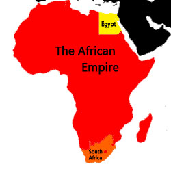
- How's this? I'm not sure about the flag though, because I'm not quite sure how to represent famine. --Bucknut4
Thanks, this is real good! I got a flag --Capt.Sarcasim 00:13, November 23, 2010 (UTC)Capt.Sarcasim
Alot of small requests
Can you please take the watermark of of this:
And this:
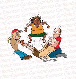
Also can you make it so all four of these people (even the one being mugged) are smiling:
Also could you take the watermark off of it? Thanks. --![]() 01:51, November 20, 2010 (UTC)
01:51, November 20, 2010 (UTC)
- I'm pretty sure removing watermarks is a breach of copyright and in these cases it would be pretty hard to justify the infringement as parody. Perhaps you can use non-watermarked source images instead? Or if none of those exist perhaps you could describe what you'd like and one of us can create it for you. -- The Zombiebaron 08:26, November 20, 2010 (UTC)
Before I specify what I want...
Can anyone here make animations as good as 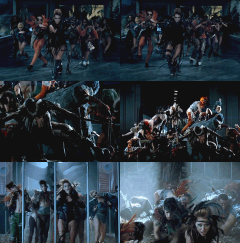 ? 21:09, 16 November 2010
Why? *eyes Socky suspiciously* Also, good like that one, or good in different ways? ~ ![]() *shifty eyes* (talk) (stalk) -- 20101119 - 05:25 (UTC)
*shifty eyes* (talk) (stalk) -- 20101119 - 05:25 (UTC)
- Good in a technical way (colours, detailedness etc.), not the shitty-choreography way. 12:20, 19 November 2010
- I think I can... Ftiercel 19:03, November 19, 2010 (UTC)
- Alright, firstly, would you please redo this request on a different file? The stuff Meep says here and here might help you figure out what to do (if you're not sure yet). If the quality is as good as I want it, I'll ask for several other animations in the near future. Cheers! 20:05, 19 November 2010
- I think this version is better but I can choose the quality level if you want. I'm on Linux. When I see a Youtube video, the file is just in the
/tmp/repertory. I split it into pictures using OpenShot. Then, I load all the images in GIMP. I first change the image mode to indexed colors. Then I click onFilters -> Animation -> Optimize for gifand I save it as animated gif. Just choose the color number for the indexed colors to change the quality. Ftiercel 07:23, November 23, 2010 (UTC)- That looks great! I'll ask for the other images soon. I'll probably do it on your talkpage. I was also wondering, if someone could provide you with media files of the anime, could that improve the quality even more? 01:04, 26 November 2010
- It could, but the resolution is so reduced that it wouldn't change things much. Ftiercel 05:12, November 26, 2010 (UTC)
- That looks great! I'll ask for the other images soon. I'll probably do it on your talkpage. I was also wondering, if someone could provide you with media files of the anime, could that improve the quality even more? 01:04, 26 November 2010
- I think this version is better but I can choose the quality level if you want. I'm on Linux. When I see a Youtube video, the file is just in the
- Alright, firstly, would you please redo this request on a different file? The stuff Meep says here and here might help you figure out what to do (if you're not sure yet). If the quality is as good as I want it, I'll ask for several other animations in the near future. Cheers! 20:05, 19 November 2010
- I think I can... Ftiercel 19:03, November 19, 2010 (UTC)
Spoofing Wikipedia's current site notice
Since A personal appeal from Jimbo Wales has been created and thought this might be a good oppertunity to spoof the current site notice on Wikipedia. The general idea I had was to simply substitute the Jimbo Wales photo of this image:
with other images from Category:Jimbo Wales such as
The only problem is incorporating the "A personal appeal from Jimbo Wales" as a link. I assume it's included as part of a template but I don't know the nessessary coding. MadMax 04:12, November 16, 2010 (UTC)
MadMax 04:12, November 16, 2010 (UTC)
- Well, the way they have it set up, the entire thing is a link, and the text is the same link with mouse-over effects. So the question is, how well does this place support CSS? The image(s) itself should be simple enough. How many do you want, though, and do you want them of the same form as the wikipedia ones? IS this what your forever template is for? ~
 *shifty eyes* (talk) (stalk) -- 20101116 - 05:28 (UTC)
I'll have to ask User:Splaka, or someone more familiar with the technical side of things about how well CSS works. I thought of using a single image originally, since Wikipedia is using one image, but I guess multiple ones could be used with <choose> to sort them randomly. The {{Forever}} template is just an idea I've been working on. Since Wikipedia uses it for its annual fundraisers, or at least since last year, I thought it'd be funny to have an Uncyclopedia version. MadMax 07:31, November 16, 2010 (UTC)
- Ftiercel 07:22, November 16, 2010 (UTC)
Yeah, that's pretty good. Thanks. MadMax 07:36, November 16, 2010 (UTC)
Hmm, still can't get the text to line up along the right side of the image.Solved the alignment problem with this version but text is a little small. It'd be nice to have an exact copy, complete with the "Read Now" and hide buttons. Of course, you could insert {{fakelink}} in place of the hide button as well. MadMax 08:03, November 16, 2010 (UTC)
Useless comment - there was more than one image. I've seen at least three of Jimbo Wales, and they've even started having personal appeals from contributors, too... but of the wales ones, sannse linked this on IRC the other day, if you want an idea of how good they can get.
Although now, hitting purge a bunch of times, it always comes up with the same one... maybe they ditched the fun ones. Boo. ~ ![]() *shifty eyes* (talk) (stalk) -- 20101116 - 15:54 (UTC)
*shifty eyes* (talk) (stalk) -- 20101116 - 15:54 (UTC)
- Really? I just saw the one version. Ah well. MadMax 06:27, November 17, 2010 (UTC)
In other news, I've been fiddling, and actually mimicking what they did is impossible, anyway, because wikia not only does not let us use <css>, but doesn't even allow css image backgrounds, even of site files, which is the only effective way to prevent overflow or repeat a gradient in a hypertext setting.
My idea was to use this with this repeating, as that's the only logical way to do something like this, but since it is apparently impossible here... could try talking to sannse, but as it stands, Ftiercel's method is probably your best bet, although you'll need a way to suppress the overflow. ~ ![]() *shifty eyes* (talk) (stalk) -- 20101116 - 16:31 (UTC)
*shifty eyes* (talk) (stalk) -- 20101116 - 16:31 (UTC)
- Ooo! I got another idea. Since it's, like, for the site notice, and all, you could, erm, put a couple of extra classes in the Mediawiki:Common.css for it and... um... okay, that'd probably be a terrible idea. But... er... it would work. I think. ~
 *shifty eyes* (talk) (stalk) -- 20101116 - 16:44 (UTC)
That's a good idea but I should probably have to ask around before I start fooling around with it. MadMax 06:27, November 17, 2010 (UTC)
Sorry for this morning. I was in the hurry. I fixed the problem. Ftiercel 19:43, November 16, 2010 (UTC)
 Magic! 21:01, 16 November 2010
Nice! The only thing is the "view the content message" on the original version but I'm guessing that's probably unavoidable if you're saving it? MadMax 06:27, November 17, 2010 (UTC)
- Does someone know how to make a real colored link? Moreover, this may interest you. Ftiercel 21:33, November 16, 2010 (UTC)
I tried using <font color=white> but it doesn't turn out so well. You might want upload a new version of your image and just use the text from the original version. MadMax 06:27, November 17, 2010 (UTC)
- When I saw MadMax had added a version of this to the sitenotice I thought I should give it my best shot.

- I hope you like it. -- The Zombiebaron 06:11, November 17, 2010 (UTC)
- That's great, thanks ZB. MadMax 06:30, November 17, 2010 (UTC)
This is prettier:
Don't pitchfork me. ~ ![]() *shifty eyes* (talk) (stalk) -- 20101117 - 06:31 (UTC)
*shifty eyes* (talk) (stalk) -- 20101117 - 06:31 (UTC)
- Maybe ZB could use this image (or this, this, or that) in place of the current one and then both versions could be used with <choose>? MadMax 07:03, November 17, 2010 (UTC)
The more chooseys the better, no? I'm sorry. I dunno why I keep getting drawn back to this. I really have no idea. I'll go away, now. ~ ![]() *shifty eyes* (talk) (stalk) -- 20101117 - 07:05 (UTC)
*shifty eyes* (talk) (stalk) -- 20101117 - 07:05 (UTC)
- Definately. :) Great image by the way. Is that based on one of the other ones at Wikipedia or is it original? MadMax 07:18, November 17, 2010 (UTC)
I just yoinked two more out of the Jimbo Wales category and turned them into bannery things. I don't even know what you saw. Are you referring to one of those? It's on random. It's... um... owww, my head. What? Dammit... oh, one of them's broken... I do know which you saw. It was the beige one. ~ ![]() *shifty eyes* (talk) (stalk) -- 20101117 - 07:23 (UTC)
*shifty eyes* (talk) (stalk) -- 20101117 - 07:23 (UTC)
- Sorry, it's late here. I was originally commenting on this edit. I didn't notice that you added more. Obviously, the layout of the original image has a small photo on the left and a gray area for the text. Your images have a different layout. For example, this image, in that is a single image without the grayspace. MadMax 08:19, November 17, 2010 (UTC)
...oh. Thought you saw that before. Or said something. Or something. Wait, single stretched...?
Okay, I know those are sentences and I know those words mean something, but I just cannot figure out what you're saying, so on this incredibly pointless note, I am definitely leaving now. O____o ~ ![]() *shifty eyes* (talk) (stalk) -- 20101117 - 07:46 (UTC)
*shifty eyes* (talk) (stalk) -- 20101117 - 07:46 (UTC)
Okay, I am now sober and now I see what you mean. I was attempting to mimic the Wikipedia format of having the whole thing be a more solid-shaded, theoretically more visually appealing banner. I have been working some theoretically more usable templates, and with some wonderful help and not so wonderful humping from Olipro, have gotten to a stage of fairly decent. This is the current worky thingy. I'm still working on it and Olipro's doing something to the site javascript and... er... cake. ~ ![]() *shifty eyes* (talk) (stalk) -- 20101120 - 19:30 (UTC)
*shifty eyes* (talk) (stalk) -- 20101120 - 19:30 (UTC)
Disguise & Blargh
a Sam make the Disguise and Blargh a Funny Picture:
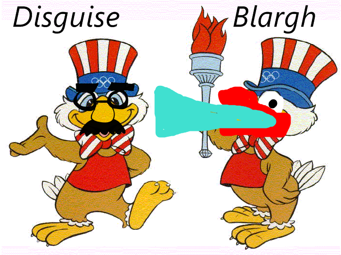 a Previous of Disguise And Have Expired Time this Time. Assalamualaikum
 ![]() my Talkneed work:
my Talkneed work:![]() 11:16, October 25, 2010 (UTC)
11:16, October 25, 2010 (UTC)
- Sorry, but what exactly is this for, and for what are you seeking help, or even are you? ~
 *shifty eyes* (talk) (stalk) -- 20101030 - 15:42 (UTC)
Fergie Turkey
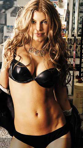
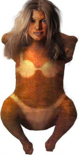
I would like this head:
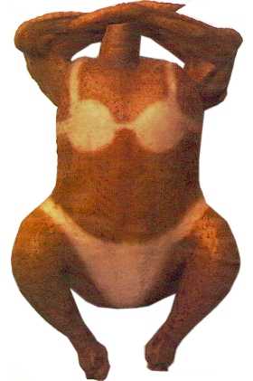
..on this body:
Like this? o_O Egads, I totally killed her hair. Oops. ~ ![]() *shifty eyes* (talk) (stalk) -- 20101116 - 05:58 (UTC)
*shifty eyes* (talk) (stalk) -- 20101116 - 05:58 (UTC)
- Oh my GOD!!! Get it away! GET IT AWAY! I love it! Though you think you could edit the hair shadow out of her lip? – 13:40, Nov. 16, 2010
- Well, I reuploaded it, but wikia doesn't want to let go of the old version, so it might take awhile to update. Or not. I dunno. Is it better, if you can get it to show? ~
 *shifty eyes* (talk) (stalk) -- 20101116 - 16:03 (UTC)
- Now she looks slightly overcooked. Perfecto! – 17:20, Nov. 16, 2010
- Well, if it works... O_o Cheers. ~
 *shifty eyes* (talk) (stalk) -- 20101116 - 17:27 (UTC)
- Well, if it works... O_o Cheers. ~
- Now she looks slightly overcooked. Perfecto! – 17:20, Nov. 16, 2010
- Well, I reuploaded it, but wikia doesn't want to let go of the old version, so it might take awhile to update. Or not. I dunno. Is it better, if you can get it to show? ~
Ok this may sound weird...
...But can some one make me a picture that is outside, has nine trees, a bunch of dogs, a doughnut shop, and no grass. But whatever you do make shure thare are no children in it. Thanks.
P.S.
I know I haven't used the last picture I asked for on here yet. But I will. It's just taking a long time. --
![]() 03:00, November 2, 2010 (UTC)
03:00, November 2, 2010 (UTC)
Actually, scrach that. I may ask for a similar picture later. Sorry. --![]() 00:29, November 3, 2010 (UTC)
00:29, November 3, 2010 (UTC)
Idea for Let's talk about something important
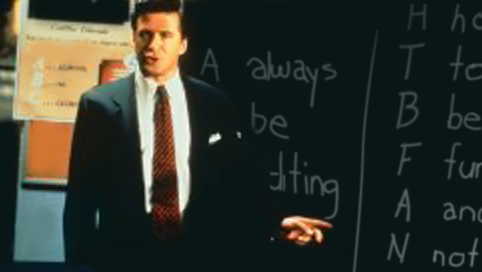
Could someone change "A-B-C. A-always, B-be, C-closing" (left) to "A-B-E. A-always, B-be, E-editing" and "A-I-D-A. A-attention, I-interest, D-decision, A-action" (right) to "H-T-B-F-A-N-J-S. H-how T-to B-be F-funny. A-and N-not J-just S-stupid." ? I've submitted three photos although the right side is obscured so the H-T-B-F-A-N-J-S. part doesn't have to be exact.
MadMax 03:25, October 31, 2010 (UTC)
After spending about an hour trying to find my tablet pen, I gave up and fumbled this with a mouse:
Will that work? ~ ![]() *shifty eyes* (talk) (stalk) -- 20101116 - 06:25 (UTC)
*shifty eyes* (talk) (stalk) -- 20101116 - 06:25 (UTC)
- Very cool. Thanks. MadMax 06:59, November 16, 2010 (UTC)
Map of New York
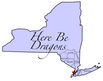
I'm a random passer-by and former upstate New Yorker who got caught up doing a lot of writing on New York's article because it was crappy compared to Arizona - why should New York City have two articles? But I'm sticking with the theme of NYC being the "real" New York and Upstate being a mysterious unknown. A map expounding on the theme (perhaps using the themes laid out in the new geography section) would be excellent. The state maps on Wikipedia] may offer a starting point. Thanks. – Preceding unsigned comment added by 72.223.90.43 (talk • contribs)
- I don't really know much about the geography of New York state so I hope this is what you wanted. -- The Zombiebaron 20:35, October 18, 2010 (UTC)
- You're warm but not quite there: the "Here Be Dragons" part would extend all the way west and I think at least another row of counties south. The idea is "NYC and suburbs" vs "everything else, a.k.a. Upstate". If you want to take it further I'd at least fill in (very roughly) the major geological features: the Hudson River, the Adirondacks (from about Warren County north to the border) and the Catskills (the south and east end of the state west of the Hudson and without running into the NYC suburb counties). And maybe a big star for NYC.72.223.90.43 06:48, October 19, 2010 (UTC)
- I've uploaded a new version. I hope you like it. I cleaned up some sloppy bits from the old version, got rid of a bunch more counties, and added a bigger star for New York City. I tried sketching on the major geographical features but it didn't really turn out so well so I got rid of them and just left it like this. -- The Zombiebaron 22:31, October 19, 2010 (UTC)
- I think this will do the trick, thanks! 72.223.90.43 17:12, October 21, 2010 (UTC)
Don't Mess with Texas
Anyone have time to photoshop an altered version of this WP image for Don't Mess with Texas? MadMax 05:30, October 15, 2010 (UTC)
- Altered how, exactly? *emits aura of laziness* ~
 *shifty eyes* (talk) (stalk) -- 20101015 - 23:07 (UTC)
Didn't have anything in mind. I thought the regulars here might have some ideas. Maybe replacing the submarine with something? A clever caption could do just as well too. MadMax 03:25, October 31, 2010 (UTC)
- I wasn't sure how you wanted the image altered so I took a wild guess. Hope you like it. -- The Zombiebaron 22:52, October 19, 2010 (UTC)
Thanks! MadMax 03:25, October 31, 2010 (UTC)
Noob Army!
Could somone make it so the text on this pic:
says "I WNT U 4 TEH NOOB ARMY! nearest recruting stashun"
Thanks. --![]() 01:45, October 14, 2010 (UTC)
01:45, October 14, 2010 (UTC)
- I dunno... it might do better with a noobier fellow doing the pointing, too, you know? *ponders deep and hard* ~
 *shifty eyes* (talk) (stalk) -- 20101014 - 01:48 (UTC)
Like who? --![]() 01:51, October 14, 2010 (UTC)
01:51, October 14, 2010 (UTC)
I dunno... here's your Sam, though. ~ ![]() *shifty eyes* (talk) (stalk) -- 20101014 - 02:12 (UTC)
*shifty eyes* (talk) (stalk) -- 20101014 - 02:12 (UTC) 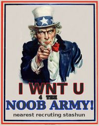
Oh, great. I messed up and had to reupload it and now it won't admit the file has changed... and the last time this happened it took a month for it to update. ~ ![]() *shifty eyes* (talk) (stalk) -- 20101014 - 02:19 (UTC)
*shifty eyes* (talk) (stalk) -- 20101014 - 02:19 (UTC)
Nevermind. ~ ![]() *shifty eyes* (talk) (stalk) -- 20101014 - 02:23 (UTC)
*shifty eyes* (talk) (stalk) -- 20101014 - 02:23 (UTC)
Great thanks! --![]() 02:50, October 14, 2010 (UTC)
02:50, October 14, 2010 (UTC)
Help uploading image
Could someone upload this image for me? MadMax 05:30, October 1, 2010 (UTC)
- Here you go MadMax. -- The Zombiebaron 05:33, October 1, 2010 (UTC)
Wow, that was fast. Thanks! MadMax 05:37, October 1, 2010 (UTC)
Gay Shakespeare
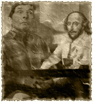
I want a picture of Shakespeare whoring himself out to a nobleman to get patronage for one of his plays. It's for this article I'm working on. Nothing too obscene please, maybe just a bit of kissing or a face resting in a crotch. Something suggestive... or just whatever you can chop together really. Thanks guys, if that's not specific enough let me know. I'm in no rush here. --Black Flamingo 18:15, September 30, 2010 (UTC)
Is this what you're after? Or do you want Shakespeare dressed as a harlot or something?--![]() -Maniac1075Complain Here 23:41, October 3, 2010 (UTC)
-Maniac1075Complain Here 23:41, October 3, 2010 (UTC)
Hanukkah
Two image requests for an article I'm writing for the holidays.
- A big public menorah lighting, but all evil-looking and shit. A black menorah, maybe red fire, or dark red clouds in the back, a pentagram star for sure.
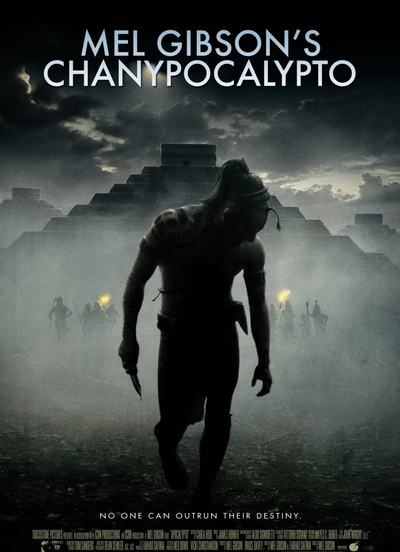
- Movie poster for Mel Gibson's Apocalypto, but with the title Chanupocalyto.
- How's this for the big public menorah picture? -- The Zombiebaron 18:48, September 26, 2010 (UTC)
- And here is a movie poster. -- The Zombiebaron 23:20, September 26, 2010 (UTC)
TAW competition
Hi,
I need some templates and awards for an upcoming writing competition, The Article Whisperer, and was hoping some of the regulars here might be willing to submit a few ideas. TAW should be starting next week but won't be needed until the end of the competition in two or three weeks. I'd defenatly appreciate any assistance. Thanks. MadMax 13:25, September 24, 2010 (UTC)
- Here's a medal that I made. If you have any suggestions on how I can make it better feel free to tell me. Also, you just say "awards" in the request. If this award isn't enough, what other awards specifically do you require? Cheers, -- The Zombiebaron 18:48, September 24, 2010 (UTC)
That's great ZB, thanks! What I'd like specificaly:
- An award for contest winners.
- A secondary award for participants.
- A recognition award for judges.
MadMax 11:32, September 25, 2010 (UTC)
- Ok no problem. I could make three separate versions of the image above. Perhaps gold for the winner, silver for the participants, and bronze for the judges. I'll play around with it a bit right now and see what I can do. -- The Zombiebaron 02:17, September 26, 2010 (UTC)



- How about these three images? You say above that you'll need help making templates for these awards. I can help with that too if you'd like. -- The Zombiebaron 02:43, September 26, 2010 (UTC)
Thanks, I'd appreciate that. I've already made {{TAWaward}} though I was thinking of a smaller "boxed" template, similar to UN:PLS or UN:ATDB, for the others. What do you think? MadMax 20:47, September 26, 2010 (UTC)
- Ok yeah that sounds good. I'll see what I can whip up. When I've got something to show you I'll drop you a line on your talk page. -- The Zombiebaron 20:57, September 26, 2010 (UTC)
Men's Bathing Suits in the cold (resolved)
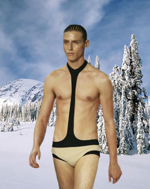
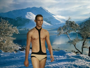
If at all possible could someone please change this pic:
So the back round makes it look like he's in a snowy place. Bonus points if you can fit a line of snow covered mountains in the back round with out it looking bad. Dancing dude ![]()
![]()
- How's this? ~Formerly Annoying Crap 03:14, 23 September 2010
- I made a version of this image request before I saw that Zana Dark had also made one. Feel free to choose either one. -- The Zombiebaron 03:41, September 23, 2010 (UTC)
Oh man... these are bolth great! Dancing dude ![]()
![]()
Evil Dolphin (resolved)
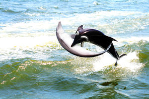
Yo, i'm a first timer and i'd appreciate some photoshop help, I am adept at photoshop myself but I haven't quite delved into this section of 'shopping. Basically what I need is a black dolphin with small black shiny horns eating a normal dolphin. Cheers. jaysonboi 13:07, September 13, 2010 (UTC)
Koolbeans. Thanks heaps dude. jaysonboi 11:29, September 14, 2010 (UTC)
- Is it what you want?

Ftiercel 19:02, September 14, 2010 (UTC)
Wowww this is fuck-awesome! Thanks heaps holmes. Much appreciated :D jaysonboi 10:12, September 15, 2010 (UTC)
- Mais je vous en pris :) Ftiercel 17:04, September 15, 2010 (UTC)
Gay Duck Necrophilia (Resolved)
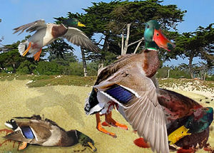
working on an article on this. see the mallard wikipedia article for confirmation that this is a real request. But i would like it as disturbing and graphic as possible -- Soldat Teh PWNerator (pwnt!) 08:16, Sep 5
Well, I couldn't come up with anything really unsettling. A lack of source images coupled with a lack of inclination and expertise on my part, I suppose. I'm sure there's some shock site that has images of poor ducks mashed up and rotting, but I wasn't really determined to find them. But you might want to keep this picture and this picture in mind if you haven't already, the first one apparently being the seminal (no pun intended) work on that rather obscure subject. In the mean time, have one that's disturbing, just not graphic. --![]() 21:05, September 5, 2010 (UTC)
21:05, September 5, 2010 (UTC)
- (moderately) kickass! Any way you could make the dead duck that is being violated look a little more dead on first sight, especially when one is looking at the thumbnail? As it currently is at first sight it just looks like some duck butt sex until you zoom in... But please don't take it as saying it sucks as an image. All in all it's pretty good. Just need the dead one more deader -- Soldat Teh PWNerator (pwnt!) 22:33, Sep 6
- Also, I really like the one on the left side that isn't currently being violated. It looks like it's bleeding from its ass from already being raped, which is pretty cool -- Soldat Teh PWNerator (pwnt!) 22:34, Sep 6
- Added cheesy blood splotching, exposed brains, and similar 'postmortem love trails' for massive deadage. The thumbnail version now makes it more obvious that the object of his "affections" is well past expired.
 23:57, September 7, 2010 (UTC)
- Sorry to say this, but he still looks alive at first. Had a friend of mine look at it without any prior knowledge, and he wasn't able to really see that it was dead, just looked like "one duck was fucking the other" -- Soldat Teh PWNerator (pwnt!) 04:32, Sep 9
- You may make an animated .gif with flies flying over this duck. Ftiercel 06:24, September 9, 2010 (UTC)
- Sorry to say this, but he still looks alive at first. Had a friend of mine look at it without any prior knowledge, and he wasn't able to really see that it was dead, just looked like "one duck was fucking the other" -- Soldat Teh PWNerator (pwnt!) 04:32, Sep 9
- Added cheesy blood splotching, exposed brains, and similar 'postmortem love trails' for massive deadage. The thumbnail version now makes it more obvious that the object of his "affections" is well past expired.
- Also, I really like the one on the left side that isn't currently being violated. It looks like it's bleeding from its ass from already being raped, which is pretty cool -- Soldat Teh PWNerator (pwnt!) 22:34, Sep 6
Alright, that amount of blood should be visible from space or something. At least in a thumbnail, which I've now purged so you can see that something's clearly amiss with Mister Quacker's unwitting bedfellow. Also, added more bugs, which have to be disproportionally larger than life to be seen at that scale.![]() 06:18, September 10, 2010 (UTC)
06:18, September 10, 2010 (UTC)
- God yes. I almost shat myself when I saw it. Thanks so much! -- Soldat Teh PWNerator (pwnt!) 22:20, Sep 23
Award alterations
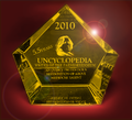
Try to keep this one professional! I put in a couple clandestine requests for this one, but just in case they fall through, I would like to some fancy but professional awards images for the Writer/Useless Gobshite of the 5.5. Years. You can come up with them from scratch if you want (try to keep it Sophia themed) or you can just slather File:2005wotyx.jpg in a fresh sheet of gold paint and encrust File:Goldcraproll.jpg with shiny pink rhinestones. Either approach works. -- 03:50, August 25, 2010 (UTC)
Here you go:
Oh, by "keep this one professional" you were looking for real awards... That might actually take a while...
But really, by "slather it in a fresh sheet of gold paint" did you mean keep the structure and the translucency and just give it a piss-like yellow cast, or try to retexture the thing? --![]() 07:31, August 25, 2010 (UTC)
07:31, August 25, 2010 (UTC)
- I love that Royal Useless Gobshite. If you can drench that in a sheet of gold that'd be perfect! And I actually love the Atlas design and the name "PenIs Mightier Award" plus the solid gold inkwell! But I think you can make the current Atlas thing right now look better (and also make the text a lot fancier). Make it so!
- And a gold texture similar to the one on the inkwell, if you can do that, will be great. -- 12:03, August 25, 2010 (UTC)
- Rather than retexture everything (my attempts came out looking like shit, being that I am ashamedly not too familiar with how to get the effect), I restored the Gobshite patch to nearer its original hue (although purple is a royal colour in a lot of places), equalized the colors and changed the text to be more Art Deco on the Pen is Mightier variety (although for some reason I see this award being more appropriate for Uncyclopedian of the Year), and I glammed up the existing WotY trophy in a similar garish, modern-day Hollywood fashion.--
 20:47, August 25, 2010 (UTC)
- Rather than retexture everything (my attempts came out looking like shit, being that I am ashamedly not too familiar with how to get the effect), I restored the Gobshite patch to nearer its original hue (although purple is a royal colour in a lot of places), equalized the colors and changed the text to be more Art Deco on the Pen is Mightier variety (although for some reason I see this award being more appropriate for Uncyclopedian of the Year), and I glammed up the existing WotY trophy in a similar garish, modern-day Hollywood fashion.--
Just remembered that I'll have to give out 5 of these awards. I think I'm good for the writers, but do you think you can maybe come up with another original concept award similar to PenIs Mightier, but for Useless Gobshite? -- 19:17, August 27, 2010 (UTC)
- In place of being original, we can be somewhat derivative and have the three Oscar-like golden figurines for the three "major" awards, as well as the modified old ones. In this scenario, it would be incumbent upon you to decide which variety (the recolours) or the figurines the supreme winner would get vs the 4.5 runners up, or to avoid that entirely, in which case I would use the recolors for the anniversary project you're planning, and find some more regularly running home for the figurines. Or vice versa. I care not.
And in reading your topic, why the choice to award single images? They certainly aren't going to care if there's a shiny new trophy next to them, whereas folks like RadicalX, Sonje, and PrettiestPretty might. The POTM and POTY awards are neglected enough already (unlike n00b, writer, and Uncyclopedian, there's usually no reminder links on the main page to it, and consequently whole months sometimes go by without a single vote...). Food for thought. I love the 5.5 idea otherwise. --![]() 01:56, August 28, 2010 (UTC)
01:56, August 28, 2010 (UTC)
- Huh. Very good idea about the PotY. Guess that means I'll need some awards for Potatochoppers of the 5.5 Years too... Anyway, you've really proved your 'chops. If my private requests come through I'll have to compare and contrast, but worst case scenario I'll definitely use these guys for something. Seriously, they're great! -- 03:24, August 30, 2010 (UTC)
Runes of Magic/World of Warcraft (resolved)
I need a simple text change on the picture to the right. Instead of "World of Warcraft" could it be possible to have "Runes of Magic" in is place? Its for this article i am writing. Thanks in advance! Pirate Lord__Sonic80 (Yell • Latest literary excretion) __ 19:23, August 21, 2010 (UTC)
- Is it OK?

- Ftiercel 22:44, August 21, 2010 (UTC)
- Yes, Thank you!
Pirate Lord__Sonic80 (Yell • Latest literary excretion) __ 16:45, August 22, 2010 (UTC)
- can i just pipe in and say this really really well done -- Soldat Teh PWNerator (pwnt!) 19:20, Aug 22
- Yes, Thank you!
4 easy steps (resolved)
Please just cut off every thing exept the parts that say "send your message in just 4 easy steps" then please change it so it says "get ripped off in just 4 easy steps" then please try to make it a bit bigger, hope thats not too much to ask. thanks
--Magic man 03:56, August 21, 2010 (UTC)
- Is
thatthis what you want?
Get ripped off
in just 4 EASY STEPS
- Ftiercel 06:15, August 21, 2010 (UTC)
yes that is how i want it too look. but in the pic. --Magic man 12:57, August 21, 2010 (UTC)
- Ease air any miss take in my ann, sir? Ftiercel 13:13, August 21, 2010 (UTC)
- I have changed the text. Ftiercel 22:52, August 21, 2010 (UTC)
Guile as an Air Force Falcon kicker (resolved)
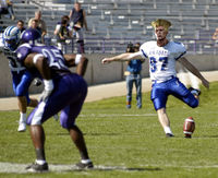
I would greatly appreciate a photoshop of Guile's hair on a kicker from the Air Force Falcons football team. Bonus points if you can edit in the flash kick trail behind his leg. Thank you so much!
S3ahawk 02:00, August 18, 2010 (UTC)
- Is it what you want? I'm not a native English speaker and I'm French.

- Ftiercel 06:23, August 18, 2010 (UTC)
That is absolutely brilliant! Thank you so much!
S3ahawk 23:59, August 18, 2010 (UTC)
Kamino Service Station
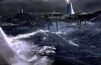
What I'd like is the picture on the right, except with a service station to the right and a little bit back from the flying stingray. It could be held up by poles disappearing into the water - whatever. Any attempts would be greatly appreciated. --Some Idiot ![]() 09:36, August 6, 2010 (UTC)
09:36, August 6, 2010 (UTC)
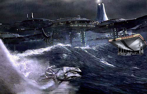
- How's this?-Dame

 10:11 August 6, 2010 (UTC)
- I would of liked it a bit bigger, but this is still great. Thanks! --Some Idiot
 09:06, August 9, 2010 (UTC)
- Do you want the entire image bigger or just the service station? -Dame

 09:18, August 9, 2010 (UTC)
 - The service station. But it doesn't really matter. --Some Idiot
 07:31, August 12, 2010 (UTC)
- Do you want the entire image bigger or just the service station? -Dame
- I would of liked it a bit bigger, but this is still great. Thanks! --Some Idiot
Mileena chucking babies
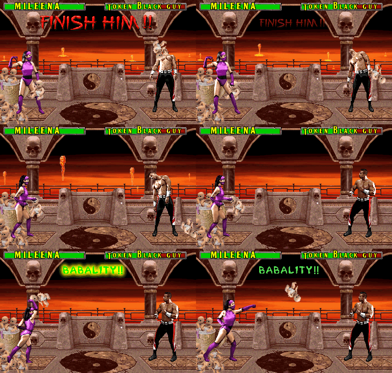
Hi, I need a picture of the Mortal Kombat character Mileena throwing her sai's at the opponent, except instead of sai's, it should be babies being thrown. Please make the babies look ugly if you can. Check out the article "Mileena" if you need to. Thanks.
Oh, and since I just realized you might actually want a proper arena mockup, and since I couldn't find too many examples of the sai throwing images, I put this together. It took QUITE a while, but I think it came out pretty well, except the movement is slightly obnoxious and jerky jammed into seven frames. Consider it my anigif magnum opus.--![]() 22:31, July 30, 2010 (UTC)
22:31, July 30, 2010 (UTC)
This is awesome! Great work! If I may be a bit rude, it's almost exactly what I wanted. I'll use this, definitely I will. But if you could make it look like her victim gets hit by the babies, then begins to swoon, it would be just perfect. But Mileena is absolutely gorgeous *ahem* perfect! --Lakepoint 18:32, August 1, 2010 (UTC)
Alrighty, well, in my opinion it's only more janky this way (you can always revert if you change your mind), but that was less painful than I thought. Good I saved the layers. Oh, and by the way, the thumb specification, aside from having a tendency to make pictures tiny, makes animations static, so if you're after the caption effect, you'll have to futz around with divs (see the source of Blue Ball Factory), else you can just remove the thumb option and go captionless. --![]() 19:13, August 1, 2010 (UTC)
19:13, August 1, 2010 (UTC)
Which is not as traumatic as it sounds, but here, I figured it out for you. Or you could just use "frame" instead of "thumb", I guess... Damn. Why Wikimedia? Why?--![]() 20:10, August 1, 2010 (UTC)
20:10, August 1, 2010 (UTC)
Alice in Sunderland
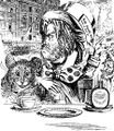
Hey. I'm after some Lewis Carol-type illustrations for an article I'm working on called Alice in Sunderland. It's a reworking set in the grim North of England, so if someone could make a picture of some of the reworked characters for me that'd be great. I mainly want one of the white rabbit, who is a dirty white ferret in this version, but one of the Mad Hatter looking rough and working class would be nice too. Thanks in advance. You guys rule. --Black Flamingo 22:27, July 9, 2010 (UTC)
Have absolutely no idea if this is what you intended by "Lewis Carroll-type illustrations", but here you have my two cents tries. --MeepStarLives 09:51, July 13, 2010 (UTC)
- I had no idea what I meant either. And yet you managed to render my idea perfectly into an image. Thanks again, you will be RadicalX of the year without a doubt. --Black Flamingo 17:12, July 13, 2010 (UTC)
A dinner party
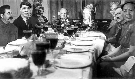
This may seem strange and a bit ott but I would like a picture of Darth Vader, Gok Wan, Marie Antoinette, Chairman Mao (preferably in shorts) and Stalin having a dinner party, if you can do that you are a genius. Ahadwick
All right, this had been sitting here for a while, and I felt bad, so if you're still into it, BEHOLD:
(I had a version with Mao in shorts, but it looked even more crudely pasted together)
Not sure if it was in line with your off-the-wall idea, but note the bonus villains!--MeepStarLives 19:37, June 20, 2010 (UTC)
Not an Image Request
Template:Infobox space agency
I need somebody to help me with this template for an article I wanna make. Me a noob so yeah. The one I need is on wiki but copying and pasting it over here doesn't work of course because all of the ones on here are people making medals for themselves. Nothing wrong with that of course. I know I'm supposed to create one on Uncy , and I have the stuff to copypaste but I'm not sure how to make one. If it's easy to do I would verymuch appreciate someone to load it on Uncy. Link is http://en.wikipedia.org/wiki/Template:Infobox_space_agency thanks NonchalantCaterpillar 09:46, May 20, 2010 (UTC) oh yeah and I realise this is the image request page I just didn't know where to ask...
Here you go. It was a good learning experience, at the least.
Usage:
{{Infobox space agency
|name          = United Federation of Planets Starfleet Command
|acronym       = Starfleet
|image         = Federation.png
|caption       = To boldly go where no man has gone before
|location      = Earth (Sol III)
|headquarters  = San Francisco, CA
|spaceport     = Starfleet Academy
|motto         = Ad astra per aspera
|established   = 2161
|administrator = UESPA Headquarters, Spacefleet Command
|budget        = [[pun|Astronomical]] (>$999,999,999,999,999.99)
|URL           = http://www.startrek.com
}}
--MeepStarLives 22:21, July 20, 2010 (UTC)
The larson
hey could you please make an image for my story. I'm not really fussed but i'd prefer it not to attempt to depict the larson because no mortal eyes may gaze upon him. --Lloxoll 15:40, May 1, 2010 (UTC)
Request for Image
Serotonin deficient has asked for someone to create a company logo and NYSE stock symbol for All China Dissident Blood and Body Parts Cleaning Service. MadMax 11:56, January 25, 2010 (UTC)
- This is pretty late but is this what you were looking for? -Dame

 19:40, August 6, 2010 (UTC)
Book Cover
This is a tricky request, so you can see why I'm putting it here instead of trying it myself.
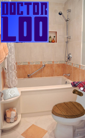
It's for my UnBook article Doctor Loo. What I would like is for the main image to be of a simple bathroom with a toilet and a soap in it. The toilet needs to be something with grey pottery, a wooden seat and handle and a tartan bonnet hat on top of the cistern. The soap needs to have an engraving on it like a rose (like they do with the dove letters on a Dove soap). Also, the title of the book should be a Doctor Who logo with 'Loo' instead of 'Who'.
It's a tough request, so I won't be surprised if nobody takes it up. Much obliged if you do, though.--Garionepsilon 19:39, January 3, 2010 (UTC)
I want to do it Done! But it sucks...-- 01:49, July 11, 2010 (UTC)
Miley Cyrus animation for UnTunes:Can't Be Blamed (For My Shitty Music)
I basically need an animation based on this video with a couple scenes where Miley and/or some other people move around like Ape-Shit Crazy. Which scenes you use is completely up to you. Please upload it at File:Can't Be Blamed.gif when you're done. A width of 240px would be ideal, but please avoid any black edges. Feel free to crop the frames as you see fit. 21:42, 11 August 2010
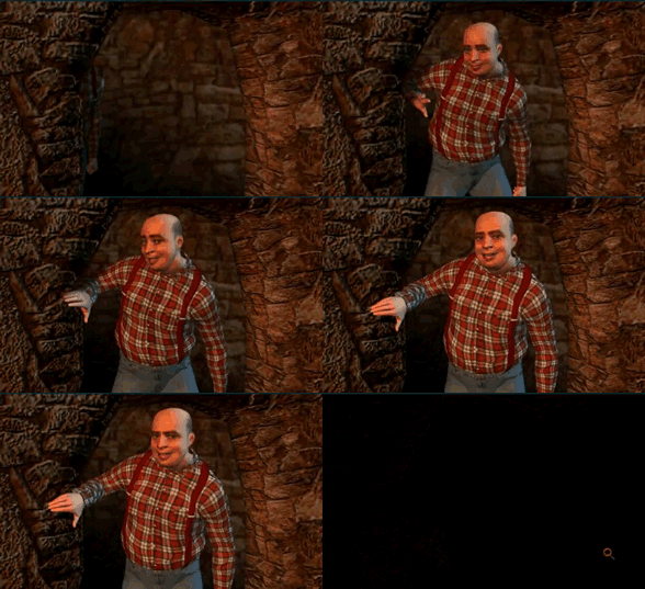
The good news is since the last time we tried this I worked out a good method for making an animation from a game or cartoon, as you can see here in this sequence I captured for an article I'm working on.
The bad news is the process and tools don't work so well outside of old-style VGA colors. So I retooled and came up with this, which while pretty small at 240px, and dark on account of the directors' rather poor choice of lighting, captures the choreographic Michael Jackson-like dance insanity of Miss Cyrus' latest outing pretty well, in my opinion.--![]() 19:05, August 12, 2010 (UTC)
19:05, August 12, 2010 (UTC)
- That's magnificent, MeepStar. I couldn't have imagined it any better. 19:09, 12 August 2010
Elfen Lied
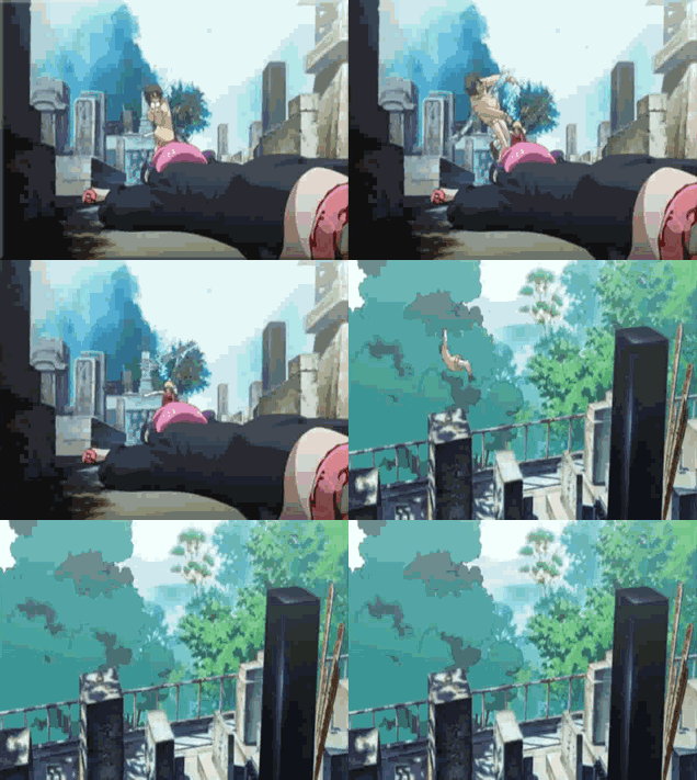
I wanted an animation of Mayu being thrown around but couldn't find one. If anyone can use this video to create a gif file, that'd be great. From 0:47 to 0:51 should be about right. It might be appropriate to crop the image so the less relevant parts aren't in the gif, but don't overdo it. A width of 320px would be just the right size, but a bit smaller is alright too. 23:03, 31 July 2010
I've been messing with this on and off since a few minutes after you put this up, and I just don't get it. By "it", I mean how anybody gets any animated gifs made off of YouTube with a reasonable framerate but without all of this artefacting. Anyway, it looks terrible, but I suppose that's what you get after downloading something from Youtube with mediaconverter, transcoding it to avi, splitting it up into frames for an animated gif in VirtualDub. I think it's the VirtualDub anigif process more than any other thing, because it looked even more horrendous before I smoothed and web optimized it a bit in Fireworks. I'm sure that Uncyc has someone who's done this before, it's just not me. In the meantime, it serves as an illustrative placeholder. Sorry for giving you two tidbits of unacceptable quality in a row! I hope I can be forgiven. --![]() 05:11, August 2, 2010 (UTC)
05:11, August 2, 2010 (UTC)
- Thanks, that's definitely good enough! As for your question, the best way of making a gif file I've ever tried was when I stored every frame separately and then put it all together in a GIF. I get the impression the colour was a lot better compared to directly pasting the frames into the gif file. File:7 Shits.gif was the result of this process, so it's not that good either. Moreover, taking screenshots of every frame was extremely tiresome. I guess the beautiful gifs out there were probably made with some sort of program which preserves the colour quality. 08:54, 2 August 2010
Petty
Could somebody replace the italic uppercase A with and uppercase Y in the same colour and font. (Don't change it to petty, just PeTY). Thanks. --Weri long wang 14:04, July 29, 2010 (UTC)
- Here's a rough version, given in two file formats (the svg seems to be going mental). aineolach (u · d · c) 17:06, July 29, 2010 (UTC)


- Brilliant. Thanks a lot. --Weri long wang 17:16, July 29, 2010 (UTC)
Jesusaurus Rex
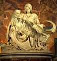
If someone could replace Jesus's body on this sculpture with a T-Rex's like this one. If you can make the T-Rex body look like it's really part of the marble sculpture, that'd be great. If it's easier to replace Jesus's head with another one, then feel free to do so, though make sure it's recognizable as Jesus. If you want to use a different image for the dinosaur part, go ahead, but make sure it looks T-Rex like. 15:38, 13 July 2010
The compression on the requested picture made an admittedly poor chop even worse, so have another fine art T-rex on me (I was working on one for some reason) unless/until someone makes you a better one.--MeepStarLives 23:10, July 13, 2010 (UTC)
- Thanks! Both images look great! 10:17, 14 July 2010
Surviving Falling of Waterfalls for Dummies
This is pretty simple, I think. All I need is one if those For Dummies books, but it's Surviving Falling of Waterfalls for Dummies. On the cover the character on the front page is falling off the waterfall, swearing. Thanks if anyone takes this up. --Some Idiot ![]() 18:43, July 7, 2010 (UTC)
18:43, July 7, 2010 (UTC)
Here's one I made [4] to give you an example. It's not well made but this is the kind of thing I'm looking for. --Some Idiot ![]() 01:58, July 8, 2010 (UTC)
01:58, July 8, 2010 (UTC)
Oh, and not to bother you, but could you do the same thing except with Taking in the Washing For Dummies as well? Thanks. --Some Idiot ![]() 03:59, July 8, 2010 (UTC)
03:59, July 8, 2010 (UTC)
Done and done. --MeepStarLives 03:02, July 14, 2010 (UTC)
- What font do you use for the titles? aineolach (u · d · c) 20:32, July 18, 2010 (UTC)
- I don't have my layers open, but I believe it's various shades and kernings of Myriad, or something close.
 20:54, July 22, 2010 (UTC)
Great work. Thanks heaps. --Some Idiot ![]() 06:33, July 14, 2010 (UTC)
06:33, July 14, 2010 (UTC)
Mario uncyclopedia
Hey it's me again magic man, sorry to ask for another pic so soon. But can i get the uncyclopedia logo, but the puzzle circle thing is replaced with this pic of mario's head:
but keep the words "uncyclopedia" under his head.
i don't need it immediately so you can take your time.
thanks
--Magic man 19:27, July 3, 2010 (UTC)
Better Image
I need a better version of this pic, as told in pee review, to replace it to make it look professional--![]() Director
Director![]() WILL
WILLYOU 333 08:15, January 17, 2010 (UTC)
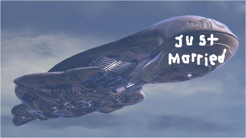
- Please supply a source image, and I'll see what I can do....RadicalX (Holla!) 02:38, January 29, 2010 (UTC)
- I started by recreating a source, but run out of time. Please go over this image with your newer version. File:Halo thingy.png Pup
Game screen
I'm looking for either a complete or a semi-complete collection of images here. I'm after a frame that is about 800px * 600px which has two sections and looks sort of like this:
800px
| 600px | 200px |
And the basic theme that I'm looking for is a horror theme, so skeletons, ghosts, haunted houses, bats, blah blah blah. Anyhting that anyone can give me would be helpful. Pup
- I've changed concept as I was having trouble visualising it all together, despite a few false starts, so we can scrap this. Pup
Kettle bell
Could this image have a midgit lobbing a kettle bell into the air. You could be crative and have it being shot and the molten contents being spreyed over the other guy - this is probably almost impossible to do. Thanks:-)--Sycamore (Talk) 18:04, July 6, 2010 (UTC)
Something like this? 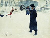 I rushed it but I was wondering if this was what you meant. --Some Idiot 10:48, July 7, 2010 (UTC)
FIFA Middle Earth Cup
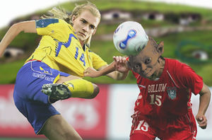
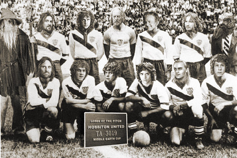
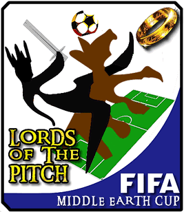
I'm doing an article on the FIFA Middle Earth Cup, and I need some pictures. Maybe a picture of some LOTR characters playing soccer or in a team photo, or a mixed soccer/LOTR emblem. Or maybe the same thing you did with that 'Finl Fantasy Footbal Team' thing. Maybe even some black and white photos from 'past' games. If you have any other idea about LOTR soccer then make them too. Thanks, and I hope this isn't to hard. --Some Idiot 00:14, July 3, 2010 (UTC)
There's one to get you started, and I'm sure somebody has some more exotic and creative ideas...--MeepStarLives 01:48, July 5, 2010 (UTC)
Alrighty, will these suffice? --MeepStarLives 04:58, July 5, 2010 (UTC)
Awesome, just awesome. Thanks. --Some Idiot 07:02, July 5, 2010 (UTC)
mario sucking his thumb
i need a pic of a full grown mario sucking his thumb.
thnx --Magic man 16:06, June 29, 2010 (UTC)
Ok. Plumber with an oral fixation. Odd, but that's par for the course here. By full grown, I'm gonna assume you mean 3D Mario rather than that god-awful Baby Mario or an 8-bit one that had too many magic mushrooms.
Will this -------------------------------------->
do? The expression's not quite right, but you pays your money, you takes your chances.--MeepStarLives 08:53, July 2, 2010 (UTC)
Ya that works great! thanks
--Magic man 15:35, July 2, 2010 (UTC)
More Ebert
Hey, I could really do with one more funny book cover for my Ebert article. You know you get those books on movie directors like "Scorsese on Scorsese" and "Spielberg on Spielberg". Well if someone could make "Uwe Boll on Uwe Boll" for me that would be great. Could you also put something like "Sarcastic foreword by Roger Ebert" on the cover too?
Thanks guys. --Black_Flamingo 15:52, May 21, 2010 (UTC)
- I like it, thanks Maniac --Black_Flamingo 12:37, May 22, 2010 (UTC)
Roger Ebert
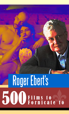
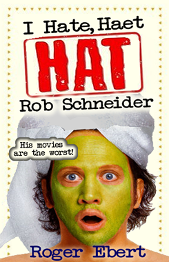
Hey guys, could you possibly make me a few book covers for this article I'm working on? Here's an example of what I'm after, but I want some other titles. Stuff like "Roger Ebert's Films to Fornicate to", "Ebert on Uwe Boll" and "Death to Schneider", or any other funny ideas you might have. Nothing too fancy as long as it looks real. Much appreciated. --Hugs and kisses, Black_Flamingo 18:39, April 20, 2010 (UTC)
Sounds like a pretty exploitable concept. Here are two donations to get you started. --MeepStarLives 02:43, April 21, 2010 (UTC)
Thanks MeepStar, they're both great. Anyone else who wants to contribute please do. --Hugs and kisses, Black_Flamingo 20:10, April 22, 2010 (UTC)
- How about "More Movies you'll Never Watch" - if anyone could make that? With the subtitle "They're all in Chinese or something!" --Hugs and kisses, Black_Flamingo 18:35, April 25, 2010 (UTC)
Trench warfare
Wow, this page is very undervalued. Anyway, I'm hoping for at least one shopped image in this article - it was the one thing I missed when I wrote my last article concerning homosexuality in the army and etc. I'm not even sure of what kind of image it could be; though there is the "Good Trench" section in the userspace article that mentions a trench with various luxuries, a bookcase, literary discussions, colourful surroundings, etc, that may catch an eye or two, but I'm not sure overall. These links are decent-ish (they're all black and white) images that could be edited in some way or another. Summary: Any help at all with a shopped image in this article would be fun. Thanks in advance for anyone who takes this up. -- 21:58, April 2, 2010 (UTC)
If you dig your trench well enough, everybody's gonna want to come. - Meep
- HAHA, they're both excellent. I'm glad you chose the picture on the right to shop (shopped very well, I may add), it's one of the most replicated images of WWI that I can find, at least one or two readers will recognise the original image that keenly represents the truth of trenches. The picture on the left will work very well in the "Decline" section of the article. Filters don't seem much trouble for black and white, right? Again, thank you so much for your help! -- 13:05, April 3, 2010 (UTC)
- Alright I think I need two more pictures, but one of which I'm sure I could just make up for with a caption (showing genuine black and white photos of the time is imperative in this I think). The other image may necessitate photoshop, if you'd be so willing, Meep. I'm interested in a picture to complement the various digging methods section near the start. I'm not sure what the picture should depict: lowly civilians digging a trench by hand, a bulldozer simply driving into the bog or a piece of artillery that has a clear name on the side of it reading "The Trenchalyser XK-5000" or some such. Whichever you find the best idea, or whatever you'd suggest yourself. Meepstar, thanks once more for your help. -- 13:40, April 3, 2010 (UTC)
- Thanks once more for helping me out, Meep, and supplying me with not just one but two images. I think I'm going to use the one on the left however, TrenchinatorInABog. My concern for the second one is that it has the 'dozer in the same presentation from the first image, and the squadron on the left are slightly disconcerting considering you've done higher quality shopping in previous pictures - nonetheless, I'm very grateful you were willing to produce another image for me. As far as I know, I'm probably not going to write another article for some time yet: different moods and that. I sincerely hope you will still be around to help me out again in future though, you're one of many decent photoshoppers on Uncyclopedia that still surprise me with each image - if not the best. -- 00:50, April 7, 2010 (UTC)
- Alright I think I need two more pictures, but one of which I'm sure I could just make up for with a caption (showing genuine black and white photos of the time is imperative in this I think). The other image may necessitate photoshop, if you'd be so willing, Meep. I'm interested in a picture to complement the various digging methods section near the start. I'm not sure what the picture should depict: lowly civilians digging a trench by hand, a bulldozer simply driving into the bog or a piece of artillery that has a clear name on the side of it reading "The Trenchalyser XK-5000" or some such. Whichever you find the best idea, or whatever you'd suggest yourself. Meepstar, thanks once more for your help. -- 13:40, April 3, 2010 (UTC)
Firearm attachments
Several image requests. I've the brunt of the writing 95% done and I have begun to theorise images. I may have more ideas for anyone willing to help me out, but at the moment I have three image ideas.
Firstly, a picture of a rifle with an elastic band wrapped around two parts of the sights on the top of it. The image below shows what parts I mean, the idea would be that one elastic band is stretched to go around the two prongs, or whatever the military term is. The image below isn't a prerequisite, I don't mind whatever image of a rifle is used, so long as there are no other attachments visible and that the elastic band can be well distinguished.
Secondly, a rifle with a small phrase book (with the book open and the cover visible, similar to this, but can be any language you want, so long as it is more worldly rather than accentuated on notorious current warzones) mounted on the top of it.
Thirdly, some unmounted horses galloping and on fire.
I don't mind if this section sinks to the bottom of the page, I know I can improvise with some of the image work for the article in question, but the work that can be done by the photoshoppers on Uncyc has not let me down before. Thanks. -- 01:56, March 22, 2010 (UTC)
I have versions of various levels of tautness, but I think this one's the best. - 05:16, March 23, 2010 (UTC) MeepStarLives
- Fantastic response, I knew I would be left satisfied, thank you very much. The first and second image, absolutely brilliant, reminds me when I would leave Sonje with a pretty vague idea but she'd come back with precisely what I had in mind. The third image I understand, I've rarely seen decent fire effects in images.
However, do you think you could edit an image that already has horse + fire? DrStrange was decent enough to provide a few images in the talk page, the second of which posits a burning neigh-sayer, only it has the rider too visible for my liking. Stupid horsemen. Taking us horse's jobs.-- 13:54, March 23, 2010 (UTC)- Nevermind, DrStrange himself volunteered to uptake the role himself. I have a few more ideas though if you are willing to partake, MeepStarLives? -- 14:00, March 23, 2010 (UTC)
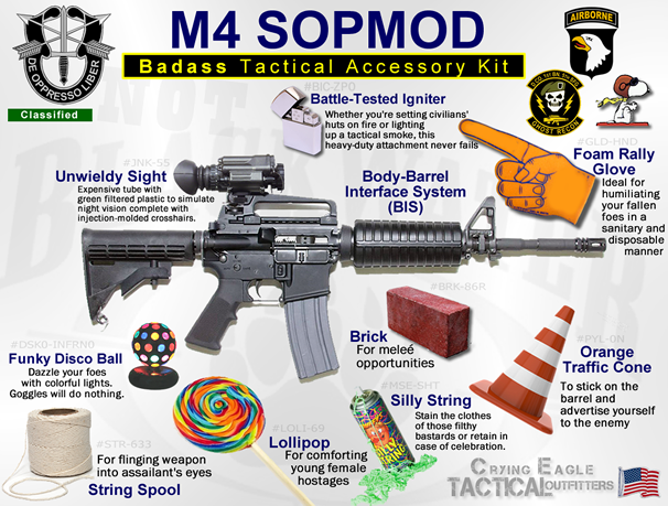
- Well, if so, I need an image for the top and for the bottom. Oh err. Anyway, I've thought about what I could do myself to alleviate demands put upon others, I know I could perform this task myself, it's just filtering the light on the image that concerns me: I want a picture that would mimic this common apparition in gun wankery sites. Instead of the standardised murder tools that surround the rifle, there would be numerous alienable items around it instead, with brief explanations for their purpose. For example, a piece of string in the area next to the butt decrying a use "for slinging rifle into eyes" and so on. Other suggestions, a lollipop next to the barrel "for quietening youths in tight hostage situations", a brick for "meleé opportunities", a foam hand on a spring with the palm facing forward for "talk to the hand situations with ignorant anti-war protestors", etc. But also anything you'd like to add, I'd like you to have freedom with this one. Not that demanding that another should be free is freedom. Or something. Thanks again in advance, the first two images: unbelievable. -- 14:35, March 24, 2010 (UTC)
- Nevermind, DrStrange himself volunteered to uptake the role himself. I have a few more ideas though if you are willing to partake, MeepStarLives? -- 14:00, March 23, 2010 (UTC)
Jingoistic gun-nut enough for you? --MeepStarLives 00:40, March 25, 2010 (UTC)
- Absolutely fantastic, thank you so much. To me, colourful images (not just mere captions) is what makes an article apply to all rungs of the ladder, your work has exemplified that. I'm going to try retain some independence and wring out one more picture by the sweat of my own brow. Once more, thanks again. -- 00:46, March 25, 2010 (UTC)
Dragon Age: Images
Hey, I'm after an alternate front cover for the game Dragon Age: Origins, for my article on the subject. The real cover has a sort of bloodstain in the shape of a dragon, but I need one where it looks like two men having sex instead. If someone could make that I'd be really grateful. Thanks. --Black_Flamingo 00:09, February 21, 2010 (UTC)


- Puppy that's awesome. However, do you think you could put it on the case with the title and everything? Sorry to be a bother. --Black_Flamingo 02:51, February 21, 2010 (UTC)
- No you're right, that is better, thanks a lot. --Black_Flamingo 09:21, February 22, 2010 (UTC)
Requesting Image
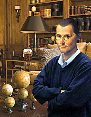
Hi. I would like an image for this article: User:Hiatus Hernia/Unbooks:The Parent. What I have in mind is a picture of Machiavelli, looking sort of mellow, kindly, with glasses, or something, suggesting a 21th century guy with a PHD in child psychology. It's going to be the first image, which will introduce the author. The caption will read "About the author: Niccolo Machiavelli is a renowned political philosopher and child psychologist. He has authored many books, including bestsellers such as The Art of War and The Discourse. He now lives in Florence, Italy, with his dog, and several marble busts of himself." Ok, I noticed that my "demand" may be a little stringent. If the picture can serve its intended purpose, even though it doesn't look like what I imagined it would, I would be really, really grateful. ~ 13:32, Feb 16, 2010
Quick stab. --MeepStarLives 02:20, February 19, 2010 (UTC)
- Wow, awesome! Now if only I can finish that article. ~ 03:59, Feb 19, 2010
User:Sycamore/Germany
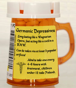
I'm having a go at rewriting Germany. I'd like a really first class image for the article, something that parodies Germany well and sits well on it's own without explanation. I'd preferably like to avoid too much Nazi stuff as its unfunny and out of keeping with what I'm going for. Something maybe with their Bauhaus architecture, Wurst, Goethe, Krautrock, Bier, Bottom slapping or their boring 'dick' cars. Creativity is must, and can be either simple or complex, but must be original. Thanks:-)--Sycamore (Talk) 12:11, December 26, 2009 (UTC)
- This good? I just couldn't miss a Poland joke like that though. --Nikau 14:55, January 16, 2010 (UTC)
Smiley Face

A smiley face would do. Something like (:. Amazing what Uncyclopedia doesn't have. 10:16 December 23
ok done it,--Soysauce 17:23, January 31, 2010 (UTC)
Goddamnit, no ms paint. Please. Just download GIMP if you're going to be a freeloader.--71.235.110.207 04:58, March 7, 2010 (UTC)
Temp Logo
I need a temporary logo for my page, User:Invincibleflamegruemaster/Christmas Reskin. Preferably, I would like an image that looks the same as the current Main Page logo, except there would be a large Santa hat on the big potato, and it would say Santapedia instead of Uncyclopedia. --Invincibleflamegruemaster 21:28, 12 15, 2009
- How's this? (See logo at top left) ~Formerly Annoying Crap 08:28, 21 December 2009
- I like! Thank You! -- 12 22, 06:49
Tetris X potsdamer platz
Hey. I'm after a very specific image. I'm looking for a tetris game image that has a background of potsdamer platz before the wall came down in the background. I'm looking for an animated gif version of it and I'm looking for it to be in 16 colour in EGA style. What I am then intending to do is have a wall created in the center with falling bricks and have a person try to cross it and be shot down by a guard at the side. If someone does the entire graphic and animation for me it would be fantastic, but if not whatever you can give me would be spectacular. (IE an animated gif version of classic Tetris for PC, a picture of potsdamer platz, an animated gif of a character jumping a wall, and animated gif of a German gaurd shooting someone, blah blah. The more elements I get of this the easier it is to put the final product together.) Pup
Running a Red Light
Yeah, so I'm writing this article called User:Staircase/Running a Red Light. Yeah, so Sonje's been gone for a while, and she's my go to person for image requests. That leaves me with you guys, I guess. So I was looking for two, maybe three images that would fit this article. Go ahead and read what I have, and make images accordingly. Thanks! Staircase CUNt 04:33, 22 July 2009 (UTC)
- Well, ok, I do have two requests. One of a guy running through a street full of cars, which should be easy (I don't have ANY image manipulation programs except MS Paint) but I can't do it, and a picture of someone holding a picket sign against red light running. That is all, although anything extra would be gladly accepted. Staircase CUNt 04:08, 23 July 2009 (UTC)
- Oh, alright, thanks! I know I've been away for a while, but this will help me get back to editing. Good job! These are great. Staircase CUNt 01:46, November 22, 2009 (UTC)
Hello
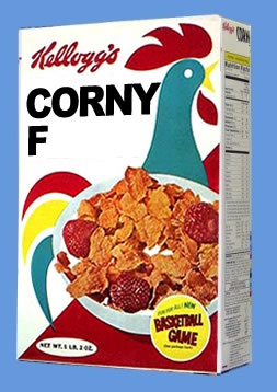
Hi, please may I have some kind of image which shows a corn flakes packet, except instead of the words "Corn Flakes" it has "Corny F?" Be as creative as you like - it doesn't necessarily need to be just the words changed. Thank you very much in advance, and let's hope this works. Nameable • mumble? 18:28, 14 June 2009 (UTC)
- Hello? :( Nameable • mumble? 13:56, 27 June 2009 (UTC)
- Sorry, dude. I never saw this request before. It shouldn't be a problem. I'll get to it as soon as I can. --Dame

 14:17, 27 June 2009 (UTC)
- Ok, so I have a bit of time now but I've realized your request is a tad vague. Changing the text is simple but what is the pic for, I need a bit more information to know what to do with the rest of the box. Like what article is it gonna be for? --Dame

 11:20, 30 June 2009 (UTC)
- Ok, so I have a bit of time now but I've realized your request is a tad vague. Changing the text is simple but what is the pic for, I need a bit more information to know what to do with the rest of the box. Like what article is it gonna be for? --Dame
- Sorry, dude. I never saw this request before. It shouldn't be a problem. I'll get to it as soon as I can. --Dame
made a mess of it but its still usable--Soysauce 17:28, January 31, 2010 (UTC)
