Forum:The Q (Quotation) template
Problem statement
There are several problems with the {{Q}} template, at least one of which is known:
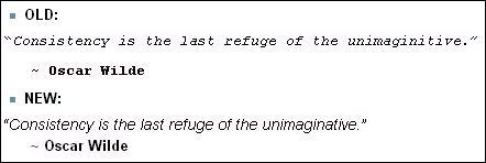
- Both lines of the quote (the quotation and the attribution) are inside
<CODE>tags. CODE tags are designed for, well, code. On my computer, CODE is rendered in a typewriter font inapproprate for quotes. In addition, my computer assumes CODE is not to be wrapped; this means a long quote at the top of an Uncyclopedia article feeds a lot of blank vertical space so it can begin underneath the initial illustration. That's ugly.- One can use a personal style sheet to change the appearance of snippets declared as CODE. My personal style sheet now has a rule for
DIV#bodyContent CODE, which applies only to CODE snippets in Uncyclopedia and not to CODE at other web sites. But even such a specific personal rule also affects other uses of CODE on Uncyclopedia, such as blocks produced by starting a line with a space. - Zana Dark tells me this problem is known and corrected in the {{Nicequote}} template. I could use {{Nicequote}} rather than {{Q}} in articles I write, but then they would look non-standard, and the other problems would remain on all the other articles.
- One can use a personal style sheet to change the appearance of snippets declared as CODE. My personal style sheet now has a rule for
- Both {{Q}} and {{Nicequote}} end the quotation with
<br />, to inhibit extra vertical space between the quotation and the attribution. But both templates follow this with a hard return, which defeats the purpose and makes the attribution a new paragraph with too much space between the two lines.- Removing the hard return prevents the use of the colon to indent the attribution. Indentation can still be performed; for example, with non-blanking spaces.
- In both {{Q}} and {{Nicequote}}, the attribution begins with a tilde character. I prefer an em-dash. Zana concedes that the em-dash is conventional style but prefers the tilde.
- The quote template should encapsulate the entire quote in a
<DIV>with a unique class name, letting users write a personal style rule that affects Uncyclopedia quotes and nothing else. - {{Q}} is locked from editing, because it is used on Zim ulator's user page, which is protected with cascading. He says he did not intend this effect on {{Q}}. If it were not for this, I might have worked on {{Q}}, despite the possibility of breaking 25,000 pages. It's not a bad thing to have been forced to ask first.
Proposed solution
A quote template as I would have written it is in User:SPIKE/Q, which includes an explanation and examples. Spıke ¬ 21:12 19-Jan-10
Discussion
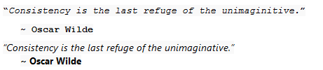
“This is a Quote”
– Standard Uncyclopedia quote, for comparison
I removed the cascade protection from Zim's page. He's probably going to be coming round to my house with a gun shortly... MrN ![]() 21:22, Jan 19
21:22, Jan 19
- Although it is currently cascaded it was originally protected to prevent people from editing a template which is on nearly every article here. Other than that I personally like the way it looks, and I assume other feel the same? But in any case, why change that template? Move your template into main space, let me know what text you want to put on the Q template to let people know they can also use the one - and we all win. ~
 21:24, January 19, 2010 (UTC)
- As set out above (point 1, second bullet), we would then have two different looks for quotes, and several remaining problems on unmodified articles. Would rather have people study what of the above can be incorporated into the stock {{Q}}. For example, if point 4 were incorporated into {{Q}}, I could solve my only serious problem via local style sheet. Spıke ¬ 21:52 19-Jan-10
- Why is that an issue to have to different formatted quotes? We already have that between {{Q}}, {{nicequote}} and {{cquote}} and I'm sure I'm missing others. And to be honest, changing a template which is on 20K+ pages because of a personal CSS issue and because of a personal liking of mdash rather than tilde seems to be a bit excessive to me, unless I'm missing a bigger issue here? ~ 21:59, January 19, 2010 (UTC)
- The world won't end in any case; and em-dash is the smallest of the issues above. It's not a personal CSS issue but an inability to correct it via CSS. Encapsulating {{Q}} quotes in, for example,
<DIV class=UncycQuote>wouldn't change anything for anyone who didn't care to write his own CSS rule. Spıke ¬ 22:09 19-Jan-10- With that I don't have a problem, even though I don't see the added value. If reach an agreement here we'll probably want to run it by Spang to see we don't break the Internet. ~ 22:12, January 19, 2010 (UTC)
- With that I don't have a problem, even though I don't see the added value. If reach an agreement here we'll probably want to run it by Spang to see we don't break the Internet. ~
- The world won't end in any case; and em-dash is the smallest of the issues above. It's not a personal CSS issue but an inability to correct it via CSS. Encapsulating {{Q}} quotes in, for example,
- Why is that an issue to have to different formatted quotes? We already have that between {{Q}}, {{nicequote}} and {{cquote}} and I'm sure I'm missing others. And to be honest, changing a template which is on 20K+ pages because of a personal CSS issue and because of a personal liking of mdash rather than tilde seems to be a bit excessive to me, unless I'm missing a bigger issue here? ~
- As set out above (point 1, second bullet), we would then have two different looks for quotes, and several remaining problems on unmodified articles. Would rather have people study what of the above can be incorporated into the stock {{Q}}. For example, if point 4 were incorporated into {{Q}}, I could solve my only serious problem via local style sheet. Spıke ¬ 21:52 19-Jan-10
This is a new idea. Like all new ideas, I assume they're an attempt to erode our traditional values and destroy the sanctity of marriage. ![]() Against. --EMC [TALK] 21:33 Jan 19 2010
Against. --EMC [TALK] 21:33 Jan 19 2010
Proposal by Zana Dark
 |
Ahoy, ye fellow Pirate!
Share in me booty while I comandeered this ship, and life is still Black and White! |
- My version uses corrrect syntax, coding standards, etc... but I dunno, how does it LOOK? ~Formerly Annoying Crap 07:26, 20 January 2010
- Don't take this as criticism; you asked how it looks. The size of the text is about right. However, I see it in Courier (typewriter) font--because it produces a DIV with in-line style requiring Courier. The quote uses single-quote characters (whereas we've been using the American double-quote style), and not even apostrophe nor accent-acute from ASCII, but a character that stock Courier on WinXP doesn't have. So the quote is rendered with blocks at start and end. It doesn't use
<CODE>, but if the<DIV>declared a class, it would give me a way of correcting the choice of font without junking my operating system. Spıke ¬ 12:22 20-Jan-10
- Don't take this as criticism; you asked how it looks. The size of the text is about right. However, I see it in Courier (typewriter) font--because it produces a DIV with in-line style requiring Courier. The quote uses single-quote characters (whereas we've been using the American double-quote style), and not even apostrophe nor accent-acute from ASCII, but a character that stock Courier on WinXP doesn't have. So the quote is rendered with blocks at start and end. It doesn't use
- Okay, well I replaced the quote marks with html characters... How does that look? I put the style inline because I do not know how to edit the main style sheet (What a noob I am). So, if everyone likes it, maybe an admin can make the modifications, and then you could still override the font with your local style declarations. ~Formerly Annoying Crap 16:45, 20 January 2010
- It's not that you are calling out the character incorrectly; it's that you were calling out a character I don't have. I have gone into your template and changed your
<DIV>to<DIV class=UncycQuote>, which solves the problem here as I have a personal style rule forDIV.UncycQuote. - But you should not call out specific typefaces and point sizes, but instead use <small> etc. until you get the effect you want. If the surrounding text is not the size you think it is, this approach will make the quote look reasonable in its surroundings. Spıke ¬ 16:58 20-Jan-10 post-edited
- Remaining problems discussed on this page: (1) Again, the second line of your template is essentially a new paragraph. I'll go in and apply the change to tighten up the vertical spacing; revert me if you don't like it. (2) The template still has the relatively minor issue of the tilde, which I won't change, as we simply disagree. Spıke ¬ 17:11 20-Jan-10
- It's not that you are calling out the character incorrectly; it's that you were calling out a character I don't have. I have gone into your template and changed your
We continued the discussion on User talk:Zana Dark#Quotation template, again
Q, the New Beginning
Let me combine issues 1 and 4 from the above list, and propose that {{Q}} be edited to change <CODE> to <CODE class=UncycQuote>. This results in no change to anyone unless he modifies his own personal style sheet to define a rule for CODE.UncycQuote, which in my case will declare that it isn't code at all.
Issue 5 (template protection) was fixed by MrN9000.
Issue 2 seems to me to be a simple bug with a simple fix, which would affect display for everyone by tightening up the spacing between the two lines of the quote.
And issue 3 (tilde) is a personal preference, on which I acknowledge the difference of opinion. Spıke ¬ 22:34 19-Jan-10
- So besides that personal coding stuff, you want to remove the "hard return" AKA
<ENTER>and the : used for the indent and instead use<br/>and a couple of &n sp;s. I don't see any problem in doing that. It'll solve the issue of quotes used in an image caption. It should be noted though that the &nsp;s shouldn't be surrounded by code tags, obviously. —Sir Socky

 (talk) (stalk)
 GUN SotM UotM PMotM UotY PotM WotM 23:11, 19 January 2010
- Currently, each line of the quote is coded as a separate
<CODE>region. If the initial tag for the first line became<CODE class=UncycQuote>and the tag for the second line (which starts after the indentation) became something like<CODE class=UncycAttribution>then users could have even more control over the appearance, though they'd have to write two style rules instead of one.
- Currently, each line of the quote is coded as a separate
MadMax on red links
One problem I've noticed recently is that the template will often create red links to non-existant pages, in place of where the "author" would usually appear, even when not using brackets. Over time, this has caused a lot of unwanted pages to be listed on Special:WantedPages (here and here for example). Is there anyway to disable these particular links? Maybe by using {{link}} ? MadMax 23:04, January 19, 2010 (UTC)
- On the red-link issue, {{Q}} calls #ifexist to see if the article exists, so maybe the bug is in #ifexist. Spıke ¬ 23:25 19-Jan-10
Any idea on how to correct this? I assume this is part of wiki software. Could the problem be fixed by a regular user or would Wikia have to look into it? MadMax 06:10, January 28, 2010 (UTC)
- Hmmm. I took a look at Primeval (which was the page listed as linking to "Captain Obvious.") and, while I can see that someone has passed "Captain Obvious." to the Q template, it is not appearing as a redlink. Yet it still shows up in the relevant Special:Whatlinkshere. Server caching perhaps? Normally my guess would be something to do with the fact that #ifexist is an expensive parser function, but the affected pages seem to be far from the limit. (In your browser, view the page's HTML code and search for NewPP to see what I mean.) --Pentium5dot1 (semi-retired) t~^_^~c 23:38, January 28, 2010 (UTC)
Spike with an additional nit
I would appreciate it if the quotation marks were in italic, as the quotation is. I happen to be using a font that doesn't have its own italic rendition, relying on the browser or Windows to fake it, which it does in an ugly way. The right quotation mark is always tight (or overlapping, if the quote ends with an exclamation point, while the left quotation mark is far away. Spıke ¬ 02:46 24-Jan-10
Resolution
The biggest opposition in this Forum is Mordillo's, that he doesn't see what the big deal is; and on her talk page, Zana Dark concedes the issue of the em-dash, provided it is rendered extra-small. (I accept the compromise.) Can we get someone with both skill and privileges to apply some or all of these changes to {{Q}}? Spıke ¬ 02:46 24-Jan-10
“Quotes suck. Stop using them.”
– Modusoperandi on quotes
- No, since you have only 2 users (yourself and Zana) who want to apply changes to a template that exits on most articles on the site. I didn't see overwhelming group of users wishing to apply those changes. Now don't get me wrםng, I don't belittle your or Zana's efforts or opinions, but it seems that this issues only really disturbs you two. My proposed solution - move your own version into main space, I'll be happy to put a link on the Q template to let people know there is another template available, and we'll call it a day. ~ 16:33, January 24, 2010 (UTC)
Usual post-resolution upheaval
Oh hey guys, I totally fixed it. • Spang • ☃ • talk • 07:35, 25 Jan 2010
- Thank you for weighing in. Absolutely,
<BLOCKQUOTE>is the right HTML element for the job. You assign a class to the whole quote and each line of it, for maximum user flexibility. And a left margin on the second line is the right HTML way to specify an indent. - Nitpicks: (1) Is
<P>now redundant? (2) Doesn'tclass=quotelinewant to go on the first SPAN? (3) Do you want to make your class names Uncyclopedia-specific? (4) Specifying a font size of 120% of the em-dash is peculiar, but I don't care, as I can now work around it. (5) The space before the tilde, if it does anything, complicates the left margin you specified. Spıke ¬ 11:43 25-Jan-10 - OK. I admit it. I have not read any of the above. But? Now the quotes are all tabbed in from the left? That's not right, right? MrN
 17:32, Jan 25
- That's technically nothing I specified, that's how your browser thinks quotes should be displayed. I could set it not to do that, but it actually looks better this way, helps separate quotes from their surroundings. If you hate it or it breaks things, let me know. • Spang • ☃ • talk • 17:58, 25 Jan 2010
{{Wilde}} still looks the same. —Sir Socky![]()
![]()
![]() (talk) (stalk)
(talk) (stalk)![]()
![]() GUN SotM UotM PMotM UotY PotM WotM 18:14, 25 January 2010
GUN SotM UotM PMotM UotY PotM WotM 18:14, 25 January 2010
- And please see this. The quote font size is WAY TOO BIG! ~Formerly Annoying Crap 19:56, 25 January 2010
- Made the font smaller and removed the indent (reload your cache), but I think it looks less good without the indent. • Spang • ☃ • talk • 21:26, 25 Jan 2010
- I'm happy (and didn't see any of this recent round of changes, as they are all overridden here). Moreover, all the quotes on the site (except {{Wilde}}?) look the same, and there is now utterly no reason for {{Q1}} (and maybe {{Nicequote}}) to exist--unless someone cares more about the tilde than I do. Spıke ¬ 22:15 25-Jan-10
- Well, the font is maybe still a teeny bit too big, but it looks good overall. Maybe it could use a small indent after all. —Sir Socky (talk) (stalk) GUN SotM UotM PMotM UotY PotM WotM 23:48, 25 January 2010
- Well, the font is maybe still a teeny bit too big, but it looks good overall. Maybe it could use a small indent after all. —Sir Socky
This is from my "Documents and Settings/.../Mozilla/.../chrome/userContent":
@-moz-document domain("uncyclopedia.wikia.com") {
/* For Q: */
BLOCKQUOTE       { margin-left: 0; color: brown; background-color: #FFC }
SPAN.quoteline   { font: italic 12pt Spik2009 !important;
                   background-color: inherit !important }
SPAN.quoteauthor { font: normal 10pt Spik2009 !important;
                   background-color: inherit !important }
/* For Q1: */
DIV.UncycQuote { font: 12pt Spik2009 !important; color: brown !important }
}
Brown on tan, just for fun, for now. Any indent you want. On new and existing pages. Thank you Spang. Spıke ¬ 00:04 26-Jan-10
{{Quote}} still looks the same. —Sir Socky![]()
![]()
![]() (talk) (stalk)
(talk) (stalk)![]()
![]() GUN SotM UotM PMotM UotY PotM WotM 00:45, 26 January 2010
GUN SotM UotM PMotM UotY PotM WotM 00:45, 26 January 2010
Usual post-upheaval dissatisfaction
No offense to the people trying to make these look better, but the Quote modification looks pretty bad - put diplomatically, it creates a load of white space and if there's more than one, take up most of the article. Beyond that it seems to be an argument of personal preference and completely devoid of any consideration for what article writers intended. Any chance the quote could be changed back?--Sycamore (Talk) 09:03, January 26, 2010 (UTC)
- I'm inclined to agree with Syccy on this one. I thought I was just reacting to the "newness" of it and I'd get used to it, but what he says has convinced me the format isn't going to work out. Rabbi Techno
 kvetch
  Contribs
  FOXES 17:37, January 26, 2010 (UTC)
- I am baffled; disabling my local overrides, quotes via {{Q}} look essentially as they did before. Spang said he had turned off the left margin that
BLOCKQUOTEadds by default. Spang has recoded {{Wilde}} now, defining it in terms of the new {{Q}}; but {{Quote}} has not been touched since 2007. It should be possible to refine {{Q}} so that, for users without local style instructions, its appearance is essentially the same as before. Spıke ¬ 18:39 26-Jan-10
- I am baffled; disabling my local overrides, quotes via {{Q}} look essentially as they did before. Spang said he had turned off the left margin that
- Put diplomatically, it creates less whitespace than the old one did, so takes up less of the article now (it didn't make any new quotes!), so I'm not exactly sure what you're talking about? Literally the only thing that has changed is the font and the spacings, which are a bit tighter. So less space taken up. If you could perhaps post screenshots of what you're seeing, or at least vaguely mention why you don't like it, that might help. • Spang • ☃ • talk • 22:46, 26 Jan 2010
- Here's a little comparison between quote styles I made. Comparing them right there, I really don't see why anyone would want the fonts monospaced. • Spang • ☃ • talk • 23:52, 26 Jan 2010
- The font is bigger for one thing, this means if there's two, it's even more intrusive - I have used the Nicequote template for some time as it blends in more, these simply don't, they also seem to align quite hard to the right and look even worse stacked because they are larger; this means the top of many articles looks a lot rougher, this also goes if they are added within text. With an emphasis on keeping quotes a little more subtle doe this really help? You've also skated round the idea that writers might not like these, but are lumped with them at yours and a few other whims for them. You have no real justification, its just you personally don't like them along with a few (notably few actual regular article contributors) think. I don't want to bicker with yourself; I think it would be a waste of my time, as much as you have to spend of it. So I'll leave it at that, and I ask again can the templates be moved back?--Sycamore (Talk) 13:12, January 27, 2010 (UTC)
- There is a slight "indent," caused by the fact that the opening quotation mark is now italic. (I asked for this, because it helps the quotation marks better hug the italic text.) Slanting the text moves the opening quotation mark away from the left margin. This is really trivial. Spıke ¬ 23:56 26-Jan-10
- PS--No, monospaced fonts was caused by the incorrect use of the HTML
<CODE>code, and is unlike anything I've ever seen in books. (Likewise tilde instead of em-dash, but we've already discussed that issue to death.) Spıke ¬ 23:58 26-Jan-10
- The font is bigger for one thing, this means if there's two, it's even more intrusive - I have used the Nicequote template for some time as it blends in more, these simply don't, they also seem to align quite hard to the right and look even worse stacked because they are larger; this means the top of many articles looks a lot rougher, this also goes if they are added within text. With an emphasis on keeping quotes a little more subtle doe this really help? You've also skated round the idea that writers might not like these, but are lumped with them at yours and a few other whims for them. You have no real justification, its just you personally don't like them along with a few (notably few actual regular article contributors) think. I don't want to bicker with yourself; I think it would be a waste of my time, as much as you have to spend of it. So I'll leave it at that, and I ask again can the templates be moved back?--Sycamore (Talk) 13:12, January 27, 2010 (UTC)
- Er, so... I've been following this along for some time (here and in about a dozen user talk pages) and have not commented on it yet, however I don't like the way it looks now-- but for the life of me I can't say why, other than it now just blends in too much to the surrounding page (it looks WAY different in my browser/screen). My request is that someone hard-code both the new and old right below here so I can screen-shot it (like Spang suggested) and show you what I'm talking about (so that I don't sound so crazy). P.S. I'm glad you fixed the formatting errors and such (and I was all for that). ~ Avast Matey!!! Happytimes are here!*
 (talk) (stalk) Π ~
  ~ 27 Jan 2010 ~ 03:32 (UTC)
- Here's a little comparison between quote styles I made. • Spang • ☃ • talk • 04:21, 27 Jan 2010
- Gretzky & Donkey Shane.
- Anyway, this is what I see in Firefox v3.0.17. (& similar in Internet Explorer 6.0.2900.infinity) -->
- Yes I know I'm using an older browser so my argument
?may be moot. But I really do like the look of monospaced MS-DOS-like quotes. It lends faux-credibility to it when, obviously, none exists. (And why is it that when the operating system cannot be found DOS thinks that'Press Ctrl + Alt + Del'will fix it?) - Er, the monospacyness is what sets it apart from the other text on the page. ~ Avast Matey!!! Happytimes are here!* (talk) (stalk) Π ~ ~ 27 Jan 2010 ~ 09:21 (UTC)
- Not the monospacyness but the italics is what sets it apart. The use of typewriter font is just inexplicable to me. What you need is a local override, a file containing
SPAN.quoteline {font-family: Courier}--the last time I used Internet Explorer, the place to type the name of your file was hidden under Accessibility. Spıke ¬ 12:52 27-Jan-10 - The indent also set it apart until it was removed. As for your picture, are you using a laptop by any chance? You should probably turn font smooting or cleartype or whatever on anyway, they look pretty bad. Or choose a better default font. Here's what it looks like on a font that doesn't suck -> ] • Spang • ☃ • talk • 21:58, 27 Jan 2010
- Wow! It's like you're right here in my bedroom (among the film crew) watching me type on my laptop! (I suppose I could turn on the smooth talk, but I like it rough.)
- Anyway, I think I just like the aesthetics of the monospartan text. I know that no matter what browser/computer/monitor combo you gots goings on it will still be offset from the remainder of the text... my two cents anyway, you've seen how it looks on my craptastic laptop/24" monitor combo. (I'll be happy with whatever is here in six months I'm sure.) ~ Avast Matey!!! Happytimes are here!* (talk) (stalk) Π ~ ~ 28 Jan 2010 ~ 05:57 (UTC)
- Not the monospacyness but the italics is what sets it apart. The use of typewriter font is just inexplicable to me. What you need is a local override, a file containing
- Gretzky & Donkey Shane.
- Here's a little comparison between quote styles I made. • Spang • ☃ • talk • 04:21, 27 Jan 2010


Vote?
Can this be resolved with a vote? --![]() RomArtus*Imperator ® (Orate) 13:48, January 27, 2010 (UTC)
RomArtus*Imperator ® (Orate) 13:48, January 27, 2010 (UTC)
- Who knows? it wasn't resolved through discussion, nor intervention by Mordillo in favor of diversity (involving his patient explanation to me to not be so Corporate and expect resolution at all), nor unilateral change, nor the resulting additional discussion. Maybe a vote will do it. But please don't propose a total rollback, but at most a vote on the issues of indentation and font--where any decision can now be overridden by individual users, as I am already doing, thanks to Spang's recoding. Spıke ¬ 14:33 27-Jan-10
- More voting, more hooplehead phony consensus? I hope not. Folks, if you want a different quote on your articles, make a separate template like Jocke Pirat did with his Nicequote, if people want to use it they can and if its as good as you claim most new articles will have it and if that takes place and there's a shift toward using another kind as a universal then that fine and maybe at that point we could start a reasonable discussion and compromise without simply riding roughshod over other peoples work. Whats going on here is arrogant and pretty shitty style - this makes a substantial change on other peoples work, not just for yourselves but all the people that have contributed here, their wishes and intentions should be a consideration. There's already doubts and I simply think this has been forced through and not well thought out amoung the people who came up with this problem and devised its solution.--Sycamore (Talk) 18:44, January 27, 2010 (UTC)
Hey people
How about, instead of going back to monospacyness, we use a different font face for the quotes. Here are a couple examples:
| Font | Example | Italic Example |
|---|---|---|
| Times New Roman | The quick brown fox jumps over the lazy dog. | The quick brown fox jumps over the lazy dog. |
| Roman | The quick brown fox jumps over the lazy dog. | The quick brown fox jumps over the lazy dog. |
| Garamond | The quick brown fox jumps over the lazy dog. | The quick brown fox jumps over the lazy dog. |
| Palatino | The quick brown fox jumps over the lazy dog. | The quick brown fox jumps over the lazy dog. |
| Antiqua | The quick brown fox jumps over the lazy dog. | The quick brown fox jumps over the lazy dog. |
| Minion | The quick brown fox jumps over the lazy dog. | The quick brown fox jumps over the lazy dog. |
| Helvetica | The quick brown fox jumps over the lazy dog. | The quick brown fox jumps over the lazy dog. |
| Swiss | The quick brown fox jumps over the lazy dog. | The quick brown fox jumps over the lazy dog. |
| Impact | The quick brown fox jumps over the lazy dog. | The quick brown fox jumps over the lazy dog. |
| Script | The quick brown fox jumps over the lazy dog. | The quick brown fox jumps over the lazy dog. |
| Decorative | The quick brown fox jumps over the lazy dog. | The quick brown fox jumps over the lazy dog. |
| Blackletter | The quick brown fox jumps over the lazy dog. | The quick brown fox jumps over the lazy dog. |
| Fraktur | The quick brown fox jumps over the lazy dog. | The quick brown fox jumps over the lazy dog. |
| Comic Sans | The quick brown fox jumps over the lazy dog. | The quick brown fox jumps over the lazy dog. |
| Modern | The quick brown fox jumps over the lazy dog. | The quick brown fox jumps over the lazy dog. |
| Courier | The quick brown fox jumps over the lazy dog. | The quick brown fox jumps over the lazy dog. |
| Calibri | The quick brown fox jumps over the lazy dog. | The quick brown fox jumps over the lazy dog. |
| Verdana | The quick brown fox jumps over the lazy dog. | The quick brown fox jumps over the lazy dog. |
| Frosty | The quick brown fox jumps over the lazy dog. | The quick brown fox jumps over the lazy dog. |
| Georgia | The quick brown fox jumps over the lazy dog. | The quick brown fox jumps over the lazy dog. |
| Avqest | The quick brown fox jumps over the lazy dog. | The quick brown fox jumps over the lazy dog. |
| Code (what was previously used in {{Q}}) | The quick brown fox jumps over the lazy dog.
|
The quick brown fox jumps over the lazy dog.
|
How about it? Maybe Comic Sans and Courier will appeal to the monospacers? —Sir Socky![]()
![]()
![]() (talk) (stalk)
(talk) (stalk)![]()
![]() GUN SotM UotM PMotM UotY PotM WotM 21:02, 27 January 2010
GUN SotM UotM PMotM UotY PotM WotM 21:02, 27 January 2010
- Also, you might not have all of these fonts installed. This means they'll default to something else, like, Times New Roman. —Sir Socky (talk) (stalk) GUN SotM UotM PMotM UotY PotM WotM 21:09, 27 January 2010
- You'd be better setting it to generic font families, such a serif, sans-serif, or script, etc. Sans serif is best if it's going to be italic though. • Spang • ☃ • talk • 21:56, 27 Jan 2010
- Oh, and anything is better than comic sans. • Spang • ☃ • talk • 22:00, 27 Jan 2010 (
 agree
agree  )
)
- How about using your default font then (Futura?)? It sure looks better than whatever I'm using (Helvetica?) —Sir Socky (talk) (stalk) GUN SotM UotM PMotM UotY PotM WotM 23:43, 27 January 2010
- My default font is Calibri, which comes which office 2003, outlook something or other and windows 7(?) I think. A lot of people won't have it. But it's kinda similar to Segoe UI, which Vista users will have, which is kinda similar to Arial/Helvetica style fonts. • Spang • ☃ • talk • 05:09, 28 Jan 2010
- How about using your default font then (Futura?)? It sure looks better than whatever I'm using (Helvetica?) —Sir Socky
- CSS style usually does specify fonts generically, as the browser is equipped to select the "best" font present on the user's machine in, for example, the set of serif fonts. But specifying fonts generically might not satisfy the desire to make quotations stand out from the surrounding text (if you don't buy my argument that the use of italics does so). Specifying fonts specifically, when carried to extremes, leads to a jumbled style sometimes known as "ransom-note typography." Spıke ¬ 02:55 28-Jan-10
- Well, as a template I don't think this would be to much of a problem because--- a clever
monkeyperson can do the proper coding to: set in-line a (LONG) series of font choices to cover the acceptable range, starting with generic font-types and then working to specifics. - I personally like a mono / serifed font* like courier and
code- italics be damned. In my opinion we should avoid a script type font and insure that our primary choices do not match the common default fonts in place now (for aesthetic reasons). - Once the template is set no one will have to mess with setting the fonts again (just the horrendous mess that is seeing quotes displayed different-fontly on different systems). ~ Avast Matey!!! Happytimes are here!* (talk) (stalk) Π ~ ~ 28 Jan 2010 ~ 06:27 (UTC)
- Can do, but it's always risky and potentially annoying specifying anything that isn't the user's default font. I'm guessing all italics look just as bad on your browser whether they're in quotes or not? It can't be just quotes. Oh, and Courier is a serif font, not sans-serif. Maybe that's what you meant to type. • Spang • ☃ • talk • 07:41, 28 Jan 2010
- *Ya know I typed that, like, seven times & still messed it up! Yes, serif. (fixed)
- (Some things look better than others on my browser/monitor, but that shouldn't be a deciding factor for this at all.) ~ Avast Matey!!! Happytimes are here!* (talk) (stalk) Π ~ ~ 28 Jan 2010 ~ 07:46 (UTC)
- I was just pointing out that it's not the quote text that looks bad on your monitor, it's all the text. • Spang • ☃ • talk • 08:00, 28 Jan 2010
- And my self-esteem was ignoring that! Sheesh! (It's down, not across, the street right? Where did I put my razor?) ~ Avast Matey!!! Happytimes are here!* (talk) (stalk) Π ~ ~ 28 Jan 2010 ~ 08:05 (UTC)
- And my self-esteem was ignoring that! Sheesh! (It's down, not across, the street right? Where did I put my razor?) ~ Avast Matey!!! Happytimes are here!*
- I was just pointing out that it's not the quote text that looks bad on your monitor, it's all the text. • Spang • ☃ • talk • 08:00, 28 Jan 2010
- Can do, but it's always risky and potentially annoying specifying anything that isn't the user's default font. I'm guessing all italics look just as bad on your browser whether they're in quotes or not? It can't be just quotes. Oh, and Courier is a serif font, not sans-serif. Maybe that's what you meant to type. • Spang • ☃ • talk • 07:41, 28 Jan 2010
- I just read the paper on-line, and it isn't a "horrendous mess" that it didn't look like the print edition, nor that my article on your PC won't reflect my font preferences. (The four hours you will spend getting your second PC to match the settings of the first one, that's horrendous.) Spıke ¬ 14:19 28-Jan-10 orig. unsigned
- Well, as a template I don't think this would be to much of a problem because--- a clever
- Oh, and anything is better than comic sans. • Spang • ☃ • talk • 22:00, 27 Jan 2010 (
- Wingdings! Wingdings! Sir Modusoperandi Boinc! 23:00, January 27, 2010 (UTC)
- HA! ~ Avast Matey!!! Happytimes are here!* (talk) (stalk) Π ~ ~ 28 Jan 2010 ~ 06:06 (UTC)
- HA! ~ Avast Matey!!! Happytimes are here!*
Comment
I don't understand a word you people have said. -OptyC Sucks! ![]() CUN00:18, 28 Jan
CUN00:18, 28 Jan
- It's all Geek to me. --
 RomArtus*Imperator ® (Orate) 10:37, January 28, 2010 (UTC)
- http://instantrimshot.com/ - P.M., WotM, & GUN, Sir Led Balloon
 (Tick Tock) (Contribs) 02:45, Jan 29
- http://instantrimshot.com/ - P.M., WotM, & GUN, Sir Led Balloon
You are all wrong
I have nothing of value to add, except this - I hated the way the quotes looked, but not to the point of changing the look on 25,000 articles. I did create a couple of other templates for quotes when the ones I found weren't making me happy. And I would actually like to go through the 25,000 or so articles and remove all the unfunny quotes - that should leave us with only about 20 or so left by my quick estimation. That was my valueless input. Please continue this extremely nitpicky and somewhat asinine conversation as though I wasn't here. Pup
Hey, I actually have a question about this!
Though, I doubt it has anything to do with whateveritis you're all talking about. Can I stop the Q template from autolinking a name to an article? It wants to link Holden to Holden which, obviously, has nothing at all to do with Holden. -OptyC Sucks! ![]() CUN23:41, 28 Jan
CUN23:41, 28 Jan
- LOL< nevermind. The answer was too simple for my superior intellect to grasp immediately. Or something. -OptyC Sucks!
 CUN23:45, 28 Jan