Forum:Proposed skin change
Now that we have moved, I propose we differentiate our new Uncyclopedia from not only the old, but even from Wikipedia itself. Fact is, while we parody Wikipedia and a similarity is thus necessary, that is no reason to look exactly the same when we have our own styles, and our own identity, that are very distinct from the object of our parody.
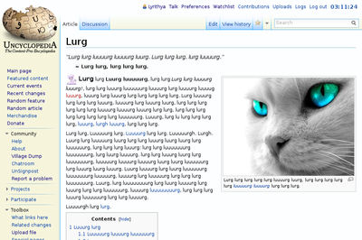
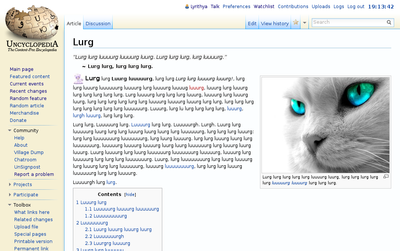
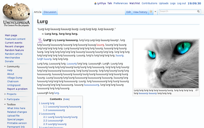
The changes are subtle - this is definitely still Vector, but the colours are more suited to Uncyclopedia - some yellows instead of greys, more vibrant blues, and, since most of us are on modern browsers, shadows. Shadows are nice.
Mockup is over to the right, css is in my vector.css because I'm lazy, and any suggestions/complaints are welcome. -— Lyrithya ༆ 03:23, 13 January 2013 (UTC)
<insert vote here>
- Kinda like the way that looks actually. I'm for it cuz why not. -- 03:24, 13 January 2013 (UTC)
- Yeah, I like it to. Plus I still use monobook. -- The Zombiebaron 03:26, 13 January 2013 (UTC)
- I use monobook but ok. ~Sir Frosty (Talk to me!)
 03:28, 13 January 2013 (UTC)
- I do like the way that looks, but I bet at least one person will shout "we must look like wikipedia! Hurg lurg! Wikipedia!". (Oh, hey, lookit that, I was right.) So... let's just make it available as a skin option and not push it onto anybody. We don't want to look like those fags at That Site Which Shall Go Nameless from Here on Out, at Least As Soon As I Can Purge All Their Links from the New Site. ~ Sun, Jan 13 '13 22:57 (UTC)
- If we're gonna have it as a separate, optional skin, we should make it more distinct. For one, the blue curses with the sandy background, so let's change all the blue to something orange/brownish. 02:47, 14 January 2013
- The blue was chosen precisely to offset the yellow (although that it is showing up as yellow just emphasises what a completely horrible colour yellow is, since this was supposed to be tan and showed up as everything from grey to orange on my monitors). Browns on browns just don't work, though - you wind up with something both dirty and flat, and because of how yellow/orange/brown ain't even a real colour on RGB monitors it looks particularly bad and strange. And varied. -— Lyrithya ༆ 05:57, 14 January 2013 (UTC)
- I remember during the last skin thingy, suggesting that we make our own tweaks to the skin to have our own identity, and all of you telling that that was stupid. Well...I may be stupid...but what does that say about stupidity? --ShabiDOO 07:58, 15 January 2013 (UTC)
- Erm... I like the idea of putting this as one of the possibilities. I wouldn't either like to force others to use this if they dislike it. And, to be honest, I don't the over-yellowness in this. :( It reminds me too much of the old brownyellowish outlook, which I have grew to hate somehow. Instead, it would be interesting if there'd be a large possibility of clors which the user can choose from. For example, I love black and pink (I'm a goth... who likes pink... Is there something wrong with me? :O ), so an Uncyclopedia which is either black or pink! (Or both!!11!!1!111!11!!!2?) But yeah, a new version would be cool, I'd say
 For.. 13:16, 15 January, 2013 (UTC)
- I was working on a black one for a gadget, but unfortunately we'd have to do something about all our templates with inline css and at very least add ids/classes to them and hopefully also move as much of the styling itself as possible into the common.css and whatnot so they can actually be styled to not clash horribly with the skin. -— Lyrithya ༆ 19:23, 15 January 2013 (UTC)
- Uh... we're all stupid. It's the only explanation. -— Lyrithya ༆ 19:20, 15 January 2013 (UTC)
- Okay, I understand. 05:31, 16 January, 2013 (UTC)
- Erm... I like the idea of putting this as one of the possibilities. I wouldn't either like to force others to use this if they dislike it. And, to be honest, I don't the over-yellowness in this. :( It reminds me too much of the old brownyellowish outlook, which I have grew to hate somehow. Instead, it would be interesting if there'd be a large possibility of clors which the user can choose from. For example, I love black and pink (I'm a goth... who likes pink... Is there something wrong with me? :O ), so an Uncyclopedia which is either black or pink! (Or both!!11!!1!111!11!!!2?) But yeah, a new version would be cool, I'd say
- I remember during the last skin thingy, suggesting that we make our own tweaks to the skin to have our own identity, and all of you telling that that was stupid. Well...I may be stupid...but what does that say about stupidity? --ShabiDOO 07:58, 15 January 2013 (UTC)
- The blue was chosen precisely to offset the yellow (although that it is showing up as yellow just emphasises what a completely horrible colour yellow is, since this was supposed to be tan and showed up as everything from grey to orange on my monitors). Browns on browns just don't work, though - you wind up with something both dirty and flat, and because of how yellow/orange/brown ain't even a real colour on RGB monitors it looks particularly bad and strange. And varied. -— Lyrithya ༆ 05:57, 14 January 2013 (UTC)
- If we're gonna have it as a separate, optional skin, we should make it more distinct. For one, the blue curses with the sandy background, so let's change all the blue to something orange/brownish. 02:47, 14 January 2013
- I do like the way that looks, but I bet at least one person will shout "we must look like wikipedia! Hurg lurg! Wikipedia!". (Oh, hey, lookit that, I was right.) So... let's just make it available as a skin option and not push it onto anybody. We don't want to look like those fags at That Site Which Shall Go Nameless from Here on Out, at Least As Soon As I Can Purge All Their Links from the New Site. ~ Sun, Jan 13 '13 22:57 (UTC)
- I use monobook but ok. ~Sir Frosty (Talk to me!)
- Yeah, I like it to. Plus I still use monobook. -- The Zombiebaron 03:26, 13 January 2013 (UTC)
No.
Uncyclopedia is a parody of Wikipedia. The skin shows that. Leave it alone. ![]() 07:24, 13 January 2013 (UTC)
07:24, 13 January 2013 (UTC)
- I agree with Joe. But I really don't know what the proposed skin would look like. Would it change the layouts at all (the pages I put up are usually thought out fairly carefully as to placement of stuff and what nots)? I'm open to a slight change, but why not just keep our wikipedia look and the premise. Aleister 23:50 13-1-'13
- She said it's basically Vector, just with slightly different colors, so I think it wouldn't mess anything up. ~ Sun, Jan 13 '13 23:58 (UTC)
- Yeah, it's definitely Vector (Wikipedia's skin). It looks exactly like the screenshot to the right, resembles and gives an idea of Wikipedia-ness, and layouts are all the same, just with slightly more vibrant colours. On some monitors you may not even notice the difference, and that's fine. -— Lyrithya ༆ 02:11, 14 January 2013 (UTC)
- Im also against. If we wanna "differentiate" the two, lets just give the old Uncyc the Wikia "oasis" theme. --
 Кıяву Тαгк Сойтяıвs 2013-01-14T02:59
- ^^
 Worst idea ever. 03:01, 14 January 2013
- Give old site oasis? omg yes. ~Sir Frosty (Talk to me!)
 03:37, 14 January 2013 (UTC)
- ^For. Also, the yellow is too vibrant. Dunno how a lighter shade might look but I oppose this change as it looks now. --EMC [TALK] 03:40 Jan 14 2013
- Yeah, yellow sucks, especially when trying to make it more subtle hues. Lighter shades tend to disappear entirely on a lot of monitors, hence why it's as dark as it is, and Kamelopedia is even darker... perhaps they hit a magic spot, though. Could try their hue. (Wasn't loading the other day or I probably would have started with that one.) -— Lyrithya ༆ 15:57, 14 January 2013 (UTC)
 For. I assumed he was talking about the Uncyclopedia skin and the Vector skin on this site, though. 04:19, 14 January 2013
- ^For. Also, the yellow is too vibrant. Dunno how a lighter shade might look but I oppose this change as it looks now. --EMC [TALK] 03:40 Jan 14 2013
- Give old site oasis? omg yes. ~Sir Frosty (Talk to me!)
- ^^
- Im also against. If we wanna "differentiate" the two, lets just give the old Uncyc the Wikia "oasis" theme. --
- Yeah, it's definitely Vector (Wikipedia's skin). It looks exactly like the screenshot to the right, resembles and gives an idea of Wikipedia-ness, and layouts are all the same, just with slightly more vibrant colours. On some monitors you may not even notice the difference, and that's fine. -— Lyrithya ༆ 02:11, 14 January 2013 (UTC)
- She said it's basically Vector, just with slightly different colors, so I think it wouldn't mess anything up. ~ Sun, Jan 13 '13 23:58 (UTC)
Good idea, but can we change it by making it look MORE like Wikipedia? Part of the humor is that it should be legitimately easy to confuse the two.--<<![]() >> 12:41, 15 January 2013 (UTC)
>> 12:41, 15 January 2013 (UTC)
- Only things we could do to make what we have now look more like wikipedia would be to change the logo (which would be problematic from a trademark standpoint at very least), remove most of the stuff from the sidebar (much of which would be problematic because we just plain have a lot more different stuff than wikipedia - that's an encyclopedia, we're an encyclopedia as well as anything and everything else folks could think of), or change the content (and lets face it, infoboxes can only be funny in so many ways and just would not work on most articles). As it is, if folks don't notice the difference with the logo, it'd take a decent bit more to make them notice the skin itself. I'm not saying we shouldn't follow the same style and layout, just that looking exactly the same isn't going to change much, especially when most every other current mediawiki install on the web is also going to look exactly the same in terms of skin. -— Lyrithya ༆ 19:20, 15 January 2013 (UTC)
yes.
![]() For. - P.M., WotM, & GUN, Sir Led Balloon
For. - P.M., WotM, & GUN, Sir Led Balloon ![]() (Tick Tock) (Contribs) 03:33, Jan 14
(Tick Tock) (Contribs) 03:33, Jan 14
Okay...
I added an orangier one and a grey one. At this point I think we can all probably maybe agree that this skin kind of sucks and also that this forum got kind of disorganised. Now what? -— Lyrithya ༆ 19:20, 15 January 2013 (UTC)
- '
 Orangier' -- 20:01, 15 January 2013 (UTC)
  Gray. - P.M., WotM, & GUN, Sir Led Balloon
  (Tick Tock) (Contribs) 23:33, Jan 15
- '
 For.'-- 00:48, 16 January 2013 (UTC)
  Abstain. I don't mind a new skin option, but it should be kept optional. Lord Scofield Stark 13:57, 16 January 2013 (UTC)
 OrangierAWESOMEAWESOMEAWESOME — Jan 16 2013 22:32
- I like the way it is now. Where do I say that?--<<
 >> 22:35, 16 January 2013 (UTC)
 - I enjoy voting. -- The Zombiebaron 03:39, 17 January 2013 (UTC)
- I honestly can't tell the difference between the skins and won't know whether or not this is implemented. Hyperbole (talk) 01:19, 22 January 2013 (UTC)
New proposal
Obviously there are a lot of different preferences for what colour people like most, no point arguing about tastes etc. So why don't we keep this regular Vector as the default and create optional Uncyclopedia skins in different colours? Like Orange-Uncyclopedia, Black-Uncyclopedia and maybe Lyrithya-Uncyclopedia for whatever combination of colours Lyrithya likes most. 03:46, 17 January 2013
 Goldenrod colours. 04:00, 17 January 2013
- Gay belgians have the greatest ideas. FOR. --ShabiDOO 05:26, 17 January 2013 (UTC)
 Like Lyrithya said, making up optional skins doesn't require a vote. Lord Scofield Stark 16:36, 17 January 2013 (UTC)
Seriously, for.
The truth is we can't look exactly like Wikipedia. From Wikimedia Foundation's trademark policy:
| “ | ...we ask that your website avoid copying the look and feel of the Wikimedia websites — again, we do not want the visitor to your website to be confused about which company he/she is dealing with. | ” |
Outside of the logo, people have already been confused by our skin thinking that we were Wikipedia, which constitutes trademark infringement. From Wikipedia's article:
| “ | The site uses a layout not unlike that of Wikipedia, which may cause confusion to inexperienced users who misinterpret the content as factual. | ” |
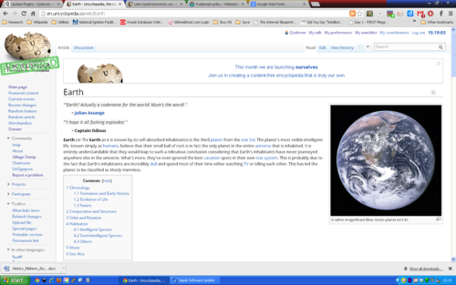
There's a difference between parodying Wikipedia and infringing its trademarks. When you parody a website, it has to be obvious that it's not Wikipedia. So I don't think we can use anything that looks exactly like Vector. I suppose we could do something like change the font or background color.
Cheers,
![]() 15:10, 21 January 2013 (UTC)
15:10, 21 January 2013 (UTC)
- Bro, our front page article right now is about Italian cocks. I'm pretty sure people will be able to tell the difference. - P.M., WotM, & GUN, Sir Led Balloon
 (Tick Tock) (Contribs) 00:38, Jan 22
Open Sans
Open Sans is, in my opinion, a softer and more graceful font than Arial (which we're using now). I already added it to my CSS file. ![]() 15:35, 21 January 2013 (UTC)
15:35, 21 January 2013 (UTC)


