Uncyclopedia:Reefer Desk/Archive1
| This page is an archive. The contents have been moved from another page for reference purposes only, and should be preserved in their current form. Discussion or voting on this page is not current. Any additions you make will probably not be read. |
The Joy of Painting
| |||

The Mona Lisa image is far too pale, you can barely make out what it is, also a little bit of work around Bob's hair, just something to blend it in with the background and not have it stand out so much. I think it could possbily do with a strong gag, like with the Featured Joy of Killing image? -- Sir Mhaille ![]() (talk to me)
(talk to me)
Yeah, you're sorta working at a disadvantage because as Mhaille said, there's already the featured Joy of Killing, which is a pretty action-packed pic to come up against and then you've also got Mona Lisa, another strong and featured pic. Not to say it's a competition, and I guess I am assuming that you're going for a featuring — on it's own, it's not a bad image, perhaps Bob is looking a little grainy, but it has it's own humour in it. I just think it would be tough to get this image featured, no matter how much work is put into it. -- Imrealized 21:45, 6 July 2006 (UTC)
- Bob Ross is far to light and grainy. Oh yah, and maybe sprinkle someother very famous pieces of art into the background. Such as: [1], [2], and [3]. The last one (of the last supper) (no pun intended) you may not want to use though because we already have a featured picture with the last supper in it. --The Zombiebaron 11:34, 13 July 2006 (UTC)
Predator Trial
| |||

Have a look at this. It only really works in the context of the page Alien v. Predator, unless the caption counts.
- I have no qualms with the quality of editing in the image: this is well executed. But yes, I agree this requires some knowledge of Alien vs Predator for people to understand. I laughed at the image even though I've never actually seen the film, but I do have a rough idea of it from what I have heard/seen etc. I think you are also correct about needing the caption to contextualise. Usually for an image to succeed at VFP, people prefer images that function on their own without the caption. Perhaps if the picture was made more blatantly connected to the film in some way, maybe a Terminator style (don't know, I'm guessing as I have never seen the film) robot's point of view with crosshairs and computer text etc. might help contextualise the image better. --Hindleyite | PL | CUN | Converse 19:32, 26 May 2006 (UTC)
- Never seen Predator? What's wrong with you, man?! Run out and rent it now! FreeMorpheme 20:41, 26 May 2006 (UTC)
- I've seen Predator, and those that have seen it will get the joke and laugh like I did, but if people haven't seen the movie then they won't get the joke and vote against.--Witt E, 21:11, 29 May 2006 (UTC)
- Never seen Predator? What's wrong with you, man?! Run out and rent it now! FreeMorpheme 20:41, 26 May 2006 (UTC)
- I do like it, but think theres something lacking. Have made a new version with a little more detail here Image:Predatortrial2.jpg, and I've done another one with the trademark red light beams, but I think it may take playing around with the idea a little more. -- Sir Mhaille
 (talk to me)
- I like the new one more. I got the joke, even without watching predator, and with this one, you get something along the lines of alien mechanoidy thing, hunting humans etc. I will nom soon. --The Rt. Hon. BarryC MUN (Symposium!) Sigh. Double Sigh. 10:34, 4 June 2006 (UTC)
- Well I had another play around with it, made it a bit sharper, added some chrome etc. What do you reckon? FreeMorpheme 22:05, 6 June 2006 (UTC)
- I like the new one more. I got the joke, even without watching predator, and with this one, you get something along the lines of alien mechanoidy thing, hunting humans etc. I will nom soon. --The Rt. Hon. BarryC
- I do like it, but think theres something lacking. Have made a new version with a little more detail here Image:Predatortrial2.jpg, and I've done another one with the trademark red light beams, but I think it may take playing around with the idea a little more. -- Sir Mhaille
I don't know how it looks in the actual movie, but the colors are all wrong if this is supposed to be infra-red or heat-based. --Spin 01:52, 12 June 2006 (UTC)
- Always a factualist about. This is the drawback with the gradient map, put I'm pretty sure that they didn't strive for accuracy in the films either. FreeMorpheme 18:54, 12 June 2006 (UTC)
I got the joke, I think, when I saw Mhaille's version. I got a joke, anyway. I'd change the caption to read "Predator's end of term exam - how many lawyers can you get in one minute?" --Sir Hardwick Fundlebuggy (Bleat) 06:30, 23 June 2006 (UTC)
- Has nobody seen this film? I thought it had attained the level of 'shared cultural reference', like Terminator, or Ghostbusters. I could change the caption, but because the image was for Alien vs Predator, I might as well change the whole picture to something else. Footballers, critics, parking wardens... FreeMorpheme 12:22, 23 June 2006 (UTC)
- I think it works well with the visual imagery of the film, just needs a few extra elements to nail the "cultural reference"..... :) -- Sir Mhaille (talk to me)
- I think it works well with the visual imagery of the film, just needs a few extra elements to nail the "cultural reference"..... :) -- Sir Mhaille
Cardboard Pimped Mini Cooper
| |||

Nothing happening here for a while, so I thought I'd add something. A couple of weeks ago I started making this for my article Disposable Car (which is still in development). I think it probably still requires some work but I would appreciate any feedback regarding what I may have to do with it. I would be grateful if you could perhaps also take a look at the article and make suggestions/changes etc. Cheers. --Hindleyite | PL | GUN | WOTM | Converse 12:09, 19 June 2006 (UTC)
- I do like it, possibly the only thing I would change would be to put some shadow on the right hand side of the car to make it look a little more photorealistic. -- Sir Mhaille (talk to me)
- Nice job. Although I think the wheels and mirrors need to be changed, although I'm not sure what you should use. --The Zombiebaron 15:28, 19 June 2006 (UTC)
- Yeah I noticed that. I tried 'cardboardificating' the wheels but it looked terrible. I need to think of an alternative... Thanks for the advice, fellers. --Hindleyite | PL | GUN | WOTM | Reefer Desk - Use it | Converse 15:36, 19 June 2006 (UTC)
- All it needs, if anything, is a better match of the lighting on the 'cardboard' to the lighting in the scene. This would include darkening the right hand side, reducing the slight gloss look to the board (is it cardboard or balsawood - hard to say), adding a cardboard 'back' that can be seen through the windscreen, deepening the shadows and insert sections around the headlights and bumper. Tyres might be made to look a little more 'plastic' - I think cardboard tyres would be too much. To add to the joke, you might put some kind of 'go faster' stipes and decals on the car.
- OR... If you really want to go for it - cut the car out of its surroundings and put it in some kind of 'big display' environment, with spotlights and flash bulbs etc... --Sir Hardwick Fundlebuggy (Bleat) 06:22, 23 June 2006 (UTC)
- Great, great, great image. If you were looking for something to do with the mirrors, perhaps making them look wrapped in duct tape (not sure if it would be worth the trouble, but it could be a nice touch). I'm not sure what could be done with the tires — I was thinking about some kind of buggy or carriage wheels or something silly like manhole covers, but I think changing them would detract and not add to the pic. Excellent work. -- Imrealized 21:58, 6 July 2006 (UTC)
The Ice Cream
| |||

I don't think the details, particularly the ice cream look dissimilar to the style of the original painting. If anything its only the speech bubble that doesn't work for me, and its difficult to say why. I almost thing the text might be better removed from the image and used in the tagline for it. "Eduard Munch had fond memories of his childhood, particularly eating ice cream on the pier"....I know that moves away from dealing with the image, but thats what I think anyway. :) -- Sir Mhaille ![]() (talk to me)
(talk to me)
Cheers Mhaille - and yeah, that's what I thought too. I put a bit of opacity on the bubble because pure white was too overwhelming - maybe I should think of how Munch would do a speach bubble - black with red writing or something. I'll let it ferment for a bit - see what happens. --Sir Hardwick Fundlebuggy (Bleat) 06:24, 23 June 2006 (UTC)
- Yeah, this has potential. I agree with Mhaille on the speech bubble thing: personally I think they are really hard to pull off successfully, so I would consider removing it. Other than that, you might want to darken the colour tones ice cream: try adding some of the red and blue tones from elsewhere in the painting so it doesn't stand out as much.
It's a good idea, don't know how well it would do on VFP, though, having seen what happened last time - they can be a bunch of vultures over there. Sometimes I feel you have to let an idea 'stew' for a while, you know, keep going back to it to make it better each time. --Hindleyite | PL | GUN | WOTM | Reefer Desk - Use it | Converse 10:14, 23 June 2006 (UTC)
- How's this - I'm using a munchbubble. --Sir Hardwick Fundlebuggy (Bleat) 17:11, 23 June 2006 (UTC)
- Munch better.... -- Sir Mhaille (talk to me)
- Munch better.... -- Sir Mhaille
- Yeah, but it still bugs me, so I dropped the bubble and focused in on the cream. --Sir Hardwick Fundlebuggy (Bleat) 08:18, 27 June 2006 (UTC)
- The cone and the ice cream have too much "pop". They need to follow a similar palette to the rest of the painting.
- The details of the ice cream should have more blur (like the water by the ships out in the harbour) and edges of both cone/cream should blend into the surrounding area, with no straight lines (as none original paintings lines are particularly "lineish").
- Lastly, it doesn't look like he's holding the cone. Remember when you were little and that cone was a crucible of strawberry nirvana? Remember how you held onto that cone like your life depended on it? Like that.
- Did I help? I used to be a competent drawer of things imagined, but this "computer" in front of me with its "graphix" has me stumbling into a new, picturey world. So while I can try to dig out your emotional artist (sorry, the few art teacher that I had were all hippies) I can't actually tell you what "button" on the "keyboard" to push: I'm still figuring that out myself ("Layers! Save File! Joy.").
- In closing I'll say to you what a grade 10 substitute art teacher said to me. "Give it up, you're no good." I'm not serious, of course, and who the "f" listens to what a highschool substitute teacher says anyway. Prick. (okay, I have issues. I'm sure you do to. Mine are just silly, that's all) Modusoperandi 09:48, 13 July 2006 (UTC)
Lake Titicaca
| |||

 |
- I definitely laughed at this one; simple, funny and it's got breasts. Now for the nitpicking — my eye could be off on this one but it looks as though the perspective on the bottom of CACA, or maybe the whole bottom, is just a touch off. Just a touch. Not enough that I'd vote against it, or even suggest you bother fixing it necessarily, just offering what little criticism was available to me on this one. -- Imrealized 21:51, 6 July 2006 (UTC)
- Yeah, the perspective is a bit off, otherwise nice one. FreeMorpheme 20:06, 7 July 2006 (UTC)
- Puerility is inherently funny. I liked it, but it would be more consistently puerile if it had the image of a turd instead - David Gerard 20:35, 7 July 2006 (UTC)
- For "caca"? I'm not sure if the expression is in common usage outside of the UK? I wouldn't want to risk being too UK Centric. :) -- Sir Mhaille (talk to me)
- Hey, perspective perfected. And in case you did want to make the change, I think "caca" is everywhere. Isn't it like, onomatopoopy or something? There certainly is an abundance of it stateside. -- Imrealized 23:25, 7 July 2006 (UTC)
- I speak Canadian, and yes "caca" is understood quite clearly in both official languages here as poo. --Carlb 01:50, 10 July 2006 (UTC)
- I second that motion. --The Zombiebaron 11:30, 13 July 2006 (UTC)
- I think I'll stick with the cars, I just feel ALL of the focus for the gag should be on the Boobies. -- Sir Mhaille (talk to me)
- I think I'll stick with the cars, I just feel ALL of the focus for the gag should be on the Boobies. -- Sir Mhaille
- I second that motion. --The Zombiebaron 11:30, 13 July 2006 (UTC)
- I think this idea is great. I dunno about the proportion though - I think the cars look a bit out. Sometimes it takes a few goes to get the perspective to look right. Also, it may be a good idea to sharpen the text 'Titicaca' - it looks a bit blurred. --Hindleyite | PL | GUN | WOTM | Image Review - Use it | Converse 11:05, 10 July 2006 (UTC)
- The text isn't blurred, I've tried to get a similar effect to the text that appears at the top of the sign, I've got a crystal clear version, but it looks too clean. Will try to get the cars sorted, tis a pain in the arse when its only a few pixels to play around with. :) Thanks for the feedback everyone. -- Sir Mhaille (talk to me)
- My mistake. The text appears blurred but in fact it's just the sign's wear, I think. But get that perspective sorted and this will be great. Sign manipulations can be simple but effective. --Hindleyite | PL | GUN | WOTM | Image Review - Use it | Converse 11:28, 10 July 2006 (UTC)
- The text isn't blurred, I've tried to get a similar effect to the text that appears at the top of the sign, I've got a crystal clear version, but it looks too clean. Will try to get the cars sorted, tis a pain in the arse when its only a few pixels to play around with. :) Thanks for the feedback everyone. -- Sir Mhaille
- OK, so you're gonna stick with the cars and not make the switch to poo (I think having the breasts as the centerpiece is the right call), so is this thing done? Looks it to me. Are we going VFP here? There's gonna be naysayers with the whole, "But we already featured a sign." They can deal with it. It's funny. The other sign has no breasts. This one does. So it's different. And better. And ready? -- Imrealized 01:45, 17 July 2006 (UTC)
- I'd vote "Fer" it. It's worth it simply on the basis that you managed to do "caca" without resorting to shit. I'd give you a cookie, but I've only got one left, and it's mine! Modusoperandi 07:00, 17 July 2006 (UTC)
Dali's 'Stache
| |||

|
I'm not nominating this for VFP or anything like that, but am wondering if: a) Anyone else finds this funny. and b) If so, how I could improve it (I know my Coreling is not the cleanest and is far from expertly crafted). Plus, if I'm gonna critique/advise/be a gasbag, I better participate on this side of things also. Comments, advice, fingerpointing mixed with profuse laughter? -- Imrealized 13:07, 12 July 2006 (UTC)
- Love it, very clever image, could almost be real. The only thing I might have done maybe I would have added a faint drop shadow to the section on the left (his right) to make it look as though it was casting a slight shadow onto his face. But thats probably a bit extreme, as it is its a great image. -- Sir Mhaille (talk to me)
- Yes, it's edited well enough so you can't see any joins. I like its relative subtletly - the caption makes the image. I fear it may be a little too surreal, for some, though. I like it. --Hindleyite | PL | GUN | WOTM | Image Review - Use it | Converse 13:34, 12 July 2006 (UTC)
- Wow, you guys work fast. I'm glad you both enjoyed it; the Dali page needed a picture of freaky-deaky himself and this was what I came up with. The drop shadow thing — I sorta tried to manipulate the moustache shadow that was already there (you probably shouldn't bother looking for it 'cause the work I did on it is pretty much unnoticable), but like I said I'm still getting my bearings with all this computer-oriented art stuff. I appreciate the feedback and if anyone else cares to put in their buck-and-a-quarter (due to inflation your two cents are worthless, sorry) I welcome any comments. Thanks again, Reefer Desk. -- Imrealized 15:37, 12 July 2006 (UTC)
- I think this might be good enough to go on to Graduation. I think we should give it a go in VFP and see how it fairs. -- Sir Mhaille (talk to me)
- Well, you seem to be the guy who knows about images (and articles, and everything else you touch around here, how do you do that?), so I am honoured by this VFP proposal of yours. Let the surrealism begin. Oh, and thank you. -- Imrealized 03:35, 13 July 2006 (UTC)
- I is a simple man. I know what I likes, and I likes what I know. Besides, its doing well on VFP already. :) -- Sir Mhaille (talk to me)
- I is a simple man. I know what I likes, and I likes what I know. Besides, its doing well on VFP already. :) -- Sir Mhaille
- Well, you seem to be the guy who knows about images (and articles, and everything else you touch around here, how do you do that?), so I am honoured by this VFP proposal of yours. Let the surrealism begin. Oh, and thank you. -- Imrealized 03:35, 13 July 2006 (UTC)
- I think this might be good enough to go on to Graduation. I think we should give it a go in VFP and see how it fairs. -- Sir Mhaille
Thermopylae
| Featured picture candidate |
|---|
 Top Selling Board Game of the 5th Century BCE Image credit: Mhaille |
|
- Got an article planned to go with this. Doesn't look too bad as a thumb, and hopefully the extra details on the full sized version add to the joke. Would love to hear what everybody thinks.... -- Sir Mhaille (talk to me)
- This would be an excellent addition to the article you plan to create. Both as a thumb and full size I think it looks good: I particularly like the 'streets' in the red and yellow zones. Another good piece of image editing here, Mhaille. --Hindleyite | PL | GUN | WOTM | Converse 17:26, 4 June 2006 (UTC)
Colecovision Al-Qaeda
| Featured picture candidate |
|---|
 The real reason Coleco went under Image credit: Hrodulf |
- This is probably the best of the phony colecovision cartridge pictures I edited. I even made a keypad overlay this time. --Hrodulf 21:32, 1 June 2006 (UTC)
- I think the idea of editing cartridges to have fake video games is a good one, but unfortunately its downfall is that the text is too small. Also, it's a little bit exclusive with regards to humour: people under the age of about 35 will be more familiar with Super Mario for the NES or Tomb Raider for Playstation or something. The keypad overlay made me laugh, but again, unfortunately, it might be a little bit too subtle for people to get the joke.
Whilst the quality of editing on this one is much better, to be honest with you, I preferred the Pac Man one actually. This is just a personal opinion, however. Right, negative comments out of the way, I think this is a good idea quite well executed, but I'm unsure whether people will like it. Keep working at this. --Hindleyite | PL | GUN | WOTM | Converse 09:31, 2 June 2006 (UTC)
Cropped Version
| Featured picture candidate |
|---|
 The real reason Coleco went under Image credit: Hrodulf |
- OK, so maybe I was a bit harsh on you there. Upon closer inspection, this is actually a much better edit than I originally thought - it is well done. I've cropped the original and turned up the contrast to place a bit more emphasis on the text to try and demonstrate to you what I meant in my original comment. The second image actually works fine with the main cartridge box. In short, yes, a good idea and with some touching up and compositional changes (removing the white space) it can potentially be quite strong. The only problem is that I'm not sure how people will take Al-Qaeda related content. --Hindleyite | PL | GUN | WOTM | Converse 09:58, 2 June 2006 (UTC)
- Never know until you try, I suppose. There's plenty of Bin Laden jokes on uncyclopedia already (my favorite was Ich Bin Laden (sadly, huffed), personally. Probably not good enough for VFP, since nobody would find it funny unless they had/have a colecovision, but at least the editing is improved, so I know it's possible to do a cleaner job. --Hrodulf 10:08, 2 June 2006 (UTC)
McJesus
| Featured picture candidate |
|---|
 And on the third day the burgers and fries were reheated and served again... Image credit: Mhaille |
|
Thoughts gentlemen (and gentlemen pretending to be ladies on the internet) -- Sir Mhaille ![]() (talk to me)
(talk to me)
- Some people, like you have mentioned before, might be tired of the Jesus jokes. However this is well done and made me laugh: it is a good Photoshop. Is there any way to make Jesus look a bit more 3D, however? This is just a minor problem, but is more apparent when the image is blown up to full size. --Hindleyite | PL | CUN | Converse 12:48, 31 May 2006 (UTC)
- Better than anything I could come up with at the moment. And don't say people are sick of the Jesus jokes, I'm in the middle of writing "list of things Jesus has been nailed to!" People havn't gotten sick of Jesus yet after 2000+ years, so I don't see how we could be sick of Jesus jokes after just a measly few years . . . --Hrodulf 14:37, 31 May 2006 (UTC)
- Comment - Thanks for the feedback, much appreciated. Take you point about 3D, but I deliberately avoided that as my initial toying with Jeebus didn't lend itself to that. I did do a version without the corporate colours, which I don't think worked as well Image:McJeebus2.jpg but overall I'm quite pleased with it. Thanks again for the comments.... -- Sir Mhaille (talk to me)
Really, Really Shitty Pac-Man
| Featured picture candidate |
|---|
 Truth in labeling Image credit: Hrodulf |
How about this one? Better gag? --Hrodulf 16:06, 27 May 2006 (UTC)
- Yeah, I could see how this could work, actually. A good attempt at rendering the text, but it doesn't really blend in well. If the text is supposed to be 'really really shitty', then it's not quite 'shitty' enough. It is actually quite hard to purposely make text look poorly rendered when you actually mean it to. If not then I think it would help a lot if you could find the font, or one close to, the one used on the original image. A quick scan of the Internet reveals a Pacman-style font here, and a similar image source character map here. These aren't the same as in the image, but they may still help keep the Pacman atmosphere. Try this font (Pump Demi).
There's a bit of a problem with the readability of the smaller text - you have to squint to see it. I would consider making this larger. I also think there needs to be more reference to the game's 'shittiness' in the illustration part of the image. Try making it more crude or cheesy in some way.
Another idea which might help would be to approach this as if though it had actually been vandalised by someone with a marker pen or with scratched in bits of text etc. with a knife or biro or something. Don't know about this, though. It might be quite hard to pull off.--Hindleyite | PL | CUN | Converse 16:56, 27 May 2006 (UTC)
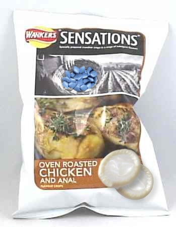
Wankers Sensations
| Featured picture candidate |
|---|
 Government advice to teenagers without access to condoms is to use clingfilm or a crisp packet instead. In response, Walkers crisps has announced plans to produce a special edition of their Sensations range with integrated spermicide. Image credit: sannse |
- I like it. On repeated lookings it provides more, like the basket and the logo. It's a bit blurry, though. FreeMorpheme 17:36, 26 May 2006 (UTC)
- I like the concept for this: there's a lot of potential here. The condoms and the 'Wankers' logo have been executed well. What I would say is that the viagra needs to be improved a bit: it might be the fact it is too blue that makes it stand out too much.
Personally I quite like the fact that the other parts you have edited don't stand out immediately. However if you plan to place this on VFP there may be problems with this and the image size. Therefore it may be worth considering sourcing another image and rethinking the composition: the packet is perhaps a bit too big. Otherwise a pretty good job. Just a bit of fine tuning here and there and this will be good. --Hindleyite | PL | CUN | Converse 17:48, 26 May 2006 (UTC)- Image size? you mean I should use a larger image to start with? -- sannse (talk) 17:55, 26 May 2006 (UTC)
- I was suggesting it may be a little large for VFP, taking into account how distinguishable the edited bits are. On second look, however, it may not work the same if it were smaller. I agree with FreeMorpheme in that it's a bit of a grower. This was just a small criticism: but I'm only looking at it through the eyes of a typical VFP
votervulture. --Hindleyite | PL | CUN | Converse 18:03, 26 May 2006 (UTC)
- I was suggesting it may be a little large for VFP, taking into account how distinguishable the edited bits are. On second look, however, it may not work the same if it were smaller. I agree with FreeMorpheme in that it's a bit of a grower. This was just a small criticism: but I'm only looking at it through the eyes of a typical VFP
- Image size? you mean I should use a larger image to start with? -- sannse (talk) 17:55, 26 May 2006 (UTC)
- 1) It's too blury, 2) Some of the writing/image are too small. ~ 18:00, 26 May 2006 (UTC)
- You might want to find a better source image. Do and image search and select "show large images" that might help with the quality. --
 Kaizer the Bjorn takkun
  (nya nya) (1961 model!) Check out T61! 18:09, 26 May 2006 (UTC)
Note: all the above refers to version 1
OK, wonderful feedback folks. So, what I did different this time. The source photo is of a smaller pack, but a clearer image (good images of this brand are not that common). The viagra is less blue, and noised a bit to merge better. I tried taking the colour out completely, but it was hard to see on this scale that it was viagra without the colour. Would it be better to have a basket of black and white dildos instead? I've tried to improve the writing, although I'd like opinions on the N in Walkers, I'm not sure it's good enough. I had to merge two images to get a clear logo on a clear packet, is that too obvious? And of course, anthing else to improve it? -- sannse (talk) 20:01, 26 May 2006 (UTC)
- Yes, the new sourced image works, I think. Certainly adjusting the colour and such has made the viagra blend in better, and the text bit is certainly an improvement. However, as you mention, the Wankers logo works well but there's something not quite right about it. I think it's the light on the crease of the packet that makes it look a bit wonky - dunno. Try sharpening it a bit. Otherwise, great. If you have time, try the dildos idea and compare it to this original version to see which looks best. Good work. --Hindleyite | PL | CUN | Converse 20:08, 26 May 2006 (UTC)
- Hmm... I say for the new version you should VFP it. I'll vote against, as always, but... it could (and probably is) good enough now to VFP. ~ 05:54, 27 May 2006 (UTC)
above refers to version 2
Well, I've done what I can to improve the logo - I'm not 100% happy with it, but I don't know how to improve it further, so I'll leave it at that. Thanks for the feedback all, it was very helpful. Do I just take this off this page now? or copy the comments to the image talk page or something? -- sannse (talk) 11:46, 28 May 2006 (UTC)
- Don't worry about moving anything, I'm going to archive closed discussions. --Hindleyite | PL | CUN | Converse 11:50, 28 May 2006 (UTC)
Hal Console
| Featured picture candidate |
|---|
 Uncyclopedia's true form! Image credit: Spang |
I know it sucks. I had the idea, Spang executed it into code (I gave Spang the image credit since I couldn't put both our names into the form). I took a picture of the screen, since Spang created the image via wiki coding so it could have embedded links and look cleaner. See UnNews:Ask_Hal_9000. This was based on the original image Image:HALCON2.JPG which obviously had shortcominges, and I don't know how to fix it, or Spang's version, because microharf paint keeps messing me up. Can you give me information about what software/techniques I should use to fix images like this up so they don't suck? I uploaded this here to learn and also to support your review service.
--Hrodulf 18:25, 26 May 2006 (UTC)
- This is certainly looking much better than the previous versions. It just needs a little bit more time spent on those buttons to make the text look a bit more computer-ish. If you want the old-school computer look, it might be worth considering adding a bit more metal and silver colours as well. Perhaps some more shiny buttons and a paper output thingy would also help in achieving this. --Hindleyite | PL | CUN | Converse 18:38, 26 May 2006 (UTC)
- I tried to get close to the HAL fonts from the movie in Image:HALCON2.JPG but it still didn't work. I was wondering specifically if you could recommend any particular software I should try using. Microsoft (want to type microharf again, but sick of the joke, you get the point) Paint messes up everything I do and changes the pixels when I save stuff. It's very annoying, like most of microsoft's products are. The whole company has a "we know what you want better than you do" attitude, and it shows in their lousy products.
- --Hrodulf 19:03, 26 May 2006 (UTC)
- I tried to get close to the HAL fonts from the movie in Image:HALCON2.JPG but it still didn't work. I was wondering specifically if you could recommend any particular software I should try using. Microsoft (want to type microharf again, but sick of the joke, you get the point) Paint messes up everything I do and changes the pixels when I save stuff. It's very annoying, like most of microsoft's products are. The whole company has a "we know what you want better than you do" attitude, and it shows in their lousy products.
- Well, unfortunately I don't know a lot about the relative strengths and weaknesses of different the image editing packages there are available out there. You could try Adobe Photoshop, which seems to be an industry standard at the moment. There is a 30-day trial available at here, simply select whether you require the Windows or Mac version from the box in the top right corner. Next, if you don't already have one, you will need to sign up for an Adobe account. I use this program and have found it to be very useful and easy to get the hang of.
Apart from this, he best I can do is point you in the direction of Google search for image editing software. I've heard GIMP is quite good, though. Hope this helps. --Hindleyite | PL | CUN | Converse 19:18, 26 May 2006 (UTC)
- Well, unfortunately I don't know a lot about the relative strengths and weaknesses of different the image editing packages there are available out there. You could try Adobe Photoshop, which seems to be an industry standard at the moment. There is a 30-day trial available at here, simply select whether you require the Windows or Mac version from the box in the top right corner. Next, if you don't already have one, you will need to sign up for an Adobe account. I use this program and have found it to be very useful and easy to get the hang of.
- Thanks.
--Hrodulf 19:23, 26 May 2006 (UTC)
- Thanks.
I like it. --User:Nintendorulez 22:05, 26 May 2006 (UTC)
- Thanks, I'm not planning to put it into VFP, I just wanted to get some advice on image editing. My other image was shot down pretty fast on VFP, so I need to learn a bit . . . Come to think of it, this is a really good opportunity for me to find out what went so wrong with that.
- I think Photoshop is the ideal program to use for image editing. I've heard GIMP is pretty good too, I've just never used it. MS paint is ok for simple editing, but its methods of saving anything other than BMPs are awful. Irfanview is free and is much better for saving stuff, so if you use Paint, you should save stuff in BMP format, then use IrfanView to convert it. That'll give a lot higher quality and should fix Paint messing up the colours. • Spang • ☃ • talk • 23:05, 28 May 2006 (UTC)
Shallow Hal
| Featured picture candidate |
|---|
 Everybody hated this on VFD. A lot. Can you help me understand why, perhaps, so I can get better? Image credit: Hrodulf |
- It's... well, is there a joke I'm not seeing? Is it just because HAL is on a poster for 'Shallow Hal'? FreeMorpheme 23:01, 26 May 2006 (UTC)
Yes. It's a joke because he's Hal, and the movie's not about him, but has "hal" in the title. --Hrodulf 23:06, 26 May 2006 (UTC)
- Hmmm. Well, if I were you, I'd replace the words 'Jack Black' with 'HAL 9000', then put the round glowy bit of HAL over Jack's face, staring out at the viewer. You need a nice crisp image to start with, and spend some real time on the details, then you have to think of a decent tag-line for this new film that you have to write in above the title. Something funny. Even then it might not be VFP material, but it's a start. FreeMorpheme 23:30, 26 May 2006 (UTC)
- Thanks. I was planning to do something like that to a picture of Halle Berry (spelling) and call her HAL-e Berry--Hrodulf 23:44, 26 May 2006 (UTC)
- I don't think people liked this at VFP because they prefer more obviously outrageous stuff, or something less in-jokey. I think something like this would be a nice addition to the Ask Hal 'environment', with a bit of improvement, though. How's about making Jack Black more mecha as FreeMorpheme suggests, perhaps substituting him completely with the Hal console, and making Gwyneth some sort of computer cyborg? Then, you could make some of the text more old computer style. That might work better. --Hindleyite | PL | CUN | Converse 12:32, 27 May 2006 (UTC)
- I see. I just didn't go far enough with the joke. I'll keep that in mind. Rather than fix this one up I'd rather do a better idea, since this was really just a pun (lowest form of humor). --Hrodulf 14:21, 27 May 2006 (UTC)
The Fifth Horseman
| |||

|
- Okay, last one. With Darth Vader vs. Lollipop Guild and now this, I'm deeply weirding myself out. Modusoperandi 04:21, 27 July 2006 (UTC)
- Deeply weirded out or not, I love this image. My only trifling comment would be that perhaps a bit of shadowing under the Feline of Death would be nice, but that is certainly nitpicky. Damn, you've really been making some leaps and bounds with photo manipulation, huh? Good stuff. -- Imrealized ...hmm? 04:52, 27 July 2006 (UTC)
- Done. When you're dealing with nine layers, one always ends up where it's not supposed to be (in this case behind the pony rather than in front of it). I reddened up the background sky and fixed Kitty's foot too. I'm just trying to make things that don't get slaughtered on VFP. I mean, sure -1 with comments like "'Against the love of God" is nice and all, but something that stays in the pluses would be nicer. It's put me off of self-nomming (what I like, and what a simple majority like, appear to be different). Even MSPaint: Online isn't doing well, although 0 is better than I'd expected (apparently half of voters have never been aggravated by the crap app MSPaint). But I digress...
- Also I put this in the "comments" for the pic, but I'm saying it again anyways, "Thanks DiZ for reminding me of the undying evil that is Hello Kitty". DiZ wanted Kitty commanding eighteen legions of hell, but I have a hard enough time with nine layers, much less however many you'd need for eighteen legions. Of hell, no less. Modusoperandi 05:29, 27 July 2006 (UTC)
- Well, you didn't have to show all eighteen legions; two would've been enough. And you're welcome, for I feel that in this confusing and sometimes scary world, we lose sight of the true evils: Hello Kitty, Oprah, and sugar-free orange sherbet. --Señor DiZtheGreat
 CUN AOTM ( Worship me!) (Praise me!) (Join me!) AMEN! 21:05, 27 July 2006 (UTC)
- On the field of combat Hello Kitty stands alone. Alone with a pony. Who also stands alone. Modusoperandi 21:25, 27 July 2006 (UTC)
- Three words: Seven-headed beast (two if you count seven-headed as one). Spewing evil blasphemies at the sky, ten horns, the whore of Babylon, fallen angels, all of it! Put it in the corner or something, don't care, I wanna see it. I'll give you another martyr if you do.....or a gift basket, your choice. --Señor DiZtheGreat CUN AOTM ( Worship me!) (Praise me!) (Join me!) AMEN! 22:22, 27 July 2006 (UTC)
- Yeh, I'll get right on that...<cough>. In the meantime, stare into the hellfire eyes of the Hellokalypse! Adorable! Modusoperandi 22:28, 27 July 2006 (UTC)
- Three words: Seven-headed beast (two if you count seven-headed as one). Spewing evil blasphemies at the sky, ten horns, the whore of Babylon, fallen angels, all of it! Put it in the corner or something, don't care, I wanna see it. I'll give you another martyr if you do.....or a gift basket, your choice. --Señor DiZtheGreat
- On the field of combat Hello Kitty stands alone. Alone with a pony. Who also stands alone. Modusoperandi 21:25, 27 July 2006 (UTC)
- Well, you didn't have to show all eighteen legions; two would've been enough. And you're welcome, for I feel that in this confusing and sometimes scary world, we lose sight of the true evils: Hello Kitty, Oprah, and sugar-free orange sherbet. --Señor DiZtheGreat
And I looked, and behold a pale horse: and his name that sat on him was Death, and Hello Kitty followed with him. Rad 03:58, 28 July 2006 (UTC)
- Revelations is a trip, man. Now I'm scared of ponies. Modusoperandi 04:53, 28 July 2006 (UTC)
Great images. That caption is gold. Although, I'd like it if the thing Hello Kitty is holding had 100% opacity. Remember, who's afwaid of a wittle VFP? --![]() SonicChao Babbel!Contribs 19:11, 29 July 2006 (UTC)
SonicChao Babbel!Contribs 19:11, 29 July 2006 (UTC)
- Good catch. I'd stretched/squished/rotated that scythe enough that it went all blurry (edges too). It's fixed and I added some shading to it. Modusoperandi 19:32, 29 July 2006 (UTC)
- Okay, last tweak. The scythe is about as clear as its going to get. Modusoperandi 20:24, 3 August 2006 (UTC)
- VFP it alredy!---Asteroid B612
 (aka Rataube) - Ñ 01:52, 17 August 2006 (UTC)
- Sorry, we (and by "We" I mean all of Uncyclopedia) were distracted and consumed by our Poo Lit entries. Sir Modusoperandi Boinc! 02:41, 17 August 2006 (UTC)
Many thanks for the help. Another student of Reefer U. graduates, methinks.--Sir Modusoperandi Boinc! 20:48, 20 August 2006 (UTC)
GI Jew The Movie
| |||

|
- Okay, after the miserable failure of my first GI-Jew attempt, I learned a few things about what people want....I think. Have a look-see at this little guy and let me know what I can do to optimize the funny. Strong Rad 19:31, 26 July 2006 (UTC)
- Background image is a lot better than the last version. The only thing I don't like is the text at the bottom, particularly the red text, on a smaller version of the image its difficult to make out what it says. -- Sir Mhaille (talk to me)
- Yeah, that text sucks. Should I re-do it, or skip it all together? It's there as a play on the recent GI Joe movie, "Valor Versus Venom". Rad 00:19, 27 July 2006 (UTC)
- Have "Hebrews vs Hezbollocks" in a hebrew font across the bottom? For people who can't read it it would look effective, and those that can will be pleased with the hidden easter egg. :) -- Sir Mhaille (talk to me)
- To the dreidel's red glare, the Menorah in air, this is excellent. Good suggestion on the Hebrew font, that looks great as well. I don't think there is anything else to be done with this except take it to VFP. -- Imrealized ...hmm? 04:56, 27 July 2006 (UTC)
- Have "Hebrews vs Hezbollocks" in a hebrew font across the bottom? For people who can't read it it would look effective, and those that can will be pleased with the hidden easter egg. :) -- Sir Mhaille
- Yeah, that text sucks. Should I re-do it, or skip it all together? It's there as a play on the recent GI Joe movie, "Valor Versus Venom". Rad 00:19, 27 July 2006 (UTC)
- I think this has a bit more 'oomph' than the aeroplane one. Above all, I think it's just plain funny. --Hindleyite | PL | GUN | WOTM | Image Review - Use it | Converse 09:59, 27 July 2006 (UTC)
- I thought all it was missing was a little chutzpa! I'm not going to self-nominate this one, though...I think it works better coming from someone else. Rad 12:17, 27 July 2006 (UTC)
"Torah! Torah! Torah!". Or is "Tora! Tora! Tora!" too obscure of a movie to reference? Modusoperandi 18:29, 27 July 2006 (UTC)
- I changed the caption...I think this version is funnier (2006 being the current conflict, and 1967 being the year of the Six Days War.) Whattayathink? Rad 03:38, 28 July 2006 (UTC)
- I'm just glad to help. I'd vote for, but I'm a sucker for puns repeated thrice. Oddly it doesn't come up that often... Modusoperandi 04:43, 28 July 2006 (UTC)
- Dude, the Hebrew bit says: SASRESH SORBE HAALABZAH. Now, even if I try to manipluate it really hard, it still doesn't mean a thing :) Do you have any particular phrase in mind? Personally I really liked the "Torah! Torah! Torah!" bit...-- Brigadier Sir Mordillo
 GUN UotY WotM FP UotM AotM MI3 AnotM VFH +S 16:07, 1 August 2006 (UTC)
- All I did was type using the Hebrew font....hehe What I typed was "Hebrews versus Hezbollah"...which it didn't do too badly, considering I didn't type it right to left...hehe Rad 04:03, 2 August 2006 (UTC)
- It actually looks pretty good....the correct phrase would be: העברים נגד החיזבאללה which in English fonts would be: VGCRHO BDS VJZCTKKV. Oh, and don't use punctuation marks because it completly changes the whole meaning :) -- Brigadier Sir Mordillo GUN UotY WotM FP UotM AotM MI3 AnotM VFH +S 08:14, 2 August 2006 (UTC)
- Cool. Thanks for the help. I'll see if I can get that to work. It automatically put in the punctuation marks for me when I used vowels...which makes sense for a font to do, since the vowels aren't used for anything else! hehe Rad 15:17, 2 August 2006 (UTC)
- Okay, I got the change made. You'll probably have to refresh it to see it. Let me know if it looks okay. Rad 18:54, 2 August 2006 (UTC)
- It actually looks pretty good....the correct phrase would be: העברים נגד החיזבאללה which in English fonts would be: VGCRHO BDS VJZCTKKV. Oh, and don't use punctuation marks because it completly changes the whole meaning :) -- Brigadier Sir Mordillo
- The spelling is correct, but it's written the wrong way :) (i.e. - from left to right).
I hope you can see that right: you wrote הללאבזחה דגנ םירבעה
and it should be - העברים נגד החזבאללה
I know it probably the same crap to you...just try to imagine how is to work with a Hebrew/English office when you have to switch sides all the time (not to mention that in the Hebrew version of Windows - the Start is on the right...) -- Brigadier Sir Mordillo ![]() GUN UotY WotM FP UotM AotM MI3 AnotM VFH +S 10:56, 3 August 2006 (UTC)
GUN UotY WotM FP UotM AotM MI3 AnotM VFH +S 10:56, 3 August 2006 (UTC)
- I just copied and pasted it...and Windows reversed it...so I copied and pasted the reversed version, so now I think it's okay. Hebrew is still read top to bottom, right? Rad 15:36, 3 August 2006 (UTC)
Air Guitar
| |||

.
- I made this! What's it need? so sayeth Sliferjam ~ Talk * Sock * Jam * Gallery * Fearless Fosdick?
 00:00, 23 July 2006 (UTC)
- Everyone knows that Disciples of the Gods of Rock bear the mark of the Most Bitchin' Mullet! Modusoperandi 01:04, 23 July 2006 (UTC)
- Fixed. so sayeth Sliferjam ~ Talk * Sock * Jam * Gallery * Fearless Fosdick? 19:03, 23 July 2006 (UTC)
- A guitar with a whammy bar would please the Gods of Rock mightily. 'specially since it's an acoustic, methinks. Modusoperandi 20:07, 23 July 2006 (UTC)
Yeah, yeah. What now? An in-flight movie? so sayeth Sliferjam ~ Talk * Sock * Jam * Gallery * Fearless Fosdick? ![]() 21:07, 23 July 2006 (UTC)
21:07, 23 July 2006 (UTC)
- Hey, now! Let's not be ridiculous... Modusoperandi 00:35, 24 July 2006 (UTC)
- I love the mullet. Also, the image works much better than the original version. Glad to see people using Image review in the constructive manner it was created for. --Hindleyite | PL | GUN | WOTM | Image Review - Use it | Converse 11:30, 24 July 2006 (UTC)
- I'm pretty sure that's a picture of me. It was nice of Sliferjam to airbrush on some clothing and a guitar. Modusoperandi 00:42, 26 July 2006 (UTC)
Sycophant
| |||

I'm going away for awhile, but feel free to drop advice for this image. --The Zombiebaron 21:09, 13 July 2006 (UTC)
- The problem with play-on-words/puns is...is...I don't know. Sigh. When I think pun with sycophant, rather than a sick elephant I picture a bunch of clones crowded around Donald Trump or some similar power-suited thug who surrounds himself with yes-men. As a sycophant to sick elephant, though, it's a good picture...it's just not stealing my lunch and beating me into sweet, sweet unconsciousness with my own fist. But what do I know? Modusoperandi 10:55, 16 July 2006 (UTC)
- Oooh. It's supposed to be sick? Right. Yeah, I didn't get it. And now I do I don't like it. There's a better joke to be had out of sycophant. What about Babar surrounded by yes-men? FreeMorpheme 11:41, 18 July 2006 (UTC)
- I acctaully prefer it with it being a sick elephant. --The Zombiebaron 23:08, 21 July 2006 (UTC)
- Puns are a individual thing. Your pic is good. If I sounded in any way insulting before, it was unintentional. Whatever you do, we're here to help. Or to try to, anyways. Modusoperandi 01:59, 22 July 2006 (UTC)
- I acctaully prefer it with it being a sick elephant. --The Zombiebaron 23:08, 21 July 2006 (UTC)
Cardboard Pimped Mini Cooper (Mark II)
|
| |||
Note:Original Conversation Archived here
OK, thanks a lot to all the people who originally commented on this. I went back and made most of the changes people mentioned, making the wheels and wing mirrors a bit more 'cardboardy'. Shadow has been put on the right hand side, and some of the other shadow parts have been improved.
I was going to go the whole hog and make the interior cardboard. I might consider this in the future, but for now I think it could be taking it too far. I dunno, I'd like to know what other people think about it. Cheers. -- Hindleyite | PL | GUN | WOTM | Image Review - Use it | Converse 18:05, 26 July 2006 (UTC)
- Think the shadow on the side makes a huge difference to the image, adds a touch of realism to the whole thing. Very nice. -- Sir Mhaille (talk to me)
- Agreed. Modusoperandi 19:13, 26 July 2006 (UTC)
- I loved this before. It's really quite impressive to me and the shading only makes it better. Now, you're gonna hate me for even bringing this up but would it be even funnier if you had a homeless person assembling it? I don't know, just a thought, but even without all that it's an well done image. -- Imrealized ...hmm? 05:00, 27 July 2006 (UTC)
KKK Concert
| |||

- I like this, just looking for any suggestions. -- Sir Cornbread The Great
 [SHOUT] [MUN] [GET THIS FEATURED!] 19:35, 22 July 2006 (UTC)
- Does the app that you use have the ability to colour match/change brightness? See how the blacks of the speakers/guitar are darker than the background? Try playing around with transparency levels for the fireworks, and antialias/blur the edge. Also, if you can find a better cross...the one that's there looks almost posterized there's not enough colour range for fire. Modusoperandi 20:29, 22 July 2006 (UTC)
- I'm not very experienced w/ this kinda stuff, I have Photo Pos Pro (something I downloaded from download.com). I'm not too sure of its capabilities...I'll look for a new cross, and try to play around w/ the program a little. -- Sir Cornbread The Great [SHOUT] [MUN] [GET THIS FEATURED!] 20:38, 22 July 2006 (UTC)
- That's probably how lots of us figure out these graphx apps. I can't speak for everyone else here, but everyone else here figured it out that way. I, for one, am but a simple office drone, not professional picture making guy, even though the latter is what appears on my business cards. The toughest part is matching the colours between desparate photos, as they were probably taken in different places with different lighting conditions. After that the toughest part is watching your pic get eviscerated on VFP, although that can be fun, too. Modusoperandi 20:54, 22 July 2006 (UTC)
- Alright, I put on a new cross, softened up the amps and guitar, and antialiased the fireworks. Does it look better? -- Sir Cornbread The Great [SHOUT] [MUN] [GET THIS FEATURED!] 21:23, 22 July 2006 (UTC)
- Improved. The blacks of the guitar/amps are still darker than the background black. Can you make the fireworks transparent/tranparency mask? You'd be able to see the wall behind the f/w, rather than black. Can you antialias the edge of the fireworks? (There's still jaggies where they meet the background). Try moving the cross behind the drummer...who appears to just be a head, you'd be able to see his whiteness between the drums. See, isn't mad tweaking fun? (note: I had eight versions of my first VFP'd pic, by the time I finally gave up). Those who can't do, critique, as they say. Modusoperandi 21:35, 22 July 2006 (UTC)
- Alright, I put on a new cross, softened up the amps and guitar, and antialiased the fireworks. Does it look better? -- Sir Cornbread The Great
- That's probably how lots of us figure out these graphx apps. I can't speak for everyone else here, but everyone else here figured it out that way. I, for one, am but a simple office drone, not professional picture making guy, even though the latter is what appears on my business cards. The toughest part is matching the colours between desparate photos, as they were probably taken in different places with different lighting conditions. After that the toughest part is watching your pic get eviscerated on VFP, although that can be fun, too. Modusoperandi 20:54, 22 July 2006 (UTC)
- I'm not very experienced w/ this kinda stuff, I have Photo Pos Pro (something I downloaded from download.com). I'm not too sure of its capabilities...I'll look for a new cross, and try to play around w/ the program a little. -- Sir Cornbread The Great
- Even better? I gave the drummer a body, smoothed up the edges, and tried to lighten the dark stuff. I just removed the cross for now, cuz it looked kinda out of place. I'm still having some trouble w/ those damn fireworks though...-- Sir Cornbread The Great [SHOUT] [MUN] [GET THIS FEATURED!] 01:16, 23 July 2006 (UTC)
- Try setting the fireworks layer to "lighten", then play with the variables. That should get rid of the black w/o removing the fireworks. As for the jaggies, with my app I have to blur/average layer edges after "merging" for the saved Jpg file or they end up with a halo. As we're probably using different programs the terminology may be a little different. Oh, and I just noticed that the Klan of Rock lack shadows. Spooky. Modusoperandi 02:07, 23 July 2006 (UTC)
- Alright, now I'm going w/ the burning crosses instead of the fireworks, they just look better. Does this look better still? -- Sir Cornbread The Great [SHOUT] [MUN] [GET THIS FEATURED!] 04:34, 23 July 2006 (UTC)
- Improving...the klan needs to cast shadows underneath them (look down...like that), plus the drum kit and the amps should probably cast shadows too. Before this I didn't even know that no one rocks harder than the Klan, although to be honest, I'm not sure I understand the pic. Modusoperandi 04:57, 23 July 2006 (UTC)
- Alright, now I'm going w/ the burning crosses instead of the fireworks, they just look better. Does this look better still? -- Sir Cornbread The Great
- Try setting the fireworks layer to "lighten", then play with the variables. That should get rid of the black w/o removing the fireworks. As for the jaggies, with my app I have to blur/average layer edges after "merging" for the saved Jpg file or they end up with a halo. As we're probably using different programs the terminology may be a little different. Oh, and I just noticed that the Klan of Rock lack shadows. Spooky. Modusoperandi 02:07, 23 July 2006 (UTC)
- Yeah, I just came across the article and got inspired...Anyway, as I said I'm kinda inexperienced w/ this. I looked and couldn't find anything related to shadows. How could I make some? I could just darken the foreground, but that would likely look like shit. Any ideas?? -- Sir Cornbread The Great [SHOUT] [MUN] ~RAP~ [GET IT FEATURED!] 07:25, 23 July 2006 (UTC)
- Try making a layer behind the people and into that layer paste a copy of a shadow shaped area of the background image. Then darken the shadow layer. Ta-da, a layer that both matches the background and looks like a shadow from the people. There's probably easier ways, but that way is the one that made sense to me. Modusoperandi 07:39, 23 July 2006 (UTC)
Uncyclo-Bomb
| |||

- Any ideas on how to improve it? I am horrible at photoshopping, so please help. Marshal Uncyclopedian! Talk to me!
- You can make it look less crappy, for one. For two, learn to photoshop better. For three, ask yourself, what is the point? so sayeth Sliferjam ~ Talk * Sock * Jam * Gallery * Fearless Fosdick? 17:55, 22 July 2006 (UTC)
- I think what he meant to say was get an app like photoshop or whatnot, get a good manual, and pick something different to do as a pic (what with the resemblance between uncyclobomb and Pop Bomb). Modusoperandi 19:40, 22 July 2006 (UTC)
- ...but if you want the quick version. Learn how to use: masks, layers and probably transparencies. Save frequently. Modusoperandi 20:05, 22 July 2006 (UTC)
- I think mostly everything has been said about this one. Try finding a fuse on Google image search and making it quite a bit smaller than you already have it. Apart from that, take a look at the Pop Bomb image for inspiration. --Hindleyite | PL | GUN | WOTM | Image Review - Use it | Converse 11:20, 24 July 2006 (UTC)
- ...but if you want the quick version. Learn how to use: masks, layers and probably transparencies. Save frequently. Modusoperandi 20:05, 22 July 2006 (UTC)
- Yew wunt help? Heer Yew Goh
 That's what it should look like...
- Thanks. Marshal Uncyclopedian! Talk to me!
- As far as help goes, you get what you pay for...it's hit or miss around here (from "good" to "bad" and "ugly" too). The easiest (or hardest) way to learn how to 'shop is to mess around with whatever app you use. Play with the settings/masks/layers and whatnot. You'll get it eventually. Modusoperandi 01:49, 27 July 2006 (UTC)
- Thanks. Marshal Uncyclopedian! Talk to me!

Boogies with Badgers
|
| |||

Wow, this place is neat-o... 'twas the ketchup that drew me in. Anyway, I like this picture but feel that it could stand to include one more joke to make it pop. As it stands you've got the badgers, the funny title alluding to said badgers and Kevin Costner, who is always funny, doubly so in that get-up. It just needs something else, like a funny tagline at the bottom or sticking with the theme, perhaps a sprinkling of mushrooms. Or go in a completely different direction and work a Wind in the Willows reference to Badger in there, which would be more difficult but the payoff is you'd appeal to an audience not familiar with the inspired piece of internet lunacy you are referencing. Though everyone here has seen that, haven't they? Overall, a fun image.-- Imrealized 21:32, 6 July 2006 (UTC)
- They come for the images, but they stay for the ketchup. I think whatever cultural references that you hide within an image or an article runs the risk of your audience not being familiar with it, but I do like the mushroom idea. Will see what other references I can stick in there. -- Sir Mhaille (talk to me)
- I agree with Mhaille on this. It made me laugh out loud, but only because I always laugh at the dancing badgers thingy. Others might be sick to the back teeth of the whole Badger Badger Badger thing, yet more may have not even seen it.
- Aside from this, I liked the 'in search of some dancing badgers' part. Photoshopping is good: the only small problem is that smaller text being a bit unreadable, but I don't think there's much that can be done about it. Actually, nobody really reads that smaller stuff, so you could easily get away with it, I think.
- As for the ketchup, I find it goes really well with chips. --Hindleyite | PL | GUN | WOTM | Image Review - Use it | Converse 11:14, 10 July 2006 (UTC)
- The text needs to be fixed up in my opinion. Where is say "One man went in search of some dancing badgers" you can hardly read it, even in the bigger version. But yah, nice concept and good work. --The Zombiebaron 11:36, 13 July 2006 (UTC)
- Have made the text a little bit bigger, and added mushrooms. I've not added too many, in case I didn't leave mushroom for anything else. Baddum tshhhhh.... -- Sir Mhaille (talk to me)
- They're magically delicious, so you don't need too many. Text looks better, too. -- Imrealized ...hmm? 07:20, 23 July 2006 (UTC)
- Have made the text a little bit bigger, and added mushrooms. I've not added too many, in case I didn't leave mushroom for anything else. Baddum tshhhhh.... -- Sir Mhaille
No Memes
| |||
- I had hoped that this would be unnecessary... Modusoperandi 14:14, 18 July 2006 (UTC)
- I like this one. One thing: try sharpening the image. Other than that, good Photoshopping. --Hindleyite | PL | GUN | WOTM | Image Review - Use it | Converse 12:25, 19 July 2006 (UTC)
- Done Modusoperandi 13:02, 19 July 2006 (UTC)
- If it was irony they wouldn't have towed my grue. Is it timely? Is it appropriate? Is it funny? Would it get it's ass handed to itself on VFP? I'm pretty sure that I know the answers to a couple of my questions, I'd just like to know if I'm alone here. Modusoperandi 07:39, 20 July 2006 (UTC)
- Great image, can't wait to see it spread out throughout Uncyclopedia. Not sure how it would do on VFP, though I personally think it would be worth a shot. Anyone else? -- Sir Mhaille (talk to me)
- I reckon you should aim for getting it added to a template. Even more kudos than VFP? FreeMorpheme 11:56, 20 July 2006 (UTC)
- That'd be okay, but I know nothing about templates. VFP is the best: templates are, for the most part, irritating. Or maybe it's just me. I'm a VFP whore, I admit it. A pic that scores higher than +1 would be sweet, or a least less sour (I'm not self-noming anymore, if there's a lesson in there somewhere, I've learned it.) Modusoperandi 21:31, 20 July 2006 (UTC)
- EUROIPODS GRUES CLINJAS PIRATES BALLMER OPRAH WINDOWS OSCAR WILDE MEMES RULE! I like memes, it might work, just barely. Marshal Uncyclopedian! Talk to me!
- I too like memes. It's just that, after witnessing first hand crap russian reversals, chuck norris's and the grue backlash I figured that it was time to just say no. Plus it's a way to sneak in one last grue. Moo ha-ha! Modusoperandi 03:39, 21 July 2006 (UTC)
- Those bad quotes are perfect for thr QuoteUnquote:Quote Market. Marshal Uncyclopedian! Talk to me!
- Keep them there. Seriously. Chuck has roundhouse kicked enough random celebs on other pages. Speaking of templates: I tried...be gentle (if anybody knows anything about templates, feel free to decraplify it) Modusoperandi 20:02, 21 July 2006 (UTC)
- Those bad quotes are perfect for thr QuoteUnquote:Quote Market. Marshal Uncyclopedian! Talk to me!
- I too like memes. It's just that, after witnessing first hand crap russian reversals, chuck norris's and the grue backlash I figured that it was time to just say no. Plus it's a way to sneak in one last grue. Moo ha-ha! Modusoperandi 03:39, 21 July 2006 (UTC)
- EUROIPODS GRUES CLINJAS PIRATES BALLMER OPRAH WINDOWS OSCAR WILDE MEMES RULE! I like memes, it might work, just barely. Marshal Uncyclopedian! Talk to me!
- That'd be okay, but I know nothing about templates. VFP is the best: templates are, for the most part, irritating. Or maybe it's just me. I'm a VFP whore, I admit it. A pic that scores higher than +1 would be sweet, or a least less sour (I'm not self-noming anymore, if there's a lesson in there somewhere, I've learned it.) Modusoperandi 21:31, 20 July 2006 (UTC)
- I reckon you should aim for getting it added to a template. Even more kudos than VFP? FreeMorpheme 11:56, 20 July 2006 (UTC)
- Great image, can't wait to see it spread out throughout Uncyclopedia. Not sure how it would do on VFP, though I personally think it would be worth a shot. Anyone else? -- Sir Mhaille

|
MEME FREE ZONE Please help this article before it is towed away. See here for more information |
|
</noinclude>
- Great - Love the template and image. -- Sir Cornbread The Great [SHOUT] [MUN] [GET THIS FEATURED!] 20:00, 22 July 2006 (UTC)
American Fundie Magazine
| |||

- Because "Left Behind" didn't exorcise all of my demons, and also because I haven't slept in 24 hours, I made this. I think that I'm starting to get the 'shopping down (the layers, oh the layers!) Modusoperandi 05:27, 15 July 2006 (UTC)
- I added shadows behind most of the text. The gold-on-flag text is easier to read. Modusoperandi 01:49, 16 July 2006 (UTC)
- Now it has got a page of its very own! This case of insomnia seems to have a positive side, I have so much extra time now. Of course, the talking can of soda on my desk is telling me to go to bed, but I'm pretty sure that's just because it's jealous of my dancing curtains. Modusoperandi 05:38, 16 July 2006 (UTC)
- I like this (and the article, too)... it looks very much like one of their mags; you've captured that well, and it's truth in the guise of funny (or vice versa?). But I'm guessing that my own, umm, not beliefs, but those other things, are influencing my laughter as well. It works really well in the article (though you may want to shrink it down, just a touch, but I could be wrong), which is quite biting. Great by my standards, but I think it'd have a hard time on VFP though, as always, I could be wrong. -- Imrealized 01:23, 17 July 2006 (UTC)
- Thanks, I'm torn a bit with the article because I can't tell if it's humourous, or if it's too bitter (the difference 'tween the two is suprisingly slim).
- I tried several sizes before uploading: the problem is (and it's the same, if not worse, with WIREDamish.jpg)...too small and the text turns to mush, but any larger and the file is too big. I just need to know if its quality is good enough for VFP, not whether it'll be popular (most of the popular people that I've met were pricks, so f*ck popular). I don't care if it has a hard time on VFP...sometimes things just need to be brought out into the open...just vote "fer" or "agin" if it appears on VFP and step out of the way. Shouldn't be too bad as, while this one has an ass on it, it's in no way similar to the one on "Left behind". Modusoperandi 03:15, 17 July 2006 (UTC)
WIRED
| |||

He's not Will Wright, he's Hezekiah Stoltzfus. Actually he's Koop, but the if the former Surgeon General isn't secretly Amish, I'll eat my soup. Modusoperandi 19:16, 13 July 2006 (UTC)
- I like this — sometimes opposites do attract and having the Amish save Apple is a damn funny idea. And you're shopping is done well, in my opinion. My suggestion would be to get rid of all those little blurbs (those were the blurbs that were originally on the mag, correct?) and replace them with some other blurbs, not necessarily related to the Amish lead story, but other funny situations/stories. That'd be my only recommendation, but sometimes I've a penchant for going overboard, so again, let's see what some others here think. -- Imrealized 20:26, 13 July 2006 (UTC)
- Are you a mindreader? If not, where'd you hide the webcam? I just uploaded V1.1, which has new headlines (a couple are the real ones, but with different endings). Modusoperandi 21:24, 13 July 2006 (UTC)
- A little of both. Who was that girl you were with two nights ago? She was pretty hot there, MO. Does she have a friend? Or an ugly cousin? I ain't too particular. Yeah, this image is frickin' sweet now. Love the "Nope, we reckon", as well as everything else. The only problem, IMO, is that at this sizing it's a bit difficult to make out some of the writing. In an article, where the image would be larger, that's alright. But if you were trying to go on to VFP, that may be an issue. -- Imrealized 01:37, 17 July 2006 (UTC)
- <cough> she turned out not to be a girl. Or so I've heard...
- As with American Fundie Magazine the issue (no pun there, move along) is size versus legibility. In this case, as it's 668X774 already, it's about as big as is practical...and if I keep it the same size but change to a non-WIRED style typeface it doesn't look like WIRED anymore. I'm still trying to improve the text but, failing that, WIRED and illegible text go together like "red shirt" and "stuffed in locker". If anything, this text is too legible for WIRED (remember when they'd have orange text on a green background in the articles?). Again, as with AFM, it matters little to me how it would to do on VFP, as long as it gets people talking (though this one is, admittedly, less political than AFM or Left Behind. I can't poke the bull all the time). Modusoperandi 03:23, 17 July 2006 (UTC)
- A little of both. Who was that girl you were with two nights ago? She was pretty hot there, MO. Does she have a friend? Or an ugly cousin? I ain't too particular. Yeah, this image is frickin' sweet now. Love the "Nope, we reckon", as well as everything else. The only problem, IMO, is that at this sizing it's a bit difficult to make out some of the writing. In an article, where the image would be larger, that's alright. But if you were trying to go on to VFP, that may be an issue. -- Imrealized 01:37, 17 July 2006 (UTC)
- Are you a mindreader? If not, where'd you hide the webcam? I just uploaded V1.1, which has new headlines (a couple are the real ones, but with different endings). Modusoperandi 21:24, 13 July 2006 (UTC)
- There appears to be some unknown blue thing on his hat. Oh yah, and the idea is really funny. --The Zombiebaron 20:38, 13 July 2006 (UTC)
- that was a layer that I forgot to delete. thx Modusoperandi 21:24, 13 July 2006 (UTC)
- Yeah, this is funnier than the previous one. The Amish are always funny. --Hindleyite | PL | GUN | WOTM | Image Review - Use it | Converse 20:40, 13 July 2006 (UTC)
Okay, last edit, dagnabit. I increased the thickness of the "shadow" behind the smaller headline text. This makes it a bit easier to read, barely any difference at all, in fact. F'ing WIRED and their dopey typefaces! There's also a minor geek tweak addition to the "Babbage" text. Modusoperandi 06:18, 17 July 2006 (UTC)
Interactive Fridge
| |||

![[1]](http://www.morrice.info/artists/images/van_gogh/room_at_arles.jpg)
![[2]](http://www.cubism-asada.com/images/D_avignon.gif)
![[3]](http://fits.depauw.edu/aharris/Courses/ArtH132/galleries/images/fullsize/fs_da_Vinci_Last_Supper_cleaned.jpg)
I think it was David Gerard that suggested this for VFP. I'd appreciate some thoughts etc. I do know that the red spot moves slightly when the hand comes in, and I'll consider fixing it. --Hindleyite | PL | GUN | WOTM | Image Review - Use it | Converse 17:01, 13 July 2006 (UTC) The bug I mentioned above is now fixed. --Hindleyite | PL | GUN | WOTM | Image Review - Use it | Converse 17:22, 13 July 2006 (UTC)
- Add "Sniff Milk" as one of the "options", maybe? Modusoperandi 19:09, 13 July 2006 (UTC)
- The "Sniff Milk" is a funny suggestion, and would probably be a nice addition, but I am way impressed with this as is. I'll admit, when I saw this in it's article, I watched it cycle through about ten times, and laughed harder each time (well, at least just as hard each time). What do others think? -- Imrealized 20:19, 13 July 2006 (UTC)
- Is the loading time for this image a big issue? I think that someone voted against the article because of the size of this file. I really am that technically inferior that I have no idea if this affects a lot of users or not. I've got cable, and there's no loading time. But would that be considered a negative for featuring? If not, I'd say it's ready. -- Imrealized 01:52, 17 July 2006 (UTC)
- The "Sniff Milk" is a funny suggestion, and would probably be a nice addition, but I am way impressed with this as is. I'll admit, when I saw this in it's article, I watched it cycle through about ten times, and laughed harder each time (well, at least just as hard each time). What do others think? -- Imrealized 20:19, 13 July 2006 (UTC)