Forum:Proposal to update the site logo
- The Puzzle Potato Through History
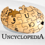
Rcmurphy's 2005 logo
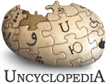
Lyrithya's 2011 logo
Lyrithya's 2013 logo proposal

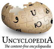
Roza's 2017 logo, current
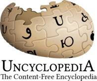
Current proposal by Zombiebaron

Current proposal by The Pioneer

cf. Current Wikipedia logo

I have created an updated logo proposal by editing Lyrithya's 2013 logo proposal to more closely resemble the current en.wp logo. I welcome any and all criticism, but I feel that my logo design more closely aligns with the historic site logos, while retaining the look of the modern Wikipedia logo. I don't really have a lot more to say, please take a look at the images I've included and then vote below. -- The Zombiebaron 05:46, 26 February 2019 (UTC)
Official Vote
Zombiebaron's proposal
- Nom and For. -- The Zombiebaron 05:46, 26 February 2019 (UTC)
 For. Sleek. The brown innards look lovely. — SG1|Hereish [citation needed] 06:08, 26 February 2019 (UTC)
- For. Very nice. ~ Kakun · talk 06:18, 26 February 2019 (UTC)
- tip. – Kip > Talk • Works ••


 06:33, Feb. 26, 2019
 - For.
 PF4Eva, the President of Imagination Vote for me My tax returns 12:16, 26 February 2019 (UTC)
  Abstain. Good one, but I still think mine is better.--The Pioneer
  12:33, 26 February 2019 (UTC)
- For, but only if the shadowing and text placement is fixed per Discord and below. →
 L A B O R A T O R I E S 17:04 26 February 2019
- The text placement issue discussed below was fixed before your vote... -- The Zombiebaron 18:33, 26 February 2019 (UTC)
- For. Both nominations are an improvement. Although, Pioneer's technically makes more sense, I like how this version keeps the existing shape. Dǐll Kevlar (talk) 00:35, 27 February 2019 (UTC)
- For. It looks more modern/flat and less realistic, going with the existing trend in design. Jetpakturtle (talk) 04:31, 27 February 2019 (UTC)
- Zombiegang Madclaw @ talk 08:48, 27 February 2019 (UTC)
- Suck-up time.Jaxpool
The Pioneer's proposal
- Nom and For. I have turned Sophia a bit upwards (and closer to the first logo), because Uncyclopedia has been falling and we need to reactivate it. I also tried to be as close as the current logo of Wikipedia so that we can stick as a parody.--The Pioneer 12:33, 26 February 2019 (UTC)
 Against. I get what you're going for, but it's way too lopsided. In all actuality, the current orientation is almost identical to the 2005 version, perspective and all, and rotating it just makes the potato look misshapen, like a decaying pumpkin that's been stomped on. — SG1|Hereish [citation needed] 13:43, 26 February 2019 (UTC)
- Against per Geeky. -- The Zombiebaron 18:33, 26 February 2019 (UTC)
Return to Rcmurphy's OG Logo
- Uncyclopedia was at it's most popular when this logo was in use. By laws of correlation equaling causality, we go back to this logo and users start dropping in by the bushel. Plus vector artwork is just a fad; we need more pixels. The Woodburninator
 Minimal Effort ™ 18:14, 1 March 2019 (UTC)
Comment
- Although I do agree with the basic idea of sticking close to Wikipedia, I feel that Zombiebaron's new logo is a bit too oblong when compared with the other two.--The Pioneer 09:07, 26 February 2019 (UTC)
- How could my proposal be more oblong than the current logo, its literally just a recolouring and a text change? -- The Zombiebaron 10:03, 26 February 2019 (UTC)
- Probably because of the layout on how you put them. Firstly because of the potato part and the text part being too close, and secondly because of the larger text size.--The Pioneer 10:15, 26 February 2019 (UTC)
- You are correct that the leading doesn't quite match up with Wikipedia, I will fix that as soon as I can, thanks. -- The Zombiebaron 10:21, 26 February 2019 (UTC)
- Probably because of the layout on how you put them. Firstly because of the potato part and the text part being too close, and secondly because of the larger text size.--The Pioneer
- How could my proposal be more oblong than the current logo, its literally just a recolouring and a text change? -- The Zombiebaron 10:03, 26 February 2019 (UTC)
Closing the vote and notes
I'm closing this vote. I would like to say that during the voting process two issues were brought up: our historical use of a shadow, and the symbols on the potato. I welcome anybody to propose logo ideas that address these issues, but this vote was mostly to address the colouring and text issues. -- The Zombiebaron 21:22, 5 March 2019 (UTC)