Forum:New site logo
Hey so as some people may have noticed the site logo was changed in January. I have mixed feelings about the change: our previous logo is from 2011 and was due for an update, but I feel like the new logo is missing some of the shading that made the old one more a potato and less a beige sphere:
I’m not sure why something as important as changing the site logo wasn’t voted on, so I’m calling a vote now to change it back, or perhaps find some other option. -- The Zombiebaron 11:40, 28 February 2018 (UTC)
2011 logo
- For Looks like a potato, not white inside, original symbols. -- The Zombiebaron 11:40, 28 February 2018 (UTC)
- the new one looks odd and blurry. -- 76.16.132.213 (talk) 12:32, 28 February 2018 (UTC)
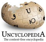
2013 logo
 For. Sophia represents, in a sense, the entire community, a shared coming together of confusing and ill-fitted parts to form a starchy, mushy whole. The new potato, rather than replacing the past or disrespecting our shared legacy, represents in a renewed sense a deep and underlying appreciation for what we stand for, as soggy and beige it may be. To return to the old potato, however familiar and comforting, would be a form of retreat, not a tribute. Yes we may stand on the shoulders of giants, but we still stand, and we never stumble backwards. Keep Sophia bold! – roza (talk ☭ ctbs ☭ log) 12:15, 28 February 2018 (UTC)
- For. This one is slightly less ugly. Auror Andrachome (talk) 12:34, 28 February 2018 (UTC)
*
![]() For. This is a cleaner version. Also the text beneath is clearer. ~ Kakun · talk 13:51, 28 February 2018 (UTC)
For. This is a cleaner version. Also the text beneath is clearer. ~ Kakun · talk 13:51, 28 February 2018 (UTC)
- For. Best of the bunch.
 PF4Eva, the President of Imagination Vote for me My tax returns 23:29, 28 February 2018 (UTC)
 - For. And I'd like to preface this by first telling everyone to go write an article, why do we have a village dump forum about this, grumble grumble grumble grumble....anyway I like this one because it's different than the one that wikia uses. -RAHB 08:00, 2 March 2018 (UTC)
- For. Sophia gives life / We can express our support / Through this new logo.
 LDA MyOwnBadSelf, 'Does it look different enough for y'all?' (talk - stalk - block) 01:18, 8 March 2018 (UTC)
Some Kind of Combination of those two above
- I mean, both of these have points. Can we, like make a better new version that has the original symbols, but looks newer, fresher? But also the middle can't be all white and glossy like that new one. Looks like an egg or something. The Woodburninator
 Minimal Effort ™ 09:02, 7 March 2018 (UTC)
 - For Yes this. -- The Zombiebaron 09:05, 7 March 2018 (UTC)
Next Header: Just Bite a Potato and be done with it

- Yeah, lets just have a human person bite a raw potato, and take out a spot in vaguely the same area as the current logos. And then, carefully carve all the special symbols into it, or just don't do that. I don't know. No, wait... Ok We bite the potato, but then digitally do the symbols and puzzle and shit. Yes. This is dumb and new. My kind of bag. The Woodburninator Minimal Effort ™ 09:06, 7 March 2018 (UTC)
 Boner. -- The Zombiebaron 09:09, 7 March 2018 (UTC)
2018 logo
They're all terrible. We should make a new one. -— Lyrithya ༆ 17:28, 28 February 2018 (UTC)
- The whole thing is a farce, I say. This issue was settled almost four years ago. – Kip > Talk • Works ••


 19:31, Feb. 28, 2018
 - For -- The Zombiebaron 20:20, 28 February 2018 (UTC)
- Logo idea: The Wikipedia logo shows the first letter in "Wikipedia" in several languages. Our logo shows the first letter in "Uncyclopedia" in English, the first letter in "Wikipedia" in Arabic, and a bunch of scribbles. I don't think that's a smart parody. Since Uncyclopedia has different names in most of the languages, we can't make a complete parody of the Wikipedia logo. So I'm suggesting to make a "Potato Sophia" much like the "Potato Jesus" painting, and drop the whole puzzle thing. Just make a potato chip with Sophia Loren's (or Oscar Wilde's) face in it, and add a small bite to it in the left-top corner, like the missing piece in the Wikipedia logo. If someone can pull this off, I'll support it. ~ Kakun · talk 20:36, 28 February 2018 (UTC)
- I just noticed that the Arabic letter (which is called "Wow", BTW) kind of looks like a "U". So I would make a bitten potato chip with the whole puzzle thing, and that way we get a logo with a better color. Currently, the color of our logo is just impossible. ~ Kakun · talk 20:49, 28 February 2018 (UTC)
- Or just use the same logo as the Klingon Uncyc which is nice and orange. ~ Kakun · talk 21:55, 28 February 2018 (UTC)
- They are using a slightly edited copy of the original 2005 puzzle potato. I like it too, and we could easily put the new logo text below it. -- The Zombiebaron 22:02, 28 February 2018 (UTC)
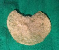
I took a bite out of a potato chip and photographed it as potential source material for your proposal. -- The Zombiebaron 05:02, 4 March 2018 (UTC)- Thanks, but I think Wageslav is right, we should keep the current logo. It's a good parody of the WP logo, and the chip isn't. ~ Kakun · talk 17:40, 4 March 2018 (UTC)
- I spent time selecting a chip and then carefully biting it to make it resemble the current logo as much as possible. If you no longer believe that a chip with Sophia's face is a good idea, how about moving on from a puzzle potato to a puzzle potato chip? -- The Zombiebaron 18:49, 4 March 2018 (UTC)
- OK but I have no idea how to actually do that. ~ Kakun · talk 20:10, 4 March 2018 (UTC)
- I'll throw something together in the next few days. -- The Zombiebaron 20:20, 4 March 2018 (UTC)
- OK but I have no idea how to actually do that. ~ Kakun · talk 20:10, 4 March 2018 (UTC)
- I spent time selecting a chip and then carefully biting it to make it resemble the current logo as much as possible. If you no longer believe that a chip with Sophia's face is a good idea, how about moving on from a puzzle potato to a puzzle potato chip? -- The Zombiebaron 18:49, 4 March 2018 (UTC)
- Thanks, but I think Wageslav is right, we should keep the current logo. It's a good parody of the WP logo, and the chip isn't. ~ Kakun · talk 17:40, 4 March 2018 (UTC)
- Or just use the same logo as the Klingon Uncyc which is nice and orange. ~ Kakun · talk 21:55, 28 February 2018 (UTC)


Moving forward
Although this may be premature, what seems to be the reasonable proposal moving forward would be:
- For now, keep the logo.
- Either make a new forum, or extend the discussion here, to help make a new logo with some more community input.
Although we have our differences, in the end we're a community of weirdos, and that's what our potato represents. So stay weird, and be italic. Or not, you do you. – roza (talk ☭ ctbs ☭ log) 07:23, 2 March 2018 (UTC)
- Really, after discussing this with you in depth for what amounts to several hours of our lives, I still cannot fathom why you're acting like this is some big concession you are making. The fact that this change was done without seeking broad community input is the entire problem this forum was created to address. You act as though this was about my unwillingness to accept change and yet I fully support change, as long as it involves input from as much of the community as possible. I realize that I'm being an armchair critic, but I will have access to proper technology soon to create designs for new logos using the community input on this page. -- The Zombiebaron 08:37, 2 March 2018 (UTC)
- At the very least it's agreed that this proposal is the best move forward. Although I felt that that I did my due diligence—discussing the changes I wished made to the site on our IRC channel and discord server—I understand that you believe differently, and I respect your point of view. I don't believe that I offered this proposal out of some position of inflated magnanimity, I simply want this (honestly silly) potato business resolved peacefully and amicably. I believe that it's best for the community if progress is made on this sensitive issue, and that we recuse ourselves of any topic involving personal animosity or inner motivations. In the end, everyone's goals are the same: what's best for the site, and what's best for the people #KeepSophiaBold. – roza (talk ☭ ctbs ☭ log) 09:00, 2 March 2018 (UTC)
- At every chance you get you try to minimalize this conversation, saying how silly it is and how we shouldn't have conversations that create animosity. I completely disagree. These are the sort of conversations we need to be having more of. If you truly believe that voting on the wiki is some outdated practice from yesteryear, I want to hear more about that, and then I want to make a rebuttal. On discord you were able to give me one example of a forum vote, a Top Ten Of The Year vote, that took several years, maybe we shouldn't do voting for top10 and instead do it by most votes on VFH? I bet at least one other person has a better idea than that. That's the magic of collaboration. -- The Zombiebaron 09:24, 2 March 2018 (UTC)
- At the very least it's agreed that this proposal is the best move forward. Although I felt that that I did my due diligence—discussing the changes I wished made to the site on our IRC channel and discord server—I understand that you believe differently, and I respect your point of view. I don't believe that I offered this proposal out of some position of inflated magnanimity, I simply want this (honestly silly) potato business resolved peacefully and amicably. I believe that it's best for the community if progress is made on this sensitive issue, and that we recuse ourselves of any topic involving personal animosity or inner motivations. In the end, everyone's goals are the same: what's best for the site, and what's best for the people #KeepSophiaBold. – roza (talk ☭ ctbs ☭ log) 09:00, 2 March 2018 (UTC)
New chip logo

- For. I'm changing my vote to this one mostly because of the shit-sewer color of the current (and the 2011) logo. That's not a weird logo, that's just a logo that says "go away", both to the readers and to the writers. Not to mention the stupid childish characters covering it. ~ Kakun · talk 10:12, 2 March 2018 (UTC)
 Comment. I made this more as a proof-of-concept than as genuine candidate for a new logo, at least in its current form. The other two current logo candidates are labors of love, I made this in 10 minutes. I'm afraid most people would see this as too big a departure from a well established concept, but I do love the idea of Sophia Loren and potatoes together. It's got potential. – roza (talk ☭ ctbs ☭ log) 10:51, 2 March 2018 (UTC)
- Could you change the color of the 2013 logo? I mean, there are shiny yellow potatoes out there, why does it have to be a sewer potato? ~ Kakun · talk 11:00, 2 March 2018 (UTC)

I made this shitty logo a long time ago

- Why did I make this file a gif? Boy oh boy wouldn't both you and I like to know! The Woodburninator Minimal Effort ™ 08:38, 7 March 2018 (UTC)
- I just added a bunch of page breaks to make the other logo more separate from this shlop. The Woodburninator Minimal Effort ™ 08:52, 7 March 2018 (UTC)
- I just added a bunch of page breaks to make the other logo more separate from this shlop. The Woodburninator
- For Just add a 1 in front of the 5 and we can start celebrating our 15 year anniversary. -- The Zombiebaron 08:55, 7 March 2018 (UTC)
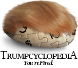
Even better logo I just made.

- This is good. The Woodburninator Minimal Effort ™ 08:49, 7 March 2018 (UTC)
- Anyone who doesn't like this hates change. -- The Zombiebaron 08:59, 7 March 2018 (UTC)