 | This page is an archive. The contents have been moved from another page for reference purposes only, and should be preserved in their current form. Discussion or voting on this page is not current. Any additions you make will probably not be read. |
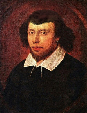
William Shakespear
Just a quick little one. --~ 
Jacques Pirat, Esq. Converse : Benefactions : U.w.p.
21:24, 12 April 2007 (UTC)
- Try to clean up the area around where the moustache was. It looks like he's got one of them newfangled Inviso-staches™. --Sir Modusoperandi Boinc! 22:33, 12 April 2007 (UTC)
- It's still not perfect, but this is what I'll do for now, since it's near my time to hit the hay. --~

Jacques Pirat, Esq. Converse : Benefactions : U.w.p.
02:17, 13 April 2007 (UTC)
- Better. --Sir Modusoperandi Boinc! 02:38, 13 April 2007 (UTC)
- Oh. God. The. Brown. Part. Of. The. Top. Of. His. Head. -- The Zombiebaron 20:24, 14 April 2007 (UTC)
- God do I love how companies cannot agree on the proper gamma for every monitor. Should be fixed. --~

Jacques Pirat, Esq. Converse : Benefactions : U.w.p.
00:56, 15 April 2007 (UTC)
- Now it looks like Hair-in-a-Can. Try copying a patch of his good hair and using that to fill in the balding area. --Sir Modusoperandi Boinc! 01:51, 15 April 2007 (UTC)
- Just can't win, eh? Clone tool looks like toupee, and charcoal paintbrush makes it look like hair in a can... --~

Jacques Pirat, Esq. Converse : Benefactions : U.w.p.
20:41, 16 April 2007 (UTC)
- Yeah. One advantage of writing over 'chopping is if you change a 'v' to a 't' it looks like a 't', rather than it looking like you edited it to make it 't'ish. --Sir Modusoperandi Boinc! 21:10, 16 April 2007 (UTC)
Hi upper lip looks like he's been drinking chocolate milk, or some gave him a Dirty Sanchez Dame  GUN PotY WotM 2xPotM 17xVFH VFP Poo PMS •YAP• 22:11, 16 April 2007 (UTC)
- Apparently the clone tool works, so I applied that and tried fixing the hair. It's off kilter right now, though... --~

Jacques Pirat, Esq. Converse : Benefactions : U.w.p.
01:43, 17 April 2007 (UTC)
- HA! This is great. -- Hindleyite Converse • ?pedia 18:46, 24 April 2007 (UTC)
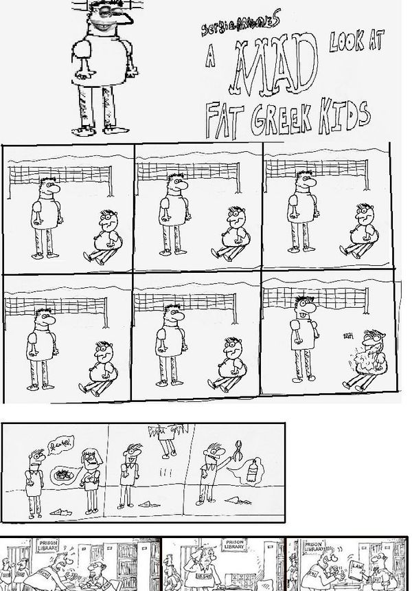
A MAD look at fat greek kids
| Please Help this Picture
|
Another MAD look at from an issue of MAD magazine...looking as detailed, original, and making as much sense as it always does. Image credit: arborguitars
Nominate - discuss this image
|
|
- From what little I remember about MAD the new cartoons don't look all that much like the original one...life is cruel, I know. The trick with pics like this is to make it close enough to the real thing that it doesn't look like fan art. This is hard to do (mimicking someone's writing style isn't all that tough, but mimicking an artist's drawing style is a bitch). --Sir Modusoperandi Boinc! 19:27, 12 April 2007 (UTC)
- Try making the kid at top look a bit better. That'll improve it somewhat. --~

Jacques Pirat, Esq. Converse : Benefactions : U.w.p.
21:24, 12 April 2007 (UTC)
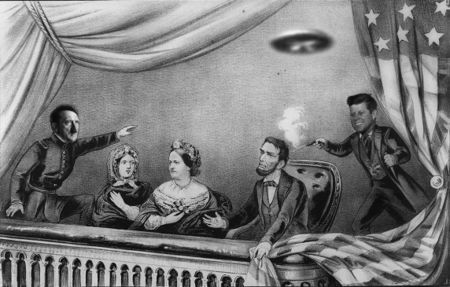
Conspiracy Theory
Hitler and JFK stick out a bit. I know it's tough making pics match a drawing, but play with the brightness/contrast until they're closer (alternately your application may have an "effect" to simulate the same thing). The UFO is blurry and is, therefore, freaking me out. --Sir Modusoperandi Boinc! 19:40, 11 April 2007 (UTC)
- What if they adjusted the contrast on the faces of hitler and JFK, cranked it up a bit? And actually Lee Harvey Oswald's face instead of JFK's pulling the trigger would be funnier. I'm thinking one could solarize them into submission and try that. Thats a UFO? I thought it was a frisbee. Dame
 GUN PotY WotM 2xPotM 17xVFH VFP Poo PMS •YAP• 22:14, 16 April 2007 (UTC)
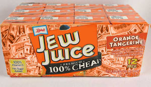
Jew Juice
- Although the "cheap" was probably intended to look that way, it just ends up looking incomplete (and "cheap" & "premium" together form a vortex from which not even light can escape). The first E should be rotated clockwise a bit, or copy the little E instead. I'm not too sure about the theme, as none of the Jews I know contain 100% of my daily requirement of Vitamin C. That's why I have scurvy. --Sir Modusoperandi Boinc! 16:05, 5 April 2007 (UTC)
- ...and if it appears that the "me" here and the "me" on VFP are two different people it's because "me" is, essentially. Here I try to help improve pics (as a "bit" on a page this could work), but on VFP I'm deciding if I want it as a standalone on the mainpage. Two different sets of criteria, if you will. Or maybe it's two different cafeterias. If it's the latter I recommend the sloppy joe's. --Sir Modusoperandi Boinc! 14:30, 7 April 2007 (UTC)
- I fancy this kinda ethnically stereotypical work. Partially because I had a really good article of mine cenosored by a Jewish user and admin. This new image of yours is as good as, if not better than, "1up". Love the little yamaka. Import your images as PNGs, they look better. --AmericanBastard 04:08, 8 April 2007 (UTC)
- If you're going to do this joke, which I think is in such bad taste you'll have to pull it off flawlessly, it'll have to be way over the top. The flavor should be "Christian Children," there should be some Yiddish/Hebrew on there, and there should be an ad about "getting in on the conspiracy," or something. Stuff like this is going to have a hard time getting on the front page regardless, given its nature.--<<
 >> 13:41, 8 April 2007 (UTC)
- Tough task, but it may work if you turn it reductio ad absurdum; it's kosher and involves blood libel, it comes with a coupon for 10% off a pack of bagels to nosh on, etc. I can't (and won't), however, guarantee that it'll get a better reception if it hits VFP this way; playing stereotypes is hard to get right. I, myself, never do such things, eh. /me puts on tuque, rides snowmobile over to a friend's igloo, etc. --Sir Modusoperandi Boinc! 20:44, 8 April 2007 (UTC)
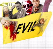
Evil Folder
- Moved from VFP. --KATIE!! 15:36, 17 March 2007 (UTC)
- Should i just flush this image? I fixed the arm.--AmericanBastard 05:05, 8 April 2007 (UTC)
- It works well enough for evil, I suppose. --Sir Modusoperandi Boinc! 05:49, 8 April 2007 (UTC)
UnScripts Logo
Well, what do you think? ~ 
Jacques Pirat, Esq. Converse : Benefactions : U.w.p.
01:17, 30 March 2007 (UTC)
- You may want to add a white or grey border around the text (the part over the laptop) to increase the readability. Also, the strap for the clown nose is unnecessary. Sir Modusoperandi Boinc! 01:22, 30 March 2007 (UTC)
- I did something slightly differently so the text will contrast better, and as for the strap, I dunno why, but for me, it seems to complete the picture a little bit more, and so I made the straps just a bit more realistic in position and size. ~

Jacques Pirat, Esq. Converse : Benefactions : U.w.p.
02:10, 30 March 2007 (UTC)
- Better. If you've got the patience, try playing a little with the border between his hair and the background; real hair tends to be hair...hair...hair/background...hair/background...background, whereas this goes hair...background. I hope that made sense. I've been passing time by holding my breath. --Sir Modusoperandi Boinc! 20:47, 8 April 2007 (UTC)
- Just so you know Jocke, clown noses don't normally have straps. They, ussually, have small slits cut in them, so that they bite into the sides of a nose and stay on. So yah, you can remove it. -- The Zombiebaron 20:21, 14 April 2007 (UTC)
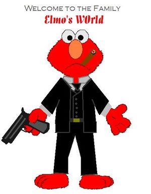
Don Elmo Corleone
| Please Help this Picture
|
"Ernie, Bert will move against you first. He'll set up a meeting with someone that you absolutely trust, guaranteeing your safety. And at that meeting, you'll be assassinated. It's an old habit. I spend my life trying not to be careless. Women and children can be careless, but not puppets. It could be anyone. I never wanted this for you. I work my whole life, I don't apologize; to take care of my family, and I refused to be a fool, dancing on the strings held by all those bigshots. I don't apologize; that's my life, but I thought that, that when it was your time, that you would be the one to hold the string. Senator Corleone; Governor Corleone. Well, it wasn't enough time, Ernie. It wasn't enough time. Now listen, whoever comes to you with this Bert meeting, he's the traitor. Don't forget that." Image credit: The Jeff Killer
Nominate - discuss this image
|
|
- Fairly Elmoish. The collar doesn't look right, though. You should work in a higher resolution; it's lo-res enough that the circles of the eyes have flattened out a bit. Sir Modusoperandi Boinc! 01:09, 29 March 2007 (UTC)
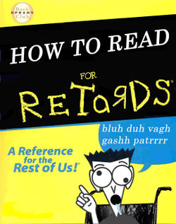
How To Read For Retards
- The black behind "retards" isn't the same black as the surrounding, um, black. Black! The voice bubble text, that should stay in its bubble, goes off the right edge of the bubble. Bubble! The "How to read" text is different than the typeface they normally use. It's generally this. This! Sir Modusoperandi Boinc! 01:48, 26 March 2007 (UTC)
i just gotta say, thats really offensive, and may it be funny for some people like you, it is VERY offensive to most others. Retardedness is a subject that is best to stay away from...plus, modus, and jocke pirat are right, the black is a black that isnt the black that we need.Reubnick 22:20, 26 March 2007 (UTC)
- "How to read" does not align correctly - it is a bit slanted and it is not properly centered. ~

Jacques Pirat, Esq. Converse : Benefactions : U.w.p.
20:40, 26 March 2007 (UTC)
- Also, instead of a wheelchair, try a hockey helmet. Sir Modusoperandi Boinc! 20:51, 26 March 2007 (UTC)
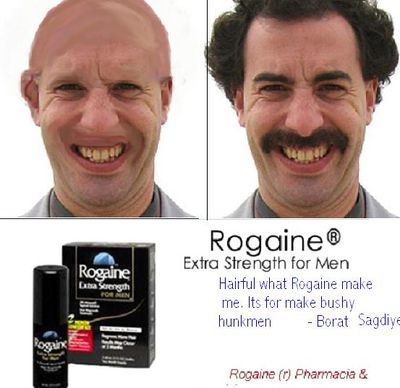
Rogaine is for make bushy hunkmen
- First, try to find a hi-res version of the Rogaine ad. This one is all pixely. Second, while the concept intrigues, the technical...process...to make it seem "real" is problematic. Or to put it another way, if it's not perfect you'll end up making the "before" Borat look like a burn victim. Which is what happened. Try selecting fairly small areas (an eyebrow, for example) with a fair amount of feathering, and "clone brush" it in with neighbouring skin tone. If it doesn't look "just right", undo and try again. When you've got that one area looking right, SAVE and move on to the next.
- Alternately, if you don't want to go insane, find a picture of a bald guy and face swap Borat's features onto it. Sir Modusoperandi Boinc! 02:23, 25 March 2007 (UTC)
Actually, i have no idea what possesed me to make this, but i thought it would be funnier if i made Borat hideous. And what you said about the eyebrow...the thing is i want Borat to be minus eyebrows...i want no hair whatsoever on his face...how would this hold up on VFP? Would i be torn to shreds emotionally over the internet?Reubnick 00:25, 26 March 2007 (UTC)
- Maybe I should have been more specific. When I said "eyebrow", I meant "the area of an eyebrow for purposes of retouching, or 'chopping, to remove said eyebrow, vis-a-vis de-brow, converting said brow into an unbrow, a no-brow, or, as more commonly known, skin.". Would it pass VFP as is? I dunno. I've seen better stuff torn to shreds there (*sniff*), and I've seen worse stuff pass. I also saw a cabbage on the road once. What it was doing there, I'll never know. Sir Modusoperandi Boinc! 00:35, 26 March 2007 (UTC)
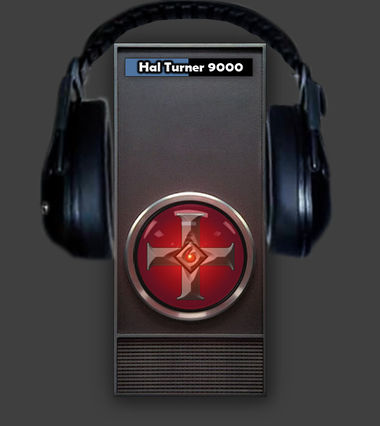
Hal Turner 9000
- Snip the head band for the earphones where it crosses over the top left and right of Hal. It looks like Hal is standing behind the headphones. The headphones, meanwhile, are hovering. Which is crazytalk. Sir Modusoperandi Boinc! 20:23, 23 March 2007 (UTC)
- Better. Sir Modusoperandi Boinc! 02:14, 25 March 2007 (UTC)
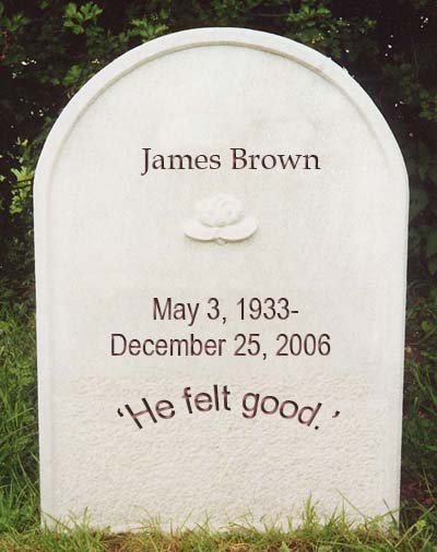
James Brown's True Headstone
- Bit of a rough job on Photoshop, still learning my way around :p. Dad 'n I found it funny though, so, what do you all think? ---Demonbob 00:13, 22 March 2007 (UTC)
- Use a seriph typeface, it's classy. Also, shouldn't the epitaph be " rather than ' ? Sir Modusoperandi Boinc! 00:33, 22 March 2007 (UTC)
I would also suggest that you use a blur brush a bit - the letters are too sharp and crisp. Dame  GUN PotY WotM 2xPotM 17xVFH VFP Poo PMS •YAP• 00:18, 15 April 2007 (UTC)
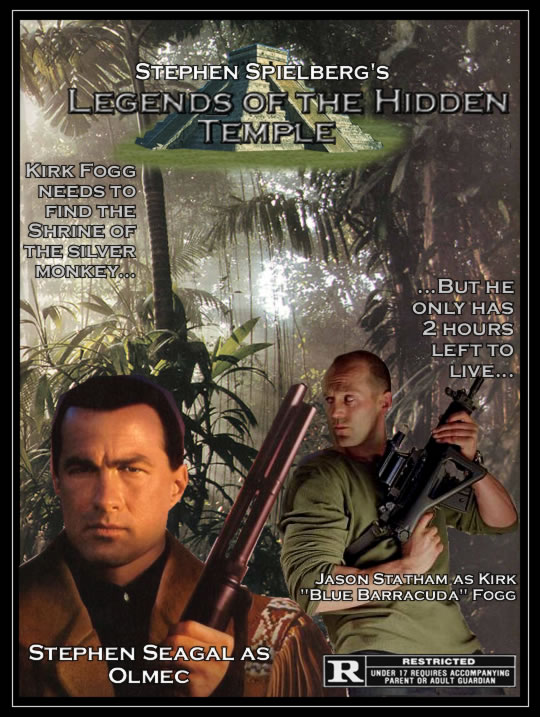
Legends of the Hidden Temple
- The text should be bigger, it's too hard to read. Statham needs to be a bit darker and Seagal should be lighter (Seagal has some fluff on the right side of his head that should be cropped out. No, the your right side. His eye doesn't look right either...the red one overlapped the lid and has no highlight). Lastly the temple needs some sort of faded background. It looks like it's hovering at the moment, rather than it being "on top" of the image.--Sir Modusoperandi Boinc! 01:04, 20 March 2007 (UTC)
- Try making the title text bigger.--Sir Modusoperandi Boinc! 02:20, 20 March 2007 (UTC)
- Got it fixed. --~

Jacques Pirat, Esq. Converse : Benefactions : U.w.p.
21:37, 20 March 2007 (UTC)
- Hmmm, center the title text. It's off centre, which makes me lean to the right. Then I get a crick in the neck and I'm grumpy all day. Sir Modusoperandi Boinc! 21:54, 20 March 2007 (UTC)
- Now with more center. --~

Jacques Pirat, Esq. Converse : Benefactions : U.w.p.
23:23, 20 March 2007 (UTC)
- That's not quite what I meant...but it's okay. I meant the "Legends of the Hidden" part of the title should be centred. The remaining title text and the temple can be offset. In any event, hopefully you're starting to see how comparatively minor changes can make a disproportionate improvement on a 'chop. It's the same way with words (read a page by Hardwick or Procopius, then read one by pretty much anyone else and you'll see what I mean). Sir Modusoperandi Boinc! 23:34, 20 March 2007 (UTC)
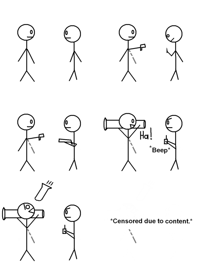
Gun Fight
- It should start out fist, knife... then go to what you've got, and the end should destroy them both, simply because the Stick people killed my parents. Or maybe that was liquor.--Sir Modusoperandi Boinc! 02:38, 19 March 2007 (UTC)
- There. Next comment, please.--The Jeff Killer 03:47, 19 March 2007 (UTC)
- Put a bigger gap at the end. It starts over too soon...and it doesn't need the "censored" bit. The guy on the right blowing up would be better. --Sir Modusoperandi Boinc! 03:57, 19 March 2007 (UTC)
- Needs some kind of nuke to kill them both off. Also, the knife doesn't look very knife-ish. Use a sword instead. --BaCaRuDa 15:39, 13 April 2007 (UTC)
- Yeah. The knife looks like a toothpick. Jedibob5 22:02, 16 April 2007 (UTC)
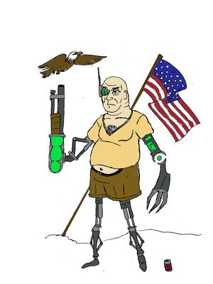
Prosthetic Joe
| Please Help this Picture
|
He was the average american guy, until he was called to serve his country. He fought furiously in the 12 hour long Granada war, and managed to lose all his limbs and his eye in it. Now he is a battle scarred veteran, and his limbs have all been replaced with super robotic parts giving him extraordinary powers. He is currently battle testing in Iraq, and is a spokesperson for viagra. Image credit: The Jeff Killer
Nominate - discuss this image
|
|
- God bless America! Also, he needs a big "state of texas" belt buckle. Maybe a mullet.--Sir Modusoperandi Boinc! 01:16, 18 March 2007 (UTC)
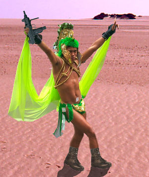
Terrorist Fairy
| Please Help this Picture
|
This image is going to go in the Afairyism article. It illustrates a typical terrorist Fairy holding a machine gun in the deserts of the Middle East. (This incomplete part of the article is being temporarily stored in my sandbox, along with another picture) Image credit: Weri long wang
Nominate - discuss this image
|
|
Weri long wang 17:14, 17 March 2007 (UTC)
- He's got no shadow (and you told me there was no film in your camera!).--Sir Modusoperandi Boinc! 19:40, 17 March 2007 (UTC)
- I’m not experienced enough in Photoshop to make shadows. Can you download the image and do it? Weri long wang 20:58, 17 March 2007 (UTC)
- No, but I'll tell you how I do it. 1) imagine what his shadow on the ground would look like 2) make a shadow "shaped" thingy with the lasso tool (with a blurred edge) 3) copy the background with that selection 4) paste the selection as a new layer on top of the background layer 5) play with brighten/contrast until it looks shadowish. You could just lasso a shadowy shape on the background image and darken/contrast that, but this covers your ass if you want to undo it a hundred edits from now.--Sir Modusoperandi Boinc! 21:14, 17 March 2007 (UTC)
How's this? (can someone fill in the images row here) Weri long wang 21:49, 17 March 2007 (UTC)
- Not bad.--Sir Modusoperandi Boinc! 22:01, 17 March 2007 (UTC)
- What is the pee review rating? 0-10?– Preceding unsigned comment added by Weri long wang (talk • contribs)
- We don't do that here. Artistes are too tempermental. And mental.--Sir Modusoperandi Boinc! 22:20, 17 March 2007 (UTC)
Featured image standard? Weri long wang 01:35, 18 March 2007 (UTC)
- If you look through PFP you'll see that they wander from nearly perfect to nearly the opposite of that. So, yes, maybe or no. One of those. You'll never know until it hits VFP, and I'm the last person who should say "Yes, it'll pass VFP" or "No, it will not pass VFP", as my hit/miss ratio with selfnoms there is about 50/50. --Sir Modusoperandi Boinc! 01:54, 18 March 2007 (UTC)
- I might as well give it a try. It’s a kind of funny idea: a raging fairy. Weri long wang 02:46, 18 March 2007 (UTC)
- (or maybe not) Weri long wang 11:53, 18 March 2007 (UTC)
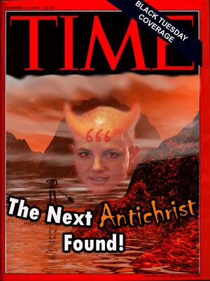
Time Magazine: The Next Antichrist Found!
Anybody??? ----  CartoonDiablo
- Try a bigger Britney. Maybe try it as "Crazy bitch of the year" or "white trash of the year" instead of antichrist. --Sir Modusoperandi Boinc! 20:32, 16 March 2007 (UTC)
Well I see what your going for but I was mainly targeting how she shaved her head and screamed "I'M THE ANTICHRIST". Also how she got that 666 tattoo on her head. ----  CartoonDiablo
- Ah. This is why I don't keep up on popculture. --Sir Modusoperandi Boinc! 14:53, 17 March 2007 (UTC)
- Hey! I just noticed that this is the same cover I once used for a 'chop. I wonder how many other people have used it. Sir Modusoperandi Boinc! 00:22, 21 March 2007 (UTC)
Oh you sneaky devil you noticed didn't you! Yeah I was VERY against it at first (chopping a chop) but then I couldn't find anything else. so yeah ----  CartoonDiablo
- Well, you didn't chop a chop. It's just the same cover, that's all. It made me go back and reminisce...ahh, good times. Sir Modusoperandi Boinc! 01:03, 21 March 2007 (UTC)
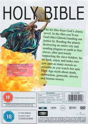
Bible
| Please Help this Picture
|
The previous problem was mixing too many image types together (cartoon, photo, computer generated etc). Does this work any better? I used a white(ish) background to make it seem less cluttered and to draw attention to the important parts. If you think the DVD film synopsis is inapropriate and or unfunny, the blank version is available here: [1] (don't review this image if you're under 18 years of age: strong bloody violence).
A brand new version. Is this any better? (blurred all the text this time) Image credit: Weri long wang
Nominate - discuss this image
|
|
Weri long wang 13:17, 13 March 2007 (UTC)
- Try using a more macho typeface for the header text; the bubbly one is too lovey in comparison with Moses and the accompanying text. This one almost more for Pee Review, as it's a text addition...the end text doesn't match the "theme" of the rest; I can't see a dvd cover promoting the enclosed dvd as "dog shit" (and it's Iron Age, though some people say Bronze Age, as Iron age makes them think of trains. Then they start making that "chugga-chugga, woo-woo!" sound, which gets really annoying, so I say "Stop that!". Then they say "Mom! Modusoperandi is picking on me!". Now I'm grounded). --Sir Modusoperandi Boinc! 14:18, 13 March 2007 (UTC)
- I anticipated that, and I agree. The blank version is available to put more apropriate text on it. I like to use the term "Dark Ages" when talking about religion; I believe it's most apt. "Iron Age" says nothing about the barbarism associated with the Bible. Weri long wang 14:58, 13 March 2007 (UTC)
- It's on the Pee Review now. We can have a look through any suggestions to see which is most appropriate. Do you have a suggestion? Weri long wang 15:13, 13 March 2007 (UTC)
- Just remember that there's a fine line between pointing out hypocrisy and ranting. The former can be entertaining, while the latter is the generally the opposite of that. --Sir Modusoperandi Boinc! 15:17, 13 March 2007 (UTC)
OK then, that's why I'm asking for suggestions. Also here's a new typeface: n[2] Weri long wang 15:19, 13 March 2007 (UTC)
- I'd be more helpful textwise, but I've written my last Biblical epic, and don't plan on going back. --Sir Modusoperandi Boinc! 15:29, 13 March 2007 (UTC)
- There's some inconsistency with the text and the scanned in bits - consider sharpening the small print and BBFC Guidance etc. at the bottom or blurring the new added text slightly. Or both. Also, consider what impression you wanna create: will it be cartoony and cheesy or epic and overly formal? If the former, consider adding more primary colours and a 'wacky' font. If the latter, change the heading font to an engraved style or a serif font. Other than that, I'd love to see this video in a bargain bin at Hindley Market boot sale on a Sunday morning.
Also, as a side note, is there any way you could perhaps format this into an article of its own like this? That could be good. -- Hindleyite Converse • ?pedia 19:36, 13 March 2007 (UTC)
I want the DVD synopsis to give the impression that the Bible (or at least the film) is a meaningless, cobbled together collection of stories, detailing barbaric savages killing people en masse for no reason. I definitely don’t want it to be cheesy. I think it’ll be easier to blur the new text (when we’ve decided what that should be) Weri long wang 20:49, 13 March 2007 (UTC)
Here's a blurred header and a texture that runs throughout the whole image. [3] Weri long wang 12:24, 14 March 2007 (UTC)
An entire new version. Is it any better (with blurred letters this time). Weri long wang 15:13, 14 March 2007 (UTC)
- I prefered the old layout, skewed text makes me woozy. Also, try a more serify (new word, hurrah!) typeface for the title.--Sir Modusoperandi Boinc! 18:50, 14 March 2007 (UTC)
- Any one font in mind? Should I leave the special features box in? What about the new synopsis? Weri long wang 19:12, 14 March 2007 (UTC)
- An old English font and some serif would look nice and religousy.--~

Jacques Pirat, Esq. Converse : Benefactions : U.w.p.
00:49, 15 March 2007 (UTC)
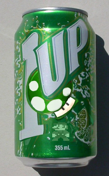
1up Soda
- Try to make the "1" look more like a one and less like a 7 with rhinoplasty. The mushroom guy and mario need highligts to match the can. I don't know what program you use, but try either 1) a "lighten" layer on top of mushroom/mario or 2) just select a rectangle shape to match the highlight on the can (but on the "mushroom" layer or the "mario" layer) and lighten a bit. And you might want to distort the brim of Mario's hat down a bit (stretch and distort are dangerous tools; if you don't get it "just right", it looks like you stretched/distorted it, rather than looking like it came from the pop can factory that way). Keep in mind that the front of the can will have no distortion, and the left/right hand edges will have a bunch, but it's not a linear distortion. Picture two parallel lines (like =), if they were pasted onto right side of the can they wouln't look like this >, they'd look like this D (but without touching...it's not a perfect analogy). I hope I didn't confuse you. Sir Modusoperandi Boinc! 20:20, 23 March 2007 (UTC)
I use Photoshop CS2 and uh yeah I mostly understood. --  CartoonDiablo
Hey Modusoperandi. Do you use photoshop? because judging by what you said it doesn't seem like you use it. Also you can just lighten the layers themselves. --  CartoonDiablo
- That would be #2, then. I sometimes use extra layers for effects because it's easier to undo thirty steps later (when you're beyond whatever number of undo's you have). No, I don't use Photoshop. I got a copy of PSelements with my Wacom, but I don't want to learn a new graphix app. I use Draftpanzerdrawin IV, the best damn 'chopping program that Nazi Germany every produced. Sir Modusoperandi Boinc! 02:13, 25 March 2007 (UTC)
D3AR L3AD3R
- For an upcoming UnNews story. Since I don't have a Wii...stop giggling...even though I tried to buy a Wii...stop it!...is this sufficiently Mii-like for Dear Leader? --Sir Modusoperandi Boinc! 02:24, 12 March 2007 (UTC)
I'm not quite sure I get it. --  CartoonDiablo
- Well, it's Kim Jong-Il, and he's got a Wii...so he's got a Mii avatar...which is him. Plus he's the best at everything. Have you ever read the news story about him scoring all hole-in-ones during a round of golf? He does that all the time! It's true!...so he's l33t. The l33test ever! --Sir Modusoperandi Boinc! 20:36, 12 March 2007 (UTC)
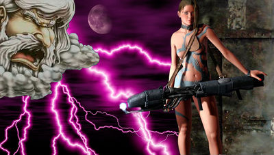
Kill God!
.
Here is an image of the goddesses of the atheists, Athe, killing God using a nuclear flamethrower. Any comments on this? Weri long wang 01:12, 12 March 2007 (UTC)
- I'm sure that it works fine in context with it's page, but it's awfully obscure w/o it. Also, I try to stick to one or two different "styles" per 'chop; more than that becomes distracting (each element in this 'chop is from a different source, and it hurts the suspension of disbelief. Who Framed Roger Rabbit, for example, works fine with two styles, but if they'd added anime and claymation and CGI on top of the real world/toon combination, it would've just been a mishmash). Try, for instance, swapping god out with a grumpy old fart w/a white beard...--Sir Modusoperandi Boinc! 02:16, 12 March 2007 (UTC)
- It's a problem trying to fing images of the right kind on line: a super-sexy goddess holding a nuclear flamethrower isn't something you find everyday. I can see what you're saying though, they don't seem to mix that well. I'll keep that in mind from now on. Weri long wang 13:11, 13 March 2007 (UTC)
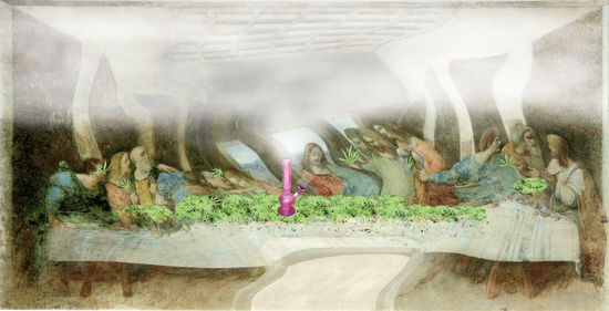
The Last Party
- Um, I've never had the room go all purple...try losing the purple and make the painting blurry (but keep the pot crisp). Is that the Holy Bong? --Sir Modusoperandi Boinc! 02:11, 12 March 2007 (UTC)
Holy bong? I guess it is now! But yeah it goes with the whole "getting high" aspect, ever hear "Purple Haze" by Jimmy Hendrix? I tried multiple colors but ended up looking too fucked up. --  CartoonDiablo
- Purple Haze is about a LSD trip, or a dream, depending on whom is asked.--Sir Modusoperandi Boinc! 20:01, 12 March 2007 (UTC)
- Better, try less distortion at the bottom. It still looks like a trip...and keep in mind that there's already a featured pic with a similar tack, if VFP is the direction you're headed.--Sir Modusoperandi Boinc! 06:00, 13 March 2007 (UTC)
- Whoa, dude. The removal of the purpliness has improved the pic. Maybe do another 'nightclub' or 'drug den' version? -- Hindleyite Converse • ?pedia 19:41, 13 March 2007 (UTC)
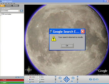
Error: Moon Landing Not Found
- Simple but effective take on the "Moon landing is fake" thingy. I think that's about as clear as you can make it, within the limitations of Googlemoon (it does lose something as a thumbnail...legibility, for one).--Sir Modusoperandi Boinc! 01:43, 12 March 2007 (UTC)
- Yes, this image works better 'blown up'. I like this. When are we getting Google Jupiter? -- Hindleyite Converse • ?pedia 19:43, 13 March 2007 (UTC)
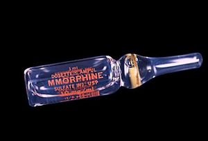
MMOrphine
| Please Help this Picture
|
Tired of only being able to get in 10 hours a day on your favorite MMOG? Well, then take some MMOrphine! It'll keep you going, and going, and going... Image credit: The Jeff Killer
Nominate - discuss this image
|
|
- Hmmmmm I guess it's fine the way it is, except the admis aren't fans of text based jokes. You could try to make it more of a parody by referencing Wow into. Overall it's not bad, but not good. --
 CartoonDiablo
Hitler Gas and GREEEEELlll
- The "fire" visible through the cutouts should be more "firey" (hunt down a pic of a forest fire, or campfire and try using that). The nazi flag is too bright (lower the contrast a bit), and the yarmulke isn't obviously a yarmulke at first glance (there's no shading underneath it). Wouldn't Hitlerco manufacture gas industrial ovens?--Sir Modusoperandi Boinc! 03:00, 8 March 2007 (UTC)
Meh I'll get on it. I'm just glad the image quality isn't total shit cause it looks like it on my computer.
It has a habit of crapifing image quality. --  CartoonDiablo
I was think of changing the and to ont or like german for and. --  CartoonDiablo
- With this version Hitler and the guy inside the grill are out of proportion (either Adolf is too small, or the guy is too big). The shadow under the yarmulke is too dark (try a more diffused shadow). The smoke is only coming out of one side of the stack and it's got a weird right-angle thing happening (the right "edge" of the smoke is too clearly delineated...not "smokey" enough). Lastly (and this is potentially a bitch to correct), the lighting on the grill is top-down, but Hitler's is left-right. Also lastly, but moreso, Hitler should have an apron of some sort, maybe a "zig heil ze cook" one with bloodstains.--Sir Modusoperandi Boinc! 18:43, 12 March 2007 (UTC)
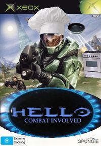
| Please Help this Picture
|
From Microsoft and Spungie Poodios comes the highest selling first person cookery shooter in the genre. 9 out of ten chefs cook! Only on Xbox. Image credit: Ikabu
Nominate - discuss this image
|
|
- "Master chef" needs to be more chef-like. Add an oven mitt and an apron. Maybe swap out the alien flying thingy for an oven firing french bread and chef's gun for one of those icing squirting "pastry bags", too. Shouldn't it be "Jello: Cooking Evolved"? Also, you may want to start over with a higher resolution pic; this one is so low res that, even with blur, things like his hat and the oval around the title will still look all pixely.--Sir Modusoperandi Boinc! 18:17, 6 March 2007 (UTC)
- Thankyou, sir, I'll get to work. By the way, what's 'jello'?– Preceding unsigned comment added by Ikabu (talk • contribs)
- Jello is one of the most misused desserts ever invented by man. For every yummy recipe involving Jello the another recipe so foul that the gates of Hell themselves would not allow it to enter. (and don't forget to sign your posts here with ~~~~).--Sir Modusoperandi Boinc! 17:15, 8 March 2007 (UTC)
- Thankyou sir, I'll see what I can do. Ikabu 21:31, 9 March 2007 (UTC)
- This pic made me laugh, if only for the dude pointing a gun at you with "Hello" underneath. :)--<<
 >> 13:33, 8 March 2007 (UTC)
- I think this is a bit better. The resolution still isn't very good, I'm sorry to say. Ikabu 23:28, 16 March 2007 (UTC)


![]() GUN PotY WotM 2xPotM 17xVFH VFP Poo PMS •YAP• 22:11, 16 April 2007 (UTC)
GUN PotY WotM 2xPotM 17xVFH VFP Poo PMS •YAP• 22:11, 16 April 2007 (UTC)
 01:43, 17 April 2007 (UTC)
 21:24, 12 April 2007 (UTC)
 GUN PotY WotM 2xPotM 17xVFH VFP Poo PMS •YAP• 22:14, 16 April 2007 (UTC)
 >> 13:41, 8 April 2007 (UTC)

 20:40, 26 March 2007 (UTC)
![]() GUN PotY WotM 2xPotM 17xVFH VFP Poo PMS •YAP• 00:18, 15 April 2007 (UTC)
GUN PotY WotM 2xPotM 17xVFH VFP Poo PMS •YAP• 00:18, 15 April 2007 (UTC)
 01:46, 20 March 2007 (UTC)

 CartoonDiablo
 CartoonDiablo
 CartoonDiablo
 CartoonDiablo
 CartoonDiablo
 CartoonDiablo
 CartoonDiablo
 CartoonDiablo
 CartoonDiablo
 CartoonDiablo
