Reefer Desk (Image Review)
Post images/concepts/ideas for images here before placing them on VFP or if you just want some advice on how to make them better.
Use {{reef|filename.ext|width in pixels|image name|caption|artist's username}}. Make sure you sign your comments with ~~~~.
- Since some of the images on VFP are becoming of such low quality, it is proposed that this page be the equivalent of Pee Review for pictures.
- If you think an image is good enough for VFP but needs some improvements or you simply want some advice on images, post them here and anyone who can be bothered will add some comments for improvement etc.
- In general, follow VFP Guidelines before posting here. However we are not that bothered: one of the purposes of this page is to advise on suitability for VFP.
- Please read HowTo:Get Your Image Featured before nominating your own image.
- Also it would help if you suggest whether you plan to ultimately place the image on VFP.
A simple procedure for producing professional quality composite images;-
- Goodsearch...image...search
- Get the GIMP. Like MSPaint, it's free. Unlike MSPaint, it doesn't suck.
- Get a graphics tablet. 6"x9" tablets go for $100 and up. You wouldn't write a novel with a mouse, why would you draw a picture with one? A hundred bucks will save you hours of fighting poor ergonomics (mouse bad, pen good). Your wrist and fingers will thank you.
- Use the highest-res source images that you can find. A 1000x1000 image eats RAM, but the end result will be superior to the same 'chop with 200x200 pixel source images.
- Increase the size of your picture to 400% while working on it (if high-res source images aren't available).
- Save often. Or, to put it another way, save often.
- Always paste into an empty layer so you can tint and fade that layer to match the original.
- Lowering the contrast can help blend the two layers.
- Use an eraser set to low opacity to fade out the hard edges of anything you paste (dont over do it).
- When you're happy with how it looks, collapse the layers, and add your new pic as a new layer over the original one, then use an eraser (set to low opacity) to rub out the top layer to reveal your modifications (This helps to blend the two pics).
- Simple colors modifications can be done this way too (B&W etc).
- When you're happy with how it looks, collapse the layers for the "final" version (be sure to save both a one layer image, for uploading to Uncyc, and a layered image, so that you don't have to start all over if you need to tweak it).
- Use a despeckle/salt and pepper filter to pick out any hot pixels.
- Sometimes a very small amount of blur works well at this point.
- Reduce your pic to 400-600px (large enough, but not stupidly big). Don't save as GIF unless you really have to. GIFs sucks. JPG is better, but can suffer from bleeding/pixelation on high contrast areas. PNG is best. This is why no one ever uses that format.
Graduates from Reefer University[edit source]
Reefer Desk Graduates are now archived here.
Current Images/Ideas for review[edit source]
- New entries on top. Add --~~~~ after your comment, please. Cheers.
Behold, an MS Paint product[edit source]
Wondering if I may put this up on VFP. Tumb13weed (talk) 11:16, 10 June 2013 (UTC)
- I think it's great. I would vote for it. And when I say "for" I mean
 For.. I will nom it for you unless you still want to work on it or something, I think it is fine as is though. --Dame
 11:26, 10 June 2013 (UTC)
- Won't be changing it unless there is something that will noticeably improve the picture. Or unless I have missed a crucial detail. Tumb13weed (talk) 18:49, 10 June 2013 (UTC)
- This image is great. --EMC [TALK] 23:28 Jun 10 2013
- Agreed and nommed -Dame 23:46, 10 June 2013 (UTC)
Giggity. ~[ths] UotM 


 22:53, 01/20/2013
- That's already good.
 Sir CuteBronyOnTheRadio [CUN • PBJ'12 • PLS(0) • Stuy'16] 23:10, 20 January 2013 (UTC)
I need Sophia, our logo, blown up to 1600 x 900 pixels as a PNG with a transparent background. Max file size of 10MB, 200-300 DPI or PPI up to 10 mb. --EMC [TALK] 20:00 May 26 2012
- That's awesome. That's so great, I'm not even going to make fun of you for asking for that here, in this place that is not for that, rather than there, in the place that is for that! Sir Modusoperandi Boinc! 21:24, May 26, 2012 (UTC)
- Alternately, you should contact the person who made it, as they probably have a higher resolution version, and editing that would be easier and better than editing the one here. Sir Modusoperandi Boinc! 14:20, May 27, 2012 (UTC)
| Please Help this Picture
|
A poorly done rendition of a tunnel that's not supposed to have an opening. This photo's not used anywhere on Uncyclopedia... that is, until we find a home for it. Image credit: Diggidoyo
Nominate - discuss this image
|
|
Please help out by:
- Improving or Redoing this picture; or
- Creating an article for it.
Thanks! -- This has been an automated message by Cute Zekrom (talk) 23:35, May 11, 2012 (UTC)
- Dude, you always fucking do this. RD is for getting help with your own images (as in you chopped them yourself) specifically if you think you want to nominate that image for VFP. Don't nominate other people's pictures for RD. If you want someone to improve an image ask for that here, not here. --
 00:25, May 13, 2012 (UTC)
Please help out by:
- Reading the replies to your comments
- Doing what those replies tell you to do
- Perhaps contacting the originator of the image
Generally i'm a pretty cool guy, i don't mind when people want to improve upon my ideas, i actually welcome it with open arms, just let me know you're doing it, you don't even need permission, just post a little "yo i thought your image could use a touch-up so i did". I'm pretty sure most people here wouldn't mind it either, and if they do, they'll do something about it after the fact.
Personally, i think you should:
- Stop asking people to edit other people's images with your vague "ideas"
- Learn how to use GIMP
- Put on your big girl panties and do things yourself
There's nothing wrong with wanting to help out, but if you're asked to do things properly, you probably should. I'm not some sort of Uncyclopedia big wig (far from it), i'm just some stranger on the internet, and normally i don't bother with speaking my mind so bluntly when i know it will fall on deaf ears. However, if even one bullet point makes it through to you, i feel like i've left the world (uncyclopedia to be specific) in a better place then i've found it.--¶ 21:53, May 21, 2012 (UTC)
| Please Help this Picture
|
Lewis and Clark, the famous adventuring pair. In need of a caption. Anyway, I'd like to make the cartoon part look more paint-like, like the background. Image credit: Nikau
Nominate - discuss this image
|
|
- Tried to make Jake less conspicuous. Better? worse? --Nikau (talk) 06:58, April 18, 2012 (UTC)
I think it looks a little better. Personally I think it would be wiser to make the painting look more cartoon like, IMO the joke is in the characters, not the iconic painting. --¶ 21:55, May 21, 2012 (UTC)
| Please Help this Picture
|
There's some pixelation type of thing at the top that is annoying me. Mainly I rendered this using Sweet Home 3D and was hoping someone had a better renderer Image credit: Puppy
Nominate - discuss this image
|
|
I've uploaded the kmz file to google 3D Warehouse. I also have an .skp or .dae of it on my pc. File:UnNews microphone and gavel.png also needs a little tidying up. Basically just trying to get it to look a little more professional. (The gavel I stole from 3D warehouse as well. A better 3D model would be welcome here.) Nominally Humane! 12:24 02 Apr
- You're trying to make it look a little more what?! (I don't know if this will help, and it might or might not depending on whether the jaggy is the model or the renderer, but try rendering at a higher resolution, then lowering said resolution in GIMP or whatever) Sir Modusoperandi Boinc! 06:17, April 2, 2012 (UTC)
- The images are already at a higher res than I really need. I'm thinking of smoothing bits out with GIMP if all else fails, but if someone has a better renderer that would be a cleaner way to do this. (It's just that damn top edge pixellation that's bugging me. That, and the texture on the gavel I'm not overly happy about. Basically open for anyone to do what they can, and if they can't, then it's back to excessive tweaking.) Nominally Humane! 07:48 02 Apr
- What I mean is that a higher res render would still have the same sized jaggies as the much smaller image above. Then, when shrunk in GIMP to the same resolution as the image above, those jaggies, in comparison to the image above, would be much smaller. Sir Modusoperandi Boinc! 08:18, April 2, 2012 (UTC)
- I was stuffing around with that earlier (I tested 100px and the one uploaded here at 400px) and it didn't make that significant a difference. I'll try bumping it up to 1600px and see if that helps, but it takes ages to process it at that size. Nominally Humane! 09:26 02 Apr
- I'm really just a shill for Big Render. Sir Modusoperandi Boinc! 17:00, April 2, 2012 (UTC)
- Different angle, 3,200px render, and adding the logo back via GIMP afterwards. Any thoughts on it now? Nominally Humane! 01:35 03 Apr
- Well, it's a little less jaggy. The potato logo is too small to be easily recognizable. I don't see any way to make that better, though. Sir Modusoperandi Boinc! 16:17, April 3, 2012 (UTC)
- Would a rounded base be better? (Like the gavel thingy?) Nominally Humane! 10:40 07 Apr
- Google says "yes". Sir Modusoperandi Boinc! 13:01, April 7, 2012 (UTC)
- "Timey"? It also suggests a longer "stem" by the look it it as well, but I actually prefer it short. Nominally Humane! 01:11 07 Apr
- You're just saying that because you don't want to hurt my feelings. Sir Modusoperandi Boinc! 22:13, April 7, 2012 (UTC)
- I think that's as good as I'm going to get it without a better renderer. Now Shrinking in GIMP to bring down the file size and I think it's there. Agreed? Nominally Humane! 01:14 08 Apr
- Sure. It just needs a sombrero. Sir Modusoperandi Boinc! 03:03, April 9, 2012 (UTC)
- Have you tried putting the potato on the round-black-mircophone-base-thing? Might allow for it to be bigger. -- The Zombiebaron 21:13, April 9, 2012 (UTC)
- I'm going to leave it as is. The only reason I added it to begin with was there was an icon there on the microphone design I stole and I wanted to replace it. Having the potato in the image wasn't a high priority, just a bonus. Nominally Humane! 11:18 09 Apr
Programming Perl for Preschoolers![edit source]
- I think the most important thing that should be done to improve this image is to make the part where it says "For Pre Schoolers" readable. Because, you know, that's the punchline of the image. There are other changes that could probably improve it too, but that's the most important one. -- The Zombiebaron 22:07, March 20, 2012 (UTC)
- Comic Sans? -- This has been an automated message by Cute Zekrom (talk) 23:14, March 20, 2012 (UTC)
- Sure, it doesn't really matter what font you use. As long as it is readable and fits into the reality of the rest of the image. -- The Zombiebaron 01:10, March 21, 2012 (UTC)
- As the guy that initially created the image, i take it upon myself to defend the image. It's poorly drawn because shut up. But because i'm not a total dick, here's the easy work done. For the life of me i can't find that joe camel image anymore, so it might be time for a re-design. I can't be bothered right now.
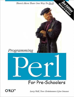
Anywho, give credit where credit is due, yadda yadda. --¶ 01:58, March 23, 2012 (UTC)
- I added back the camel guy. -- This has been an automated message by Cute Zekrom (talk) 19:52, March 23, 2012 (UTC)
- I'm not really sure either of you really understand what The Reefer Desk is for, you guys might be looking for UN:PIC. -- 22:00, March 23, 2012 (UTC)
- I'm not sure you understand that i don't really care, i happened to randomly look at my old uploads and notice the picture was here. --¶ 00:55, March 26, 2012 (UTC)
- Is this Paragraph or Qzekrom? Because if it's one of you two, you forgot to log in. -- 01:44, March 26, 2012 (UTC)
- I'm gonna guess it's Paragraph's IP, as he is the one who uploaded the image in the first place. But I'm kinda confused as to why Qzekrom would put somebody else's image on the Reefer Desk... -- The Zombiebaron 04:00, March 26, 2012 (UTC)
- Like I said, I think they're misunderstanding what the Reefer Desk is for. -- 04:34, March 26, 2012 (UTC)
- It's probably Paragraph. My IP is 68.173.113.106. --
 alkies 00:40, March 27, 2012 (UTC)
- IDK man, i don't really mind all that much that someone wants to improve an image of mine, i just don't like someone else taking full credit for something they didn't do, not just to my stuff, not just here, just in general. On top of that, i have no clue what this page is for, i just saw my picture was on here and read about it and wanted to have some input. --¶ 00:52, March 27, 2012 (UTC)
| Please Help this Picture
|
What the hell is this, like someone spray-painted the sign? It's a vandalized version of the Bulbapedia logo. Image credit: Qzekrom
Nominate - discuss this image
|
|
Not actually funny in any way shape or form. Or maybe it's actually the funniest joke in the world, and there's just something I'm not getting. Either way, explain. -- 00:43, March 5, 2012 (UTC)
- The latter. Ever heard of the Great Bulbapedia Turkey Shoot? It was this nutjob named Ph34r trying to get his point across on that site by vandalizing a bunch of articles, renaming pages, etc. Cute Zekrom! Use Fusion Bolt NOW!! • It's super effective! 01:12, March 5, 2012 (UTC)
- I still don't see how this is funny. -- 01:50, March 5, 2012 (UTC)
- It is. QED. --
 God talk - contribs 03:04, March 5, 2012 (UTC)
- See? Cute Zekrom! Use Fusion Bolt NOW!! • It's super effective! 03:04, March 5, 2012 (UTC)
- I think God may be wrong on this one. I can't say it's funny unless you actually tell me why. What's the point? What makes it funny? I get the background on the image, now tell me what you are making fun of, or spoofing, or pointing out about the situation. -- 05:04, March 5, 2012 (UTC)
- Yeah, I agree with Magic man. Everything about this image is terrible. My recommendation for improving it is to completely forget about it and try something totally different. -- The Zombiebaron 05:22, March 5, 2012 (UTC)
- Alternatively, you could just upload a clean version of the image over the top of this one. Pup 05:32 05 Mar '12
- Got it.

- Now how can we use this thing? Maybe someone can come along and color it red with a hammer & sickle, because I think Bulbapedia's kinda Communist.
- Cute Zekrom! Use Fusion Bolt NOW!! • It's super effective!00:45 06 Mar '12
- What? Look, dude, you really need to learn how to be more clear. I think you might be misunderstanding what RD is for. The purpose of RD is for you to make and image, and have us tell you how you can make it better. I believe you might be looking for this. -- 01:53, March 6, 2012 (UTC)
- Two things you're missing here. First of all, I used MS Paint to create that because I don't have Photoshop or anything like that, so I can't make anything look very nice (except Pokémon sprites). So I'm going to need someone to fix it up a little by making it transparent. Second of all, I gave you the original image (which might be useful here on Uncyclopedia, like what I'm doing here). No copyright infringement or unoriginality was intended in uploading it. Cute Zekrom! Use Fusion Bolt NOW!! • It's super effective!02:04 06 Mar '12
- Two tools i think you need to look up. GIMP [[1]] and [Phoenix Editor]. The "I don't have Photoshop" excuse hasn't been valid for quite some time, the only excuse you would have now that you know about these two tools are "I'm too lazy to learn how to use GIMP" and "I'm too lazy to actually do any work, so here's my crappy idea, please make this image thanks". No offense to you dude, just might be good to look around for your options before shouting "I ONLY HAVE PAINT". It also might help if you read this article since it has a link right to GIMP in it, here's a link to that section. --¶ 01:08, March 29, 2012 (UTC)
TheHappySpaceman Show His Face![edit source]
I am so drunk. ~Pleb  the magic!
  19:51, 01/22/2012
- The source images are very low quality - use larger images, cut them out at high resolution, and then scale down the result, and the result should look a lot cleaner. Also, the face should probably be at the same angle as the guy's head, and have some of the reflection of the hat over it so it doesn't look so clearly pasted on. 1234 ~
 22:27, 22 January 2012
- Yes. His "hat". ("Mom! I'm going to play in orbit!" "Leo, it's awfully cold outside. Make sure to put on a hat."). Sir Modusoperandi Boinc! 23:24, January 22, 2012 (UTC)
- What do you call those? >.< 1234 ~ 00:20, 23 January 2012
- @Lyrithya: A helmet. Also, I'm making the changes. (Potatochop is really slow today.) ~Pleb the magic! 00:53, 01/23/2012
Island of misfit toys[edit source]
| Please Help this Picture
|
As seen here, in a deleted scene from Rudolph the red nosed reindeer, the misfit toys dance and sing with Richard the oddly-shaped dildo. Image credit: Magic man
Nominate - discuss this image
|
|
The idea came from a conversation I was having with some friends. Whaddaya'll think? -- 03:29, January 16, 2012 (UTC)
- The dildo is going off the edge of the frame. The added part should probably also be the same colour as the rest of it; right now it's a lot brighter, higher saturation and green content. 1234 ~ 03:49, 16 January 2012
- Also, perhaps the dildo should be in front of the plane (beside the girl). And the dildo should have a face. -- The Zombiebaron 20:14, January 22, 2012 (UTC)
- Better? -- 01:37, January 23, 2012 (UTC)
- It's really blurry and has no shadows. 1234 ~ 01:47, 23 January 2012
- Yeah it's blurry and needs a shadow. Also, when I said "beside the girl" I meant the other side of the girl. Also, unless the dildo can fly it should be on the ground. -- The Zombiebaron 02:27, January 23, 2012 (UTC)
My Little Pony: Franchise is Moronic main characters: Apple Jackoff[edit source]
| Please Help this Picture
|
Main character in the new TV show, My Little Pony: Franchise is Moronic, Apple Jackoff is constantly masturbating, and when she isn't, her hoof is having spasms as if it has a mind of its own and that mind wants to masturbate. Image credit: El Kırby
Nominate - discuss this image
|
|
For all fans of bestiality. kırby, seriously, that's my name. Winner of <insert name here> of the month! 00:18, January 11, 2012 (UTC)
- There's too much dead space in the pic. Try moving the logo closer to the pony and clipping off some of the excess on the sides, top and bottom. Also, while I know that making odd-typeface'd letters that weren't there by hand is tough, the legs of the "R" are too narrow.
- Unrelatedly, here's how to make a signature. Sir Modusoperandi Boinc! 19:38, January 11, 2012 (UTC)
- Alternatively, instead of trimming all the blank space, you could add some sort of humorous backdrop. -- The Zombiebaron 21:10, January 11, 2012 (UTC)
The most current version has Oscar Wildes signature, but the thumbnail shows the older version with Barack as president and Oprah as secretary, is this fixable?--Angryfaic 02:11, September 2, 2011 (UTC)
- Wait, what are you asking for exactly? Because this might be the wrong place. -- 02:45, September 2, 2011 (UTC)
When I modified the image, I changed the President and Secretary signatures to Oscar Wilde for the President, and Bill Gates for the Secretary, and I moved Barack Obama's signature to the deans spot. after uploading the new changes, the thumbnail did not change to reflect the new changes, either on the article it's on or on the dedicated photo page. However, once you click on the image itself on the photo page, and the image fully loads, the new changes are shown on the picture. I was wondering if it was possible to change the thumbnail to reflect the most recent changes made to the photo.--Angryfaic 02:58, September 2, 2011 (UTC)
- Oh, well in that case you should be posting this on UN:PIC. But, I would suggest just uploading the modified image under a new name, and getting this one QVFDed. -- 03:06, September 2, 2011 (UTC)
I'll probably upload a new file under a new name and bring it back over here. But anyways I'd like to know what people think of the picture anyways; improvements?--Angryfaic 13:13, September 2, 2011 (UTC)
- No, for the most part it looks good to me. It's not that funny, but it could suit an article well. Maybe make the font just a little less fancy? It's hard to read. -- 15:58, September 2, 2011 (UTC)
- Sometimes it takes the server a while to update the thumbnail. I deleted the oldest version for you. Soon, I'll delete the newest version. I'm both Spock and Evil Spock. Sir Modusoperandi Boinc! 21:51, September 2, 2011 (UTC)
- I don't see anything wrong with it, except that it's not all that funny. But other than that, it's fine. -- 04:29, August 12, 2011 (UTC)
- This is a render of a model, yes? Thing is, it's too easy to tell. It appears to just be a cylinder, which, yes, is the logical base shape, but it needs more geometry at the ends. Look at the shape of an actual battery and round the edges a bit like that, and add the bumps and ridges at the end, especially the big button-like one, which right now just looks terribly wrong because it's apparently just a texture - those will work head on, or as details and whatnot, but they make no substitute for expected geometry when viewed at an angle such as this is.
- Also, it's so... plain. Like a sketch, not a final render, you know? Default surfaces and lighting, no surroundings... batteries tend to be shiny, so why not use a blinn or something? Good renders also tend to have depth and surrounding - at least add an invisible plane so it can drop a shadow, or maybe put it on something specific, perhaps something that would make the joke clearer, as currently I have no idea what it's supposed to be save for perhaps some vague pun, and use some more dynamic lighting to get good shadows. You've seen how folks'll overdo that in advertisements and the like; it can look good, and it's also kind of inherently funny, so why not parody that?
- Another thing is the textures themselves - the stars don't seem to be high enough resolution for the zoom and size of the render; I suspect you know how to fix that. But what of the stripes extending slightly past the stars on the near side, is that intentional? 1234 ~ 14:26, 12 August 2011
- The extension of the stripes was unintentional, but I actually liked the result with that The render was done using GIMP, as my 3D modelling is horrible. Hence the choice for the end of the battery being the "flat" end. Shadows are off on that end, which I could have rectified by some rotation before the render, but the software didn't give me much flexibility. But the idea was topical, hence this has been a little rushed. I can tidy up the image itself - have to eventually get over my reluctance to do decent 3D stuff - but as for the concept, nit the execution, thoughts? Pup 12:43 13 Aug '11
- I really don't know what the concept is, sorry. O_o 1234 ~ 00:54, 13 August 2011
- Make the battery look like a dick. Cute Zekrom! Use Fusion Bolt NOW!! • It's super effective! 23:06, March 4, 2012 (UTC)
- My $0.02? I think it needs, in very fine print, possibly where it currently says "do not dispose of in a fire", the words "Made in China". I (hope) i grasp the concept, and an overly patriotic AA battery needs to be made in china for it to really be american. I'd also add a second cylinder up front like a real battery so it looks a tad more realistic. Hit up google images for references photos of AA's, you might even want to abandon the render and edit one of the existing images there. --¶ 01:24, March 29, 2012 (UTC)
- At the time I did this it was very timely. It's now a little old news, but I've also taught myself to work with better 3D image generators. If I did this again it would be a very different render that I did, and give a more 3D effect on the end. It's just a question of wether or not it's worth it now. (And it did have made in China on it but it wrapped around too far, and I figured it didn't make or break it enough to redo.) Nominally Humane! 02:04 29 Mar
- What is this? -- The Zombiebaron 15:15, July 11, 2011 (UTC)
- It's a spoof on this movie's poster. And while it's a good idea, it's poorly executed. The white space doesn't look good as a background, and if you're going to only have two, why is it off to the left? Why not have it more centered? I would suggest that you just use your own font in order to do that. Then, to get the lines, just use the rectangle select. That'll do for a start. -- 23:23, July 11, 2011 (UTC)
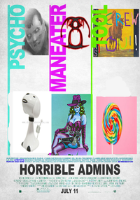
- I second Magic man's suggestions. Particularly you'll want to have at least three entries and either clean up the font by hand or, better, come up with a good-enough substitute by shopping through fonts that look good in sans-serif caps (Arial Black's a half-decent ape for Windows). You might just want to start from the original poster again for this and just stretch the fonts over if you have something that handles layers well. I thought that the effect would be even greater if you were to, as in the original movie poster, match the bosses with pictures representative of users who would either loosely or realistically be or have (almost) been their nemeses/subjects of ridicule.
Contentwise, I'd also recommend making judicious use of the cast listings that accompany such "coming soon" posters. If you want to get fancy, you could conceivably put the image in a frame (and even then that in a photo scene) or fake lighting or something. -- KUN VFH POTM VFP(IMAGES⇔TALK) 03:13, July 12, 2011 (UTC)
- Also, shouldn't Zombiebaron be the maneater? Seeing as he's a zombie and all. Maybe Lyrithya's corresponding nemesis could be something do do with VFD (Seeing as she deleted it once)? -- 05:03, July 12, 2011 (UTC)
- Realistically, admins would all be the tool. Sir Modusoperandi Boinc! 08:11, July 12, 2011 (UTC)
- Originally, I did want to include the third column, as well as the bottom panel, but it got so ridiculously messy I was forced to paint over most of the poster just to make it look even presentable. That's why I had to settle for two columns instead. Also, the reason I tagged Lyrithya as a maneater was because this term is usually used for females, which she is. I think MeepStarLives may have succeeded where I failed. Could we nom his version, or would even that require a bit of work? --Scofield & Friends 12:42, July 12, 2011 (UTC)
- Well I think Meep was just doing an example version. The last column doesn't make any sense, and the things in the bottom for the other two, don't correspond with the admins at the top; I think Meep just put random things down there. As for Lyrithya being the maneater, I get why you put her as maneater, I just think it would be funnier and more satirical to put Zombiebaron in that place. Also, while yes, Lyrithya is a maneater, Zombiebaron is not a psycho. But if you switch them around, the both work, because Lyrithya is a psycho, and Zombiebaron is a maneater. -- 15:19, July 12, 2011 (UTC)
- LOL Magic man! But who oh who is the tool? --ShabiDOO 18:21, July 12, 2011 (UTC)
- Roman Dog Bird? -- 22:04, July 12, 2011 (UTC)
- Well, they weren't umm.. totally as unthinkingly placeholder as that. ZB's picture was set against one that I believe was from Kakun. I didn't come here much those days, but since Zombiebaron rules VFP with an iron fist and since Kakun had to get written up in Flammable's Office and submit to a separate VFP system for so many of his images failing (uh oh, I better watch out) I thought it was a bit of a fit considering the next two. I actually should have just put up a text image. Lyrithya's nemesis wasn't really at all either, although I think people might have thought there was some friction at the end, as the blue woman's picture was one of the last things Zana put up on her userpage before her recent departure. That third one's indeed RDB and the picture below his of Smurfette referred to a troll or family of trolls I personally watched hours of changelogs for as I believe RDB specifically and other admins reverted their edits. I remember a name that I can't actually type in because of the spam filter (in fact, the patriarch of The Smurfs) specifically, but I've seen quite a lot of Roman Dog Bird haters, page defacers, slanderers, and would-be intimidators, so he's an iconic admin in my book, and I'm sure the Smurfette could be subbed for any actual troll, unless there's some recent user to user thing I'm not clear on. --KUN VFH POTM VFP(IMAGES⇔TALK) 10:11, July 26, 2011 (UTC)


