 | This page is an archive. The contents have been moved from another page for reference purposes only, and should be preserved in their current form. Discussion or voting on this page is not current. Any additions you make will probably not be read. |
Dumb and Dumber
| Please Help this Picture
|
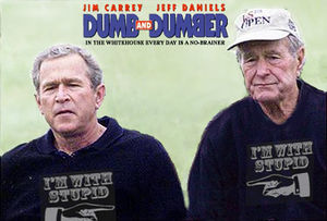
From the Producers of "Three Men and a Blowjob" and the director of "There's Something about Khomeini" comes a new comedy about presidental incompetance: Dumb and Dumber. Coming to a Democratic campaign near you! Image credit: Isra1337
Nominate - discuss this image
|
|
Someone put up an image with this joke on VFP. I decided to see what would happen if I tried to do it well. Comments, suggestions? --- Rev. Isra (talk) 22:17, 17 October 2006 (UTC)
- Pretty good. I think it would be more effective if you put elder Bush on the left and tried to get their names in the title.--Procopius 16:47, 17 October 2006 (PDT)
- The problem is, while your image itself is original, the idea itself is far from it. Googling images for "dumb dumber bush" I came up with several varations on the theme: I'm sure that there are more...The VFP'd one, by the way, had Bush Jr and a Bush Jr impressionist. --Sir Modusoperandi Boinc! 00:33, 18 October 2006 (UTC)
- How about you do Steven Harper (He's my Prime Minister, eh?) and Bush. They are like clones it seems. --Sir Zombiebaron 19:46, 17 October 2006 (PDT)
- Thanks for comments everyone. Probably this won't ever be feature material, so I think I might just leave this one alone. Anyone who has a home for it is welcome to use it though. ---
 Rev. Isra (talk) 03:18, 18 October 2006 (UTC)
- Heheh, love it.. -- Hindleyite 18:13, 18 October 2006 (UTC)
Mementos
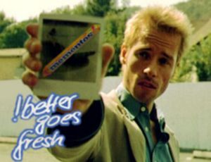
- I thought of this when I was making Leonard's arm for Memento, but it didn't fit the burgery theme of the page, so I never made it. Apologies for the quality, I couldn't find a hi-res cap of Leonard w/the pic...and my dvd collection is still waiting to be unpacked.--Sir Modusoperandi Boinc! 19:10, 14 October 2006 (UTC)
- You should probably flip the order to "!Better Goes Fresh".--Sir Modusoperandi Boinc! 02:37, 15 October 2006 (UTC)
- Thanks. I should've pointed that out to me that earlier.--Sir Modusoperandi Boinc! 02:39, 15 October 2006 (UTC)
- This might be kind of crazy, so feel free to ignore it, but remember those Mentos commercials from the 90s. The basic theme of them was that someone would either do something odd or make some sort of social gaff, but then they'd pop open a mentos, chew one, everything would be alright, and then the frame would freeze, the mentos logo would come up and then the announcer would say "the fresh maker." The Foo Fighters did an entire video that was just a bunch of parodies of these commercials. Maybe you could try to replicate this effect on the scene where Leonard drinks spit or something. Except it'd be Momentos. I dunno. ---
 Rev. Isra (talk) 02:50, 15 October 2006 (UTC)
- For a page, perhaps. But I figure that any Memento page I make would just be "another Memento page" (for examples, see Jesus). My original sketch shows Leonard holding a packet o' Mentos and smiling (like the last scene of those infernal Mentos ads). This picture is more recognizable as Memento (tradeoff being that it loses a bit of Mentos).--Sir Modusoperandi Boinc! 03:01, 15 October 2006 (UTC)
Oh great, another Mentos meme. ;) (Sorry, couldn't resist.)--<< >> 03:37, 15 October 2006 (UTC)
- Nutty bunny. You're lucky that I'm still a little drunk from my Unbirthday party yesterday. An imaginary party, for an imaginary birthday, with imaginary booze. Hey, that means I'm sober! I guess I should put on some pants...--Sir Modusoperandi Boinc! 03:46, 15 October 2006 (UTC)
- Hmm, this picture says I should put some pants on... wait a minute, am I not wearing pants? Why the heck not? Man, I wish I could remember things for more than 5 seconds. Wait, what does this picture say? ... etc, etc, etc. :)--<<
 >> 04:02, 15 October 2006 (UTC)
- I must be chasing this guy. Nope, he's chasing me. Classic. I really should unpack my dvds.--Sir Modusoperandi Boinc! 04:10, 15 October 2006 (UTC)
Revised version, cleaned up and w/flipped text.--Sir Modusoperandi Boinc! 05:24, 16 October 2006 (UTC)
Darwin and St. Michael
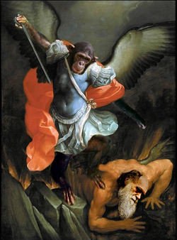
Been in a photoshoppy mood lately, and trying the religion thing again. Suggestions/problems with image quality? Does the concept work? Should I crop it more closely than the original? --- Rev. Isra (talk) 03:26, 18 October 2006 (UTC)
- Oh dear, this is funny. I was laughing so hard I was in tears.--<<
 >> 03:29, 18 October 2006 (UTC)
- Since you're asking for things that could be better, Darwin's skin color is off.--<<
 >> 03:31, 18 October 2006 (UTC)
- Changed caption as per suggestion. Altered Darwins skin color and darkened Michael's head as Severian suggested. (May require reload) ---
 Rev. Isra (talk) 03:56, 18 October 2006 (UTC)
About my comment of VFP... there isn't anything inherently wrong with it, I just think that adding head onto a picture is just a relatively simple manner of photoshopping. Of course, I should talk. Also, now I realize it's not just the head; for the monkey you also added limbs. So, in other words, I should shut up. -- §. | WotM | PLS | T | C | A
- Whoa dude, I leave off Reefer for a few days and something gets featured. AND there's a few Reefer pics on VFP to come...
Anyway, I like this. It looks a lot better in its downsized version: blown up you can see the joins, though. I know it's already been featured, but it might have benefitted from the 'chopped heads to look more painterly. As for the concept, it's brilliant. A deserved feature. -- Hindleyite 17:49, 22 October 2006 (UTC)
Field Navigation
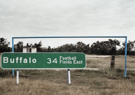
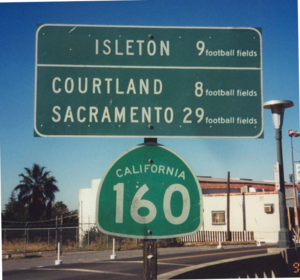
- This came from my previous attempt at road-signary. That one really didn't have a punchline, and will probably end up on an UnNews article, which since I've now given away my idea will now be, written by someone else. Anyway, this one has more of a punchline, bigger text, and includes a refrence to British sport. --The Zombiebaron 00:09, 12 October 2006 (UTC)
- Since you have Buffalo referenced, you almost HAVE to have it specifically mention wide right...--<<
 >> 00:30, 12 October 2006 (UTC)
- Maybe if you could explain what "wide right" means. --The Zombiebaron 01:06, 12 October 2006 (UTC)
- Actually, it probably won't work. "Wide right" refers to the Buffalo Bills' first Super Bowl loss, where their kicker missed a field goal at the end of the game wide right. They've been to three more since then, but were never that close to winning. Just seeing "Football" and "Buffalo" makes me think "wide right," even if it doesn't mean much in the "roadsign" angle.--<<
 >> 01:23, 12 October 2006 (UTC)
- I'm not sure if you caught on to the background or the caption, but the sport portrayed in this image is the original football, called "soccer" by you southerners, eh? Thanks anyway Brad. I'm open to any and all suggestions. --The Zombiebaron 02:08, 12 October 2006 (UTC)
St. Stephen the Martyr
| Please Help this Picture
|
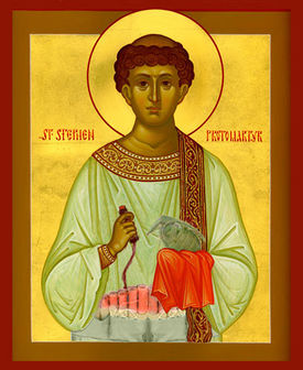
St. Stephen the ProtoMartyr, the first adherant of the Christian faith to be martyred.
According to the New Testament Acts of the Apostles, Stephen attached sixteen sticks of dynamite to his chest, detonating them in a crowded market in Jerusalem, killing 32 Zionists and 2 Great Satans, and wounding dozens more. Stephen is venerated as a Saint by the Catholic Church, and in many countries St. Stephen's Day is a publicly recognized holiday.
St. Stephen is depicted here in a 12th century Orthodox icon. The grenade in his hand is probably anachronistic.
Image credit: Isra1337
Nominate - discuss this image
|
|
Trying my hand at an image for VFP. Comments on image, caption and VFPability are welcome. --- Rev. Isra (talk) 23:32, 11 October 2006 (UTC)
- The dynamite should be more "dynamitey", a la this. Whenever I make a pic with a dynamite bomb, I put an analog clock timer on the front, like so Image:Howtosuicide-bomb.jpg; it's technically unnecessary, but I am quite mad. Mad! Also I'm of the opinion that a standalone pic should, um, standalone. That is, if it needs a caption at all, it should be short. The pic is the cake, the caption is the icing. Of course, there are those that would disagree. They think I'm mad. Mad!--Sir Modusoperandi Boinc! 23:49, 11 October 2006 (UTC)
- Looks good, althought if you could sort of... I don't know how to describe it.. dull the grenade a bit, so it looks more like it belongs in the image, it might help? It looks a bit "added-in" still.--Theo 00:30, 12 October 2006 (UTC)
- Don't listen to Modus. He's mad. Long captions are the wave of the future, my friend, and more closely parallel the evil children at Wikipedia.--<<
 >> 00:31, 12 October 2006 (UTC)
- The grenade is a little sharp but other than that, it fuckin' rocks.


 01:01, 12 October 2006 (UTC)
- I reddedned up the dynamite like modus suggested. Added a new version just before this comment, but am still having some trouble with the grenade. ---
 Rev. Isra (talk) 01:33, 12 October 2006 (UTC)
- Cool, it looks a bit like a kiwi bird. You probably just need to fade the grenade (or lower its contrast, or colour saturation) vice the kiwi-ification.--Sir Modusoperandi Boinc! 01:45, 12 October 2006 (UTC)
Mae Zedong
| Please Help this Picture
|
The Cultural Revolution led to fanatical devotion to Mae Zedong and her Little Black Book. The Chinese caption reads "The People's Liberation Army does not mind being held up, but it does mind the inconvenience." Image credit: Procopius
Nominate - discuss this image
|
|
- I liked how this turned out, although I did it with the GIMP and it may show. Anyway, if you have suggestions to improve it, I'd love to hear them. It's the only image I've made that I think has an outside chance to be VFP -- although I won't weep if it's not worthy. I know we've been hitting the Maoist stuff hard lately.--Procopius 02:24, 10 October 2006 (UTC)
- It's cute, and yes VFP took a swing to the left...don't worry, it'll turn violently to the right next. Mae West to Mao Zedong is a bit of a stretch for a pun, mostly because kids these days probably haven't heard of her (and I think the VFP crowd has matured beyond the head-swap'd pic phase). I would say that you should start a Mae Zedong page, but that link isn't red, so you already are.--Sir Modusoperandi Boinc! 02:42, 10 October 2006 (UTC)
- Thanks -- I figured the picture would have a hard time standing on its own. Oh well. I have to say it was a little spooky how well Mae West fit on Mao's head.--Procopius 03:08, 10 October 2006 (UTC)
- I'm sure there's a good conspiracy theory to explain that. Welcome to the club, if you haven't been welcomed already. "Chop-anon"; we meet on Thursday nights and talk about our head-swap and colour-balancing related nightmares. Plus there's coffee.--Sir Modusoperandi Boinc! 03:32, 10 October 2006 (UTC)
- You might want to try it at VFP; I'd vote for and, even if it fails, you'd have popped your VFP cherry, as it were.--Sir Modusoperandi Boinc! 03:34, 10 October 2006 (UTC)
- Okay, not that its bad. But it is. Why? Cause Ive seen like 200 head swaps using that same photo on VFP. Thankfully none of them are featured. --The Zombiebaron 03:37, 10 October 2006 (UTC)
- Gotcha -- I admit, it's one o' my first attempts at photo manipulation, so it's going to have a strong tendency to, um, suck. I'll just file this one under juvenalia . . .--Procopius 03:49, 10 October 2006 (UTC)
- No no don't get me wrong. If I knew who Mae West was, and if that image of Mao Zedong hadn't been head swapped so many times, I might even vote for it. But I don't and it has. Its not you're fault, so keep trying! --The Zombiebaron 06:39, 10 October 2006 (UTC)
- Yeah, don't lose heart! It's not bad for an early attempt. Someone who's never seen the poster before might find it funny... but I would try to think of a better subject for your Potatochops, this has been done before. Remember, appropriation is good, but too much and it becomes cliched. -- Hindleyite 19:19, 10 October 2006 (UTC)
- Oh yah, let my point out that some people create 93 images, but only get one featured. And I'm sure you're better then some other people, eh? --The Zombiebaron 23:54, 10 October 2006 (UTC)
- Do some people need a cookie and some milk? It sounds like some people are a little bit cranky-wanky. Maybe it will help some people if they never again put a cross made of poop on VFP, hmmm?--Sir Modusoperandi Boinc! 00:48, 11 October 2006 (UTC)
- Boys, boys, you're BOTH pretty! :)--Procopius 03:31, 11 October 2006 (UTC)
I've never seen that picture before. So I liked it. I would have Fored it  23:08, 10 October 2006 (UTC)
- Thanks for the kind words. I've seen this mocked before. At the very least, the propoganda of the Cultural Revolution opens itself to jokes very easily. Maybe it's the fanatical sincerity of it.--Procopius 03:31, 11 October 2006 (UTC)
New American Measurement System
- Okay, so as I was on the road traveling this Thanksgiving Weekend (Yes, we celebrate Thanksgiving in October in Canada), I watched milage signs go by, and though about turkey. This idea popped into my brain, and I made it. Nice story, eh? --The Zombiebaron 02:09, 10 October 2006 (UTC)
- The "football fields" could be a bit bigger; s'tough to read. Or, it might just be me. Maybe push the digits leftish and make the "ff"s bigger.--Sir Modusoperandi Boinc! 02:32, 10 October 2006 (UTC)
- Yah, I kinda thought that myself when I uploaded it. --The Zombiebaron 03:33, 10 October 2006 (UTC)
- I have now uploaded a new version of this image using the advice given to me. Procide to tell me how much I can't Potochop below. --The Zombiebaron 04:09, 10 October 2006 (UTC)
- It's a little better. There's only so much that you can do in the space provided, I guess.--Sir Modusoperandi Boinc! 04:25, 10 October 2006 (UTC)
Kafka Cartoon
| Please Help this Picture
|
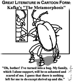
Franz Kafka started his career as a newspaper cartoonist, before being sued by Gary Larson in the court of his own mind Image credit: Modusoperandi
Nominate - discuss this image
|
|
- Be kind; I'm still learning how to use my tablet...it's better (so far) for photochopping than it is for drawing...--Sir Modusoperandi Boinc! 00:43, 9 October 2006 (UTC)
- I like the picture muchly, but methinks the caption could use a little work.
 17:28, 9 October 2006 (UTC)
- Hmm... let's see. This is of course quite funny. It strikes me immediately as something Gary Lawson would do for "The Far Side", and I think that should be mentioned in some way. It's presentation is more "funny pages" than cartoon, but that's just being picky. That's all I've got. Cheers on the funny pic.--<<
 >> 18:01, 9 October 2006 (UTC)
- "...in comic strip form", perhaps?--Sir Modusoperandi Boinc! 19:14, 9 October 2006 (UTC)
- maybe just "...in the comics." It's shorter, and still gets the point across.--<<
 >> 19:22, 9 October 2006 (UTC)
Baah! I just called it that because a few years ago I went back and read (or reread) most of the "Great Literature" that I'd skipped through in highschool and found, to my dismay, that most of what was presented as "Great Literature" was not great at all. "Pretentious" would be a better word (famous literaturologist wrote a book on The Metamorphosis with 130 different theories on what the story means. 130, and it's a friggin' short story! That's not great; that's muddled). But I digress.
"...in the comics." sounds okay.--Sir Modusoperandi Boinc! 19:44, 9 October 2006 (UTC)
So, I changed it...and liked it better before Image:Kafkametamorphosisv11.jpg --Sir Modusoperandi Boinc! 02:55, 10 October 2006 (UTC)
- Ignore that bit. I realize I misread the tips before. Changed it, and like it. --Sir Modusoperandi Boinc! 00:45, 11 October 2006 (UTC)
- Might be funner as a page from a Kafka Coloring Book. Maybe Kafka was originially a children's author.--Rljenk 23:58, 9 October 2006 (UTC)
- If it was for a page, perhaps. But I've wasted too much time on Kafka as it is. --Sir Modusoperandi Boinc! 02:55, 10 October 2006 (UTC)
- I think it's about as good as it's going to get, now. Put something about Kafka getting sued by Gary Larson (creator of "The Far Side") in the caption, and I think you've got a winner.--<<
 >> 00:42, 12 October 2006 (UTC)
- Or, to be more Kafkaish (and a sly reference to the awful "The Trial"), "Franz Kafka started his career as a newspaper cartoonist, before being sued by Gary Larson in the court of his own mind". Wow, that didn't seem all that obscure until I typed it out.--Sir Modusoperandi Boinc! 00:49, 12 October 2006 (UTC)
- It has the virtue of sounding clever enough to be funny even if it isn't, so I wouldn't worry about being too obscure. ---
 Rev. Isra (talk) 00:59, 12 October 2006 (UTC)
- I don't know if that compliment is backhanded or fronthanded...I'll take it as the latter, as it's funnier.--Sir Modusoperandi Boinc! 01:17, 12 October 2006 (UTC)
No Television
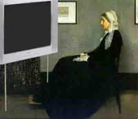
- I made this after the idea hit me. Its ranked higher then the mon lisa when you google "Famous painting" (the original, not mine!) --The Zombiebaron 22:01, 6 October 2006 (UTC)
- A test pattern on the TV, maybe (I know it's not "realistic", but there's comedy in the test pattern)?..and the TV itself seems a bit out of perspective.--Sir Modusoperandi Boinc! 23:45, 6 October 2006 (UTC)
- It's *really* low res, do you not have a better version of it?
 13:09, 7 October 2006 (UTC)
- This is a great concept. I suggest you go with it, though I would have an old fashioned, small portable television instead of the widescreen, which takes up a load of the 'canvas'. Just be careful to make it blend in with the paint. It might also help, as FM says, to get a higher resolution version of the painting - it's pretty famous so there should be loads of versions about. -- Hindleyite 19:21, 9 October 2006 (UTC)
- Good idea, a folding 1950's table tray would be the perfect thing to raise the portable TV to eyelevel. Rabbit ears are always funny.--Rljenk 00:03, 10 October 2006 (UTC)
N00b Policy
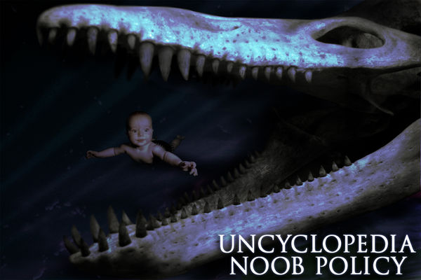
I made this for a thread on the Dump, then decided I quite liked it.  19:49, 3 October 2006 (UTC)
- It confuses and frightens me, as it did in the Forum. I can understand that at least a couple of admins have this as their windows background, but is this injoke really something that we want to promote? Other than my confusification/frightenation, it's a good image; I was a hoverbaby. Or I wasn't. It was one of those.--Sir Modusoperandi Boinc! 19:55, 3 October 2006 (UTC)
I would heavily promote this if it was up to me, I think users should get this as part of their welcome package, to leave them with no illusions. And what is this hoverbaby thing? Is there some hilarious joke that has passed me by?  20:06, 3 October 2006 (UTC)
- It's a baby, right? But it's hovering. It's not underwater, 'cause there's no bubbles. Therefore = hoverbaby.--Sir Modusoperandi Boinc! 20:17, 3 October 2006 (UTC)
- Simple as that, eh? Actually, the picture I took it from had scarily no bubbles either. But if that kid's not holding his breath, he must be enjoying some tasty bubble-gum.
 20:25, 3 October 2006 (UTC)
- Okay, I can tell that the "fish" was probably originaly surrounded by black, cause you didn't even bother to eraes the black tottally. Other then that, it seems to lack pinash, cause its just an inside joke...sorta kinda.... --The Zombiebaron 21:34, 3 October 2006 (UTC)
Actually I painted the black in. But I do feel it needs something. Some sense of movement, perhaps? I should try and find some bubbles maybe.  22:02, 3 October 2006 (UTC)
- Maybe baby in water, with a great white approaching in the background would work better than the fossil. Or a bluer background and bubbles--Sir Modusoperandi Boinc! 22:09, 3 October 2006 (UTC)
- Slightly different take? -- Sir Mhaille
 (talk to me)
- I like yours, but I made mine in response to Wikipedia's virulently soppy and ugly pictures as part of their girly-wirly policy here. Hence the biting. What it needs is something to make it look a bit more underwater, something with the lighting or something to give it a bit more motion. It's a bit slow on VFP right now, so I might just stick it up if nobody has any bright ideas for it.
 13:09, 7 October 2006 (UTC)
- I could upload a picture of Gang Rape with the caption: "Fucking n00b! Suck my dick you dirty slut!", but I won't, cause I could never do the mental image justice ;) --The Zombiebaron 23:44, 6 October 2006 (UTC)
- OK........I've tried to make it a bit more "underwatery" for you. Is this what you were looking for? -- Sir Mhaille
 (talk to me)
Yeah, that's pretty cool, thanks.  18:02, 7 October 2006 (UTC)
I have made a new one based on your input, she's underwater now.  13:28, 8 October 2006 (UTC)
- If anything, now it's too underwatery. <FM bops MO on head w/rolled up newpaper, chases MO from room> --Sir Modusoperandi Boinc! 14:49, 8 October 2006 (UTC)
Viagra
| Please Help this Picture
|
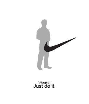
Viagra reaches out to go-getters and athletic men - unfortunately, the target demographic was way off. Image credit: Maxmillian
Nominate - discuss this image
|
|
Be funnier if it was an old dude with a walking-stick, or a zimmer.  07:51, 28 September 2006 (UTC)
- I don't know, I like the simple idea of an everyman better. Plus it goes with the caption well. -- cdr. thetoastman
 tlk ctr cun f@h 15:12, 28 September 2006 (UTC)
- I don't know...it just doesn't have it. It's a funny picture and all...but I feel its missing something...and Im not sure what. --The Zombiebaron 01:11, 29 September 2006 (UTC)
I made another one. Maxmillian 03:42, 13 October 2006 (UTC)
- It looks good, but I don't get the new reference.
 00:09, 30 September 2006 (UTC)
- The first one (pictured here) is a Nike joke, the second one is Gatorade. Google search either to find out more. --The Zombiebaron 20:09, 1 October 2006 (UTC)
- I revised it. Behold, version 2.0. Maxmillian 03:42, 13 October 2006 (UTC)
I like the first one better, but it could be better with an actual Viagra logo and the actual Nike ad text. -- cdr. thetoastman  tlk ctr cun f@h 21:06, 1 October 2006 (UTC)
You'll probably get more votes with the Nike one, Gatorade isn't sold all round the world.  23:36, 4 October 2006 (UTC)
Diversion Convention
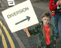
- I got the idea for this when I visited England last March. As I was walking to the Globe Theater, I saw a sign that said "Diversion" and had an arrow pointing up. Sadly, the camera which I took the picture of this sign with was lost, and I forgot all about it. Until recently when I found an image of one of a "Diversion" sign somewhere on the interweb. And from that image, this image was born! --The Zombiebaron 16:27, 16 September 2006 (UTC)
- I take it that "diversion" is brit for "detour"?--Sir Modusoperandi Boinc! 05:09, 18 September 2006 (UTC)
- Yes. --The Zombiebaron 12:55, 18 September 2006 (UTC)
- Okay, then. I must not be british (although I do drive on the left side of the road; it's good for the heart).--Sir Modusoperandi Boinc! 23:59, 19 September 2006 (UTC)
Hmm... this seems to be lacking a punchline...--<< >> 01:36, 22 September 2006 (UTC)
- Ummm...but the sign is the punchline...isn't it? Any suggestions? --The Zombiebaron 01:38, 22 September 2006 (UTC)
- If there were something obviously wrong with the kid, for example...--<<
 >> 01:39, 22 September 2006 (UTC)
- If the sign was pointing away from a homeless person and toward a gay wedding couple (groom and "bride")...--Sir Modusoperandi Boinc! 01:41, 22 September 2006 (UTC)
- I'm on it --The Zombiebaron 01:47, 22 September 2006 (UTC)
Lil' Al Onestone
| Please Help this Picture
|
In a desperate attempt to make science cool to the younger generation, Oxford University quickly attempts to create a remix project... Image credit: Jocke Pirat
Nominate - discuss this image
|
|
I got inspired by A-Stien E-Stien to make something I feel is funnier funnier. Oh, and in case you're wondering about the name in German - ein = one, stein = stone. --~ 
Jacques Pirat, Esq. Converse : Benefactions : U.w.p.
23:08, 14 February 2007 (UTC)
- Try cutting the edged around Einstein closer; the leftovers around the pipe, in particular, stick out like a sore thumb. Blur or fade the edges around the hair more. It's a hard edge now; hair don't work like that (see where it overlaps the arm?). Try playing with the brightness/contrast of Albert to match it as closely as possible to the body. Lastly, as much as I love German, it is the language of love after all, if you have to explain a joke it's too obscure.--Sir Modusoperandi Boinc! 05:14, 15 February 2007 (UTC)
- I did a few things to make it a bit better. --~

Jacques Pirat, Esq. Converse : Benefactions : U.w.p.
23:57, 15 February 2007 (UTC)
- You remember that rule "'I' before 'E', except after 'C'"? Forget it for the duration of this picture.--Sir Modusoperandi Boinc! 00:43, 16 February 2007 (UTC)
- Meh. 21st century rappers can't spell anyways. --~

Jacques Pirat, Esq. Converse : Benefactions : U.w.p.
03:31, 16 February 2007 (UTC)
- Still working on this? A mathematical/German death metal band font could be nice. Try playing around with typefaces to see what works best. -- Hindleyite Converse • ?pedia 19:49, 13 March 2007 (UTC)
iCcordion
| Please Help this Picture
|
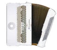
The latest and greatest electronic accordion from the number one manufacturer of white products starting with a lowercase i! Image credit: El Zoof
Nominate - discuss this image
|
|
After hours of struggling with paint.NET, I downloaded the GIMP and did this in less time than it took me to look up every rude word in every language and apply them liberally to Microsoft's lumbering pile of crud. Speaking of lumbering piles of crud, what do you think of the picture? ---El Zoof 06:34, 14 February 2007 (UTC) Stupid machine doing what I tell it to instead of what I want it to...
- Wouldn't an iCcordian only have that wheel thingy? I'm asking for real, all I know about iCrap is I don't need one. The accordian folds should probably match the iPod colour scheme. Other than that; a good take on a grossly overdone meme. --Sir Modusoperandi Boinc! 06:47, 14 February 2007 (UTC)
A-Stein E-Stein
| Please Help this Picture
|
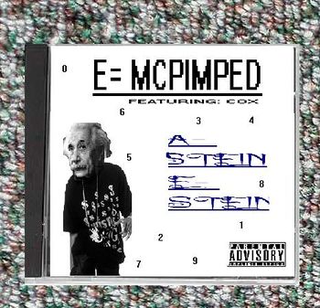
One of the few, and rare rap albums by A-stein E-stein...is this one any good guys? i made this guy a while ago. Is this even near good enough for VHP...not that i was planning on putting it there, but if it actually made any sense, how would it go down on VHP Image credit: Arborguitars
Nominate - discuss this image
|
|
- It's an interesting idea but...(take a deep breath, this may hurt)...Einstein's head is out of proportion with his body. His arm/hand doesn't look, um, human. The "pimped" should probably be superscript (offset up higher than the "E=MC"). The "A stein E stein" is hard to read. Wasn't his DJ "RLO-t.v.t." or somesuch nonsense? Not that I'm any judge, but it would get butchered on VFP, IMO.--Sir Modusoperandi Boinc! 06:42, 14 February 2007 (UTC)
seriously, to tell the truth, i just got a picture of Chamillionaire, and chopped his head off -medieval style. SO Chamillionaire just probably isnt human then if the arm looks "unhuman", or as you youngsters say "His arm/hand doesn't look, um, human." Anyway, thanks for your other help Modusperandi, it actually does help, and i also made this before i got GIMP, with ...(shudder) MS paint, so that might explain it's crappiness, but hey, Leave it to Jocke Pirat to make something better, AND ONE-UP EVERYONE! (ahem, Hannibal article) hahaha --Arborguitars 23:36, 14 February 2007 (UTC)
- I liked your concept, and I thought of doing something fun with it by making it better quality since I could do it quickly(though I'm not the best photoshopper - none of my images nominated ever got through VFP). I never really intended to one-up you with it, though. I don't know how I'm one upping someone with Hannibal, though. --~

Jacques Pirat, Esq. Converse : Benefactions : U.w.p.
01:26, 15 February 2007 (UTC)
No, i didn't mean that you were upping one with Hannibal, but as you may have noticed, i had said "making something better" before i say that you participate in upping ones. Meaning that Hannibal sucked, but you fixed it up. And i dont care that you one upped me, seriously...i also
dont care that "one upping" has lost all meaning at the end of this comment.--Arborguitars 01:41, 15 February 2007 (UTC)
Ottoman
| Please Help this Picture
|
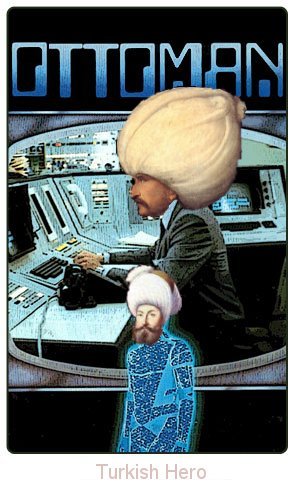
The Ottoman Empire was so great in its majesty that the kind people at Bollywood made a movie as a tribute to the empire's grandeur. Image credit: Insineratehymn
Nominate - discuss this image
|
|
This is my first attempt at making a good image using GIMP. I'm still new at it, so I decided to make something simple. Yes, I know this image may appear to be silly nonsense, but I plan to use it for a planned rewrite I have for the Ottoman Empire article. --General Insineratehymn 04:55, 11 February 2007 (UTC)
- The first 'O' is too high and the bottom Ottoman's head seems too low on the body. Automan? You know that was totally my favourite show in '84. It was wicked. --Sir Modusoperandi Boinc! 05:08, 11 February 2007 (UTC)
Methos
| Please Help this Picture
|
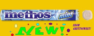
Those sneaky bastards at Ghettosweet have done it again...CURSE YOU GHETTOSWEET!...i just got GIMP and i wanted to make something easy, i know it may be a bit dumb, but i think its at least slightly funny Image credit: arborguitars
Nominate - discuss this image
|
|
- Keep at it. The first go-round isn't going to be VFP-worthy, but keep trying, and you'll get it someday. (This picture would have people calling for your head at VFP, so it's good you posted it here first. Do NOT put this on VFP unless you want your ego totally shattered.)--<<
 >> 23:18, 10 February 2007 (UTC)
- What Brad said; there's a learning curve to 'chopping. Your first attempts will always be crap. Keep at it.--Sir Modusoperandi Boinc! 05:02, 11 February 2007 (UTC)
The Road Not Taken
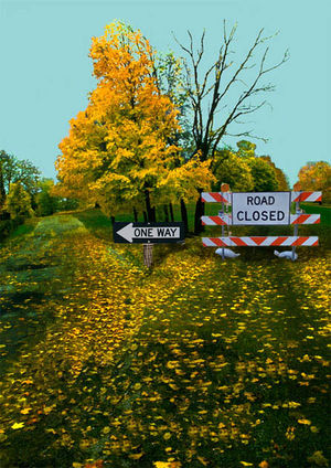
It's the no-life effect. Very simple image, but some feedback would be appreciated. Cheers - It's gneomI 09:00, 6 February 2007 (UTC)
- Nice to see poetry making its way into Reefer Desk. :) I actually think the image might work better without the poem on it. Its too small and difficult to read anyway. Maybe some of the lines could be worked into it in a different way? -- Sir Mhaille
 (talk to me)
- Cheers. The problem is, the poem was already there, hahaha. I'll figure something out. Thanks again - It's gneomI 09:31, 6 February 2007 (UTC)
- Update: I have got the new image without the poem but it looks weird. Actually I think it works better with the poem, because the "The Road Not Taken" words are very important and apparently those are the only readable words. What do you think? Cheers -- It's gneomI 10:01, 6 February 2007 (UTC)
Make the arrow in the center a bit bigger, like a regular road sign. --AAA! (AAAA) 01:01, 8 February 2007 (UTC)
The Blair Lantern
| Please Help this Picture
|
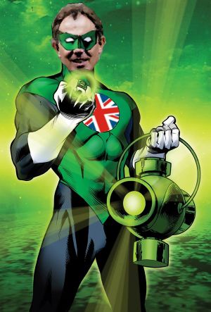
In darkest day, in lightest night, I hope no evil should escape my sight, especially if it's a terrorist, or my wife, or cancer...oh just fuck it! Ring on! Image credit: Jocke Pirat
Nominate - discuss this image
|
|
- Play around with the angle on his mask; it's crooked. For his badge, rotate it aboot fifteen degrees ccw; it should probably rest with the red cross, as they would say in the wild west, "Real upright-like". Also, there's a comic book ear under his right ear. Or maybe it's neckfat.--Sir Modusoperandi Boinc! 03:08, 5 February 2007 (UTC)
- I tried to fix it. This should be more spot on, though I can't really help that his head messed up the power ring's glow. --~

Jacques Pirat, Esq. Converse : Benefactions : U.w.p.
03:38, 5 February 2007 (UTC)
- Try making a blurry circle that's the same colour as the glow, cut out the center (again, blurred), and paste it as a "soft color" layer on top. Or, if you've got a steady hand, airbrush it in.--Sir Modusoperandi Boinc! 03:45, 5 February 2007 (UTC)
- Fixed by using layers and opacity options while erasing. --~

Jacques Pirat, Esq. Converse : Benefactions : U.w.p.
03:52, 5 February 2007 (UTC)
- /me shakes Magic-8 ball. "Outlook cloudy". I dunno. My own record with VFP is something around 4/10...so I'm not the one to answer your question.--Sir Modusoperandi Boinc! 21:59, 6 February 2007 (UTC)
- I got the idea from someone I met at a summer camp. And, yes, this is an actual, non-photoshopped screenshot. If it's well recieved, I might put it on VFP. Blah Blah Blah 16:40, 4 February 2007 (UTC)
- As a joke, it's pretty funny of Microsoft. As an "..actual, non-photoshopped screenshot" it's not VFPable (VFP has to be original), unless I'm misreading what you've written here, above my paragraph, in the paragraph above. Above this paragraph, I mean.--Sir Modusoperandi Boinc! 21:26, 4 February 2007 (UTC)
- Well, it's not photoshopped, but it is manipulated. I made the javascript code to create a popup that said "Popup Blocked," and then took a screenshot of it, so it is original, just not photoshopped. Blah Blah Blah 13:30, 5 February 2007 (UTC)
- Ah. Better. Of course now the rugby team is totally gonna stuff you in your locker...--Sir Modusoperandi Boinc! 18:04, 5 February 2007 (UTC)
Make it more clearer (I suggest PNG). --AAA! (AAAA) 22:51, 7 February 2007 (UTC)
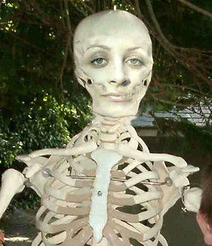
Nicole Ritchie's new swimsuit body
Comments/suggestions? --ynnaD 14:33, 3 February 2007 (UTC)
- Thats..its..ju..SHE HAS HAIR YOU KNOW!--Arborguitars 18:29, 3 February 2007 (UTC)
- (Off topic - Who? /me checks interweb. Wow, fame has changed. Being the dumb friend of a rich, spoiled whore qualifies as "famous" now). Rather than putting her face onto a skeleton, try putting a skeleton onto her; it would look more...human (like a skinny human, rather than a fleshy skeleton, if that makes any sense.--Sir Modusoperandi Boinc! 07:59, 4 February 2007 (UTC)
- Modus has sound advice - but I have to say that her face on that skeleton looks a bit like the man in the moon, so don't be afraid of color. Dame
 GUN PotY WotM 2xPotM 17xVFH VFP Poo PMS •YAP• 21:20, 4 February 2007 (UTC)
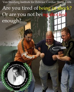
Shocked too much?
I whipped up this for an image request. Tell me what you think... --~ 
Jacques Pirat, Esq. Converse : Benefactions : U.w.p.
01:16, 27 January 2007 (UTC)
- The text is too far left; it doesn't have to be centered, but it's making me lean way over. Maybe that's just me. Depending on whether the people have feet or not, try moving them up (maybe mirror them), put the text on the top, and the logo on the bottom right. It might balance better that way (it's bottom heavy right now).--Sir Modusoperandi Boinc! 03:09, 27 January 2007 (UTC)
- Better. Try having the text as:
- Tired of being in shock?
- Or are you not getting
- shocked enough?
- That will eliminate the need for the text to spill onto the people. I didn't know that the angle of the people differed that much from the background pic; it looks like they're flying. Maybe crop a bit off the bottom (after moving the logo up).--Sir Modusoperandi Boinc! 09:48, 27 January 2007 (UTC)
- Heh, that's quite good. Only problem is that I can't read the red text on that browny background. Consider making it a paler colour or giving it a border or something. -- Hindleyite Converse • ?pedia 11:38, 3 February 2007 (UTC)
Grues in odd places
| Please Help this Picture
|
I made this for the grue page, and i think it is a buttload better than the other picture i just submitted...anyway, what can I do for this little guy? I don't mean to bring up a cliche, barely funny joke...but i thought about it AND JUST COULDN'T NOT MAKE IT! Image credit: Arborguitars
Nominate - discuss this image
|
|
- /me looks confused, shrugs. Leno chin is pointy, domokun are cubic. Leno is really white, domokun are brown. I'm not seeing the link. As for how to improve it; work in higher resolution, jpgs (depending on your application) artifact like an SOB (which is really noticeable in the pic). Try to keep the mouth and eyes in scale/in line (the eyes and mouth are crooked). Lastly, if it's a shaved grue (and in my fantasies, it is), you'd be able to see either a grenis or grugina. --Sir Modusoperandi Boinc! 01:45, 25 January 2007 (UTC)
- Oh dear God! What the Dickens is that creature? I want to like it, because it's pretty well made, but the fact it's a 'Grue' puts me off. It's great, in the context of the Grue page, I suppose. -- Hindleyite Converse • ?pedia 11:40, 3 February 2007 (UTC)
God's ineffable sense of humour
| Please Help this Picture
|
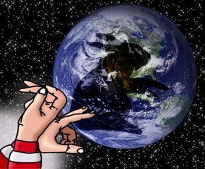
And God said, "Let there be humor."
And truly His wiggling fingers didst come forth,
And spread His holy puppet of shadow across the firmament... Image credit: Modusoperandi
Nominate - discuss this image
|
|
- It was AmercianBastard's idea. Blame him, oh LORD, blame him! Sorry, I reread Joshua recently and they friggin' go allcaps on Lord all the time...--Sir Modusoperandi Boinc! 06:39, 23 January 2007 (UTC)
- Now this is funny!! Perfect for me. But wait till my image got promoted, :P. It's gneomI 07:01, 23 January 2007 (UTC)
- I like it. The only thing that I could think of that could be changed, if something *had* to be changed (which it doesn't) is a real set of hands. It's fine as it is, though. --ynnaD 17:11, 23 January 2007 (UTC)
- The only set of hands I could find that were making a shadowpuppet bunny was a lo-res cap of a book cover. They were so bad that I just used them to outline these airbrushed ones.--Sir Modusoperandi Boinc! 17:28, 23 January 2007 (UTC)
- Ha, that's great! Why do I keep thinking that's Wally from the Where's Wally books at the front though? :) -- Hindleyite Converse • ?pedia 18:52, 24 January 2007 (UTC)
- Because when I was making it I accidentally clicked on the wrong directory and stumbled onto the Waldo 'chops from a page that I won't whore here. Their commonalities are incredible: People search for both of them, they're both everywhere, both sell a lot of books, they're both fictional...*zap!*...one of them is fictional. --Sir Modusoperandi Boinc! 19:00, 24 January 2007 (UTC)
- ...I may change it to white sleeves; I'm not attached to it.--Sir Modusoperandi Boinc! 01:31, 25 January 2007 (UTC)
- No. I like Waldo. However, the shadow puppet could be something more funny. Like...me. Or...you know...something else funny...I'm not sure...you'll think of something funny... --The Zombiebaron 01:39, 25 January 2007 (UTC)
- Shadowzombie? I think I'll stick with bunny.--Sir Modusoperandi Boinc! 03:00, 26 January 2007 (UTC)
- Me like. Dame
 GUN PotY WotM 2xPotM 17xVFH VFP Poo PMS •YAP• 02:30, 2 February 2007 (UTC)
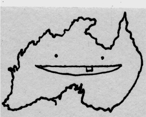
'appy birthdai A'straiya!
| Please Help this Picture
|
this was an image used on this stupid thing in social studies that got me a lunch DT...so i thought i would make it useful by putting it here. I put it on the Australia page, and said that a boat full of beer sunk, and it is screaming until New Zealand wakes up. It's kind of random, and its not anything excellant yet, but thats why i'm here. Image credit: arborguitars
Nominate - discuss this image
|
|
- Need more info: What page is it for? Caption? What's the gag? Without context it's just...this.--Sir Modusoperandi Boinc! 03:52, 20 January 2007 (UTC)
- Well, it was all worth it for a dit. What about if you expanded the concept to the whole world, with the map of each country anthromorphosised, or whatever, to include a face. The Australian one would have a cork hat whilst the Britain one would have a monocle and top hat etc. -- Hindleyite Converse • ?pedia 11:42, 3 February 2007 (UTC)
![]() Rev. Isra (talk) 22:17, 17 October 2006 (UTC)
Rev. Isra (talk) 22:17, 17 October 2006 (UTC)
 Rev. Isra (talk) 02:50, 15 October 2006 (UTC)
![]() >> 03:37, 15 October 2006 (UTC)
>> 03:37, 15 October 2006 (UTC)
 >> 04:02, 15 October 2006 (UTC)
![]() Rev. Isra (talk) 03:26, 18 October 2006 (UTC)
Rev. Isra (talk) 03:26, 18 October 2006 (UTC)
 >> 01:23, 12 October 2006 (UTC)
![]() Rev. Isra (talk) 23:32, 11 October 2006 (UTC)
Rev. Isra (talk) 23:32, 11 October 2006 (UTC)
 Rev. Isra (talk) 01:33, 12 October 2006 (UTC)
 23:08, 10 October 2006 (UTC)
 17:28, 9 October 2006 (UTC)
 >> 18:01, 9 October 2006 (UTC)
 >> 19:22, 9 October 2006 (UTC)
 >> 00:42, 12 October 2006 (UTC)
 Rev. Isra (talk) 00:59, 12 October 2006 (UTC)
 13:09, 7 October 2006 (UTC)
 19:49, 3 October 2006 (UTC)
 20:06, 3 October 2006 (UTC)
 22:02, 3 October 2006 (UTC)
 (talk to me)
 13:09, 7 October 2006 (UTC)
 (talk to me)
 18:02, 7 October 2006 (UTC)
 13:28, 8 October 2006 (UTC)
 07:51, 28 September 2006 (UTC)
 tlk ctr cun f@h 15:12, 28 September 2006 (UTC)
 00:09, 30 September 2006 (UTC)
 tlk ctr cun f@h 21:06, 1 October 2006 (UTC)
 23:36, 4 October 2006 (UTC)
![]() >> 01:36, 22 September 2006 (UTC)
>> 01:36, 22 September 2006 (UTC)
 >> 01:39, 22 September 2006 (UTC)
![]()

 01:26, 15 February 2007 (UTC)
 >> 23:18, 10 February 2007 (UTC)
 (talk to me)
 02:59, 5 February 2007 (UTC)
 21:36, 6 February 2007 (UTC)
 GUN PotY WotM 2xPotM 17xVFH VFP Poo PMS •YAP• 21:20, 4 February 2007 (UTC)
![]()
 01:07, 5 February 2007 (UTC)
 GUN PotY WotM 2xPotM 17xVFH VFP Poo PMS •YAP• 02:30, 2 February 2007 (UTC)