UnNews:Study shows 69% of data graphs contain sexual innuendo
5 November 2006
HALIFAX, Nova Scotia -- The York Hunt Memorial Research Institute published a study today that reports up to 69% of charts and graphs designed to display seemingly innocuous data actually may contain subtle forms of sexual innuendo.
The findings came after a team of scientists closely examined market reports, financial magazines, and dozens of other forms of media to investigate the prevalence of sexual innuendo in data charts. The results clearly showed that innuendo was even more widespread than they had anticipated. In a press conference in Halifax this morning, lead researcher Dr. Mike Hunt, great-grandson of the Institute's namesake, spoke on behalf of his team about the controversial new findings.
"There's no doubt in our minds that the occurrence of sexual innuendo in data presentation has exploded in the last few decades. Me and my colleagues, during the entire eighteen-month period where we pored over data samples, practically had constant erections. During the last few weeks, three members of our team had to be pulled from the project because so much blood was circulating through their penises it was affecting oxygen transport to their brains. This is most certainly a disturbing trend, though, admittedly, one that bodes well for the adult entertainment industry. I can't tell you how much cash we've blown on porno and hookers in the last year and a half to stave off our horniness."
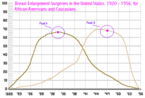
Factors contributing to the rise in innuendo include the shape of the graphs and newer methods of presentation. Three-dimensional pie graphs, the report stated, just look "rounder, firmer, and juicier" than their two-dimensional counterparts, and the smooth curves of rolling line graphs created with modern rendering programs "can't help but give the viewer the urge to rip out the page and caress it". Cunning linguists, employed by data analysis companies to make their data more appealing to the reader, are also able to forcefully insert suggestions into the dark crevices of the reader's mind.
Dr. Hunt recommended at the end of the conference that the government take immediate action to quell the tide of innuendo in data graphs.
"If we don't act quickly, this problem could explode into a messy ejaculation right onto the unsuspecting faces of the Canadian people."
Sources[edit | edit source]
- Associated Press "New study shafts previous defense of data graphs" CNN.com, November 5, 2006

