User talk:Sourcerror
Welcome to our magnificent civilization![edit source]
Greetings, honored traveler Sourcerror, and welcome to the glorious nation of Uncyclopedia! Thank you for your contributions to the site. I hope you enjoy this great land and decide to make a home here. If not, the city exit is right over there... no, a little more to your left... yeah, there you go. Anyway, here are a few helpful links for humble newcomers such as yourself:
If you read any of Uncyclopedia's sacred parchments, make it the above two links. If you want to find out more about Uncyclopedia or need more help with some sort of issue, try these:
- About Uncyclopedia and The five pliers of Uncyclopedia
- How to get started editing on uncyclopedia
- Everything you ever wanted to know, but were afraid to ask
- Help Pages - if you need help with a specific issue
I hope you enjoy editing here and being a proud citizen of Uncyclopedia! Please remember to sign your name on all talk pages by typing four tildes (~~~~) or alternatively use the "sign" button (![]() ) that you see just above the edit box. This will automatically produce both your name and the date.
) that you see just above the edit box. This will automatically produce both your name and the date.
If you need any sort of help, then feel free to ask me on my talk page, ask at the Village Dump, or add the following template: {{help}} to this page along with a message describing your dilemma and someone will come along and help you if they can.
Again, welcome! -- 02:20, 18 February 2007 (UTC)
javascript[edit source]
You probably want to put your javascript at User:Sourcerror/uncyclopedia.js rather than monobook.js as uncyclopedia.js is the default skin here. • Spang • ☃ • talk • 12:19, 23 Mar 2007
HTBFANJS[edit source]
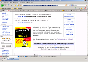
I don't know what you're seeing when you edit, but the way you keep rearranging the pictures on it kinda sucks. See >>
Left aligned images generally don't work especially around the TOC, and disrupt the flow of the text. Best keep them on the left and let the text do the talking. • Spang • ☃ • talk • 00:01, 09 May 2008
- Strange, in Firefox 3b5 it looks fine. I just wanted to keep the dummies book next to the intro text. Also the clown should be next to some unfunny nonsense. (To make the reading less boring.) --Sourcerror 00:14, 9 May 2008 (UTC)
- Aha. --Sourcerror 00:28, 9 May 2008 (UTC)


