Design basics
“It looked good when I was drunk.”
– Milton Glaser on Design
Design is a specialized school of study that takes years of classroom learning and practice. Designers once commanded huge salaries and were considered intellectuals. Since the advent of Adobe Photoshop any idiot can be a designer and command salaries upward of $9 hourly.
Designers make things look good, or at least make people think they look good enough to buy them. So, to be more accurate, design is the art of making people think something looks good whether or not it really does.
Most designers could have been lawyers or politicians, but there were some ethical lines they won't cross. After all, if someone buys a product a designer designs, they can always throw it away when the next product comes out, which they will probably do anyway. In most cases, this means six months to a year, although in the case of computer design, a couple of weeks.
People are stuck with the shit lawyers and politicians dish until the next wave of politicians or lawyers come along.
The History of Design[edit | edit source]
Most anthropologists agree that design can be traced back to the household goddesses early men carried with them as they hunted or gathered. These goddesses were highly stylized, usually with extremely large breasts, unlike real women.
Unfortunately, wives formed leagues of decency which forced the nude female figure to be reproduced as art and displayed in temples and museums. Their husbands and sons were forced to travel to see the nude form instead of hiding it under their mattresses (which, admittedly, made the mattresses extremely lumpy and uncomfortable for their wives).
Design continued, but as an offshoot of the more superior art. It wasn't until the 1950s that Hugh Hefner found a way to bring the stylized figures of the female form back into the home. Only he did it with magazines, which were easier to hide.
The name "design" didn't enter the language until the period of Roman architecture. Tato, ancestor of Tatoo of Fantasy Island, noticed that the architect of the early colosseum forgot to raise the sign "Colosseum" before the public opening. As the crowds pushed their ways inside, he repeatedly yelled, "De sign. Boss, de sign."
Unfortunately the colosseum collapsed do to poor planning, killing several hundred visitors. The architect, Erectus Malus, misunderstood Tato's warning to mean he had failed to properly plan the colosseum, or even draw preliminary sketches. He gave the name "design" to the plans for the construction.
When his patron and spectators congratulated Erectus for his new success, he realized he could hire yet more workers as "designers" and hit up his patrons for even more money. His success was copied by other architects, such as Dullis Copyus and Plagiarus. Artists who chose to do their own "designs" still added the costs to the final patronage bill and design became an essential stage in planning ever since, whether it be architecture, sculpture or fashion.
Design Elements[edit | edit source]
Designers work with three principal elements: point, line and shape. And color. So that makes four. But point, line and shape are the most important, except maybe for space. So space would make five. But you need space to express point, line and shape. And color. So space would be the most important. Then point, line and shape.
Except for texture. Granted, the space in digital media has no texture because it's all pixels displayed on a monitor, but if you print digital designs you get some texture, unless you use the expensive glossy photo paper. Come to think of it, digital media likes to use digital reproductions of texture, so maybe it's more important than I thought.
Line[edit | edit source]
But really, the most important element is the line. After all, points are kind of pointless stuck out there by themselves, unless you put them really close together, and then you get a line. And you can't have a form without lines, so the line is it.
But lines are really important because designers are too geeky to get laid without good lines, even when they're trying to get laid by other designers. Some of the best lines include:
- Hey, baby. If we put our points together we can make something beautiful.
- I like the form under that dress. Could you show it to me?
- What's your line? My line is design. Will you come to my apartment now?
- Would you me to fill your space?
- I'd like to draw a straight line to your canvas.
- You can color me hot every time I look at you.
Color[edit | edit source]
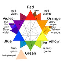
Color is so important, it's mathematical. This means that designers have to add and subtract all the time. That's why designers have to do additive and subtractive color. Since most designers failed math (or they wouldn't have decided to be artistic), they have charts to help them do math.
Designers have been known to multiply, but only with other designers or people they picked up at a party after too many drinks and too much pseudo-intellectual conversation.
Unlike addition and subtraction tables, which require math, designers use pictures of colors to do the math for them. Most often they use color wheels, but they use other kinds of charts as well (see the color chart illustration). Using the charts, designers can do calculations like:
1 blue + 1 red = purple
1 red + 1 yellow = orange
This seems easy, but purple is actually between blue and red rather than higher, which shows how little designers understand even the basics of math. And since calculators can't be programmed with designer math, because it doesn't make sense, they use charts and wheels.
Design Principles[edit | edit source]
Most designers realize that all the elements in the world won't help them if they don't have some principles about how to use them. For most people these principles would be, "don't steal," or "don't backtalk you mother," or "treat your neighbors the way you want them to treat you."
Not designers, however. They have to have their own principles, all to themselves, that nobody else seems to understand. These principles include things like "unity" and "balance," which don't seem like principles at all so much as words or topics.
Unity[edit | edit source]
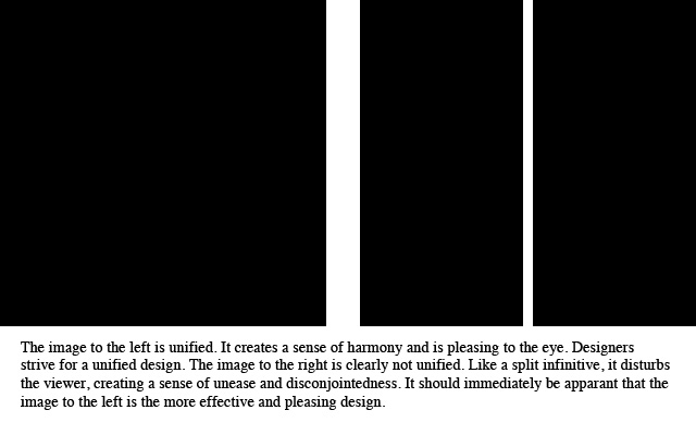
Unity is the most important principle of design. If a design isn't unified, it fails to draw the reader in. Unless it's really cool and the viewer is an anarchist or schizophrenic. Then disharmony is essential. So a design can be unified or disunified or even somewhere in between as long as the designer knows what she's doing. Or has natural talent, in which case all the design classes in the world aren't likely to be necessary.
Actually, the same is true if the designer has no talent at all. So the real point of unity is to convince would-be designers that they should all be doing the same thing, which is buy computers, Adobe Photoshop and lots and lots of design books.
Symmetry[edit | edit source]
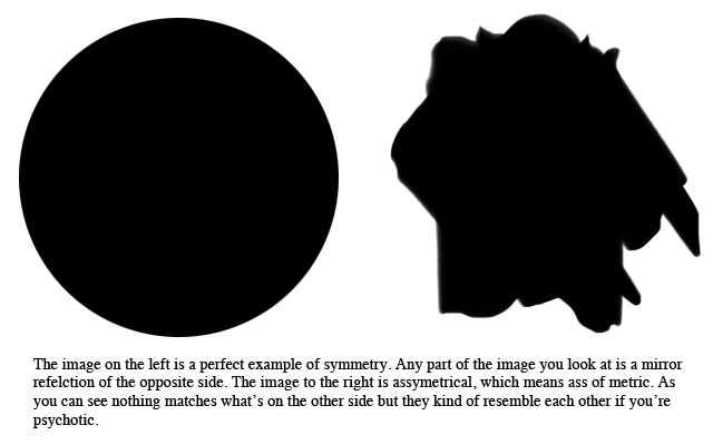
Symmetry is one of the techniques used to create unity. Even if a design is completely stupid, so long as it's symmetrical it's a design. Symmetry comes from the Greek meaning simulacrum of a tree. No one is sure exactly what that has to with it's current meaning, but somehow the meaning stayed around. The idea of symmetry is to make as much of the image look as much like itself as possible.
Asymmetry is not the opposite of symmetry so much as symmetry done badly. People may wonder why symmetry is so important when when we do something else, but that's how it is. As you might assume, the word asymmetry is used because if you use asymmetry you are making an ass of a tree.
Repetition[edit | edit source]
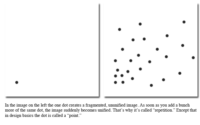
Designers also use repetition to create unity. Repetition means to repeat things and do them over and over again. In fact, it's a given that the more times a designer repeat things, the more copies of the same things he makes. A good rule of thumb for design is that the more things you repeat the more unified the image, the less things you repeat is to use bad grammar. (It should be "fewer things." "Less" and "more" apply to volume.)1
There are lots more techniques for creating unity, but the bottom line is the more unity a design has, the more harmony it will find within itself. This is a very Zen thing and design is all about Zen.
Zen, and psychology. Well, Zen and psychology and aesthetics. And making things look cool. Designers should never forget the making things look cool part.
Balance[edit | edit source]
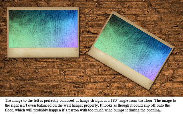
Designers should strive for balance in their work before they attempt anything else. If you can't sit straight at your desk, or stand without falling over, your work could be lopsided or you could even spill ink or point. While it is true that digital designs require less balance, it is hard to focus on your monitor if you lean too far to one side or another.
Foreground and Background[edit | edit source]
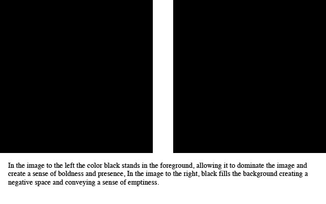
Every design has a foreground and a background. But this is hard to explain since the foreground and background are on the same level (designs are flat). The foreground is usually the smaller object floating over the larger background but sometimes the foreground is so big, the background has to peek through.
Contrast[edit | edit source]
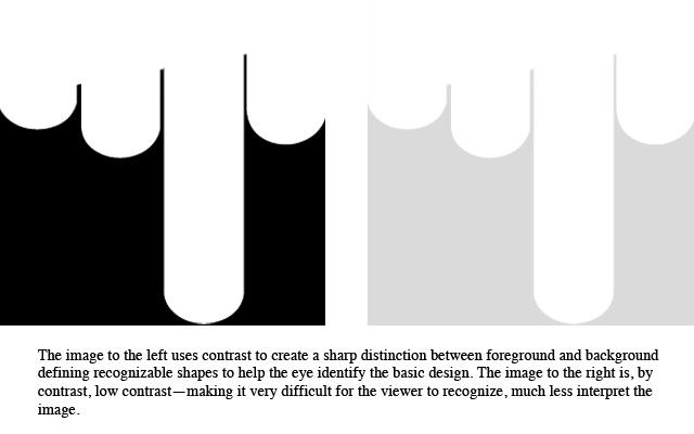
Contrast is too difficult to explain. Not as difficult as postmodernism or nuclear physics, but almost that difficult. That's why you have this nice illustration:
If you study the above illustration more carefully, you may even notice the trick image to the far right, which has no contrast at all. However that would be extremely unlikely because of the total lack of contrast, even with the page.
Gestalt[edit | edit source]
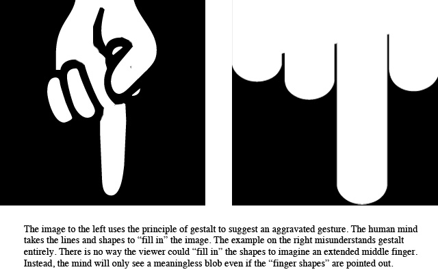
Design works on a principle called gestalt. Gestalt is a German word that literally means "get salt," a concept designers understand to mean "this design needs some seasoning." It's a psychological concept that suggests the mind suggests things. For instance, if the eye sees a bunch of twigs, the mind automatically suggests "nest" to the brain. Or if the eye sees several girls with short skirts standing in the street and smoking, the mind suggests "hookers."
Similarly, if you add a bunch of grains of salt to your dinner, the mind suggests "flavor." Which is why the German word is so appropriate.
Many designers feel they couldn't design without the gestalt operating in the mind. They believe the mind does all the work for them. Unfortunately, not everyone has gestalt. This is why they look at something and say, "my three year old can do that."
And maybe their three-year-old could. But they wouldn't be designers because they don't know the principles of design and they certainly don't have gestalt.
Footnotes[edit | edit source]
1 The illustration on unity through repetition presented below (well, actually above this footnote in the section on repetition, but below the 1 that sent you to this footnote, which is why, technically, it is the illustration below even though it's the illustration above) may appear to contradict the illustration on unity to open this section (the section on unity which contained the 1 that sent you to this footnote, not the footnote section where you are actually and currently reading the footnote), but you would be wrong. If you really understood design you would know why. If you are confused by the footnote, perhaps you should read my article on postmodernism.
References[edit | edit source]
- Ring, Bo. Principles of Design: An Illustrated, Comprehensive and Very Expensive Exploration of Darkness and Light, Not to Mention Color and Everything Else, vol 72 (New York: Accredited and Expensive Textbook Press, 2013).
- Tinsella, Ray. If You Design It They Will Buy (New York: Saltpeter Press, 1988).
- Latrrell, Tinker. Who Cares Where You Think When the Box Design Sells? [San Francisco: Alternative Everything Press, 2001).
- Dolt, Richard. What Color is My Parachute? It Doesn't Matter if I Didn't Pack It (Dimebox, Tx: Nickle Plated Press, 1966).


