HowTo
This article is part of Uncyclopedia's
HowTo series
See more HowTos
By and large death isn't fun. Hence you would think selling a product that actively keeps you alive would be a walk in the park.
the Kellogg brothers ran a hospital

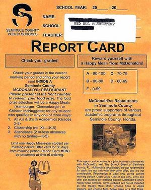
...And the prize for an F is an employment contract.
Processing the food is only half the battle, the other half is actually getting the thing sold. This is psychological warfare on a scale that would make Goebbels chow down on another cyanide pill in fright.
While fresh foods couldn't give less of a fuck if they went home with you for dinner or were dumped in a bin for worm feed, processed food does everything short of sexual favours for the consumer in the hope of a sale. They may not even stop there judging by the expressions of these mascots.
|
|
The Jack Torrance hasn't got shit on my crazy.
- << We also enjoy blue lipstick and premature baldness, but shit. That face can only exist when there are no pants within the next square mile. Seriously, that clown could not be happier if he murdered the universe and stuffed it in his basement.
- Except the clown is that happy about sugar coated rice, a foodstuff that requires only a spoon and a bowl of sugar. Minus the clown, the consumer would be lucky not to have slipped into a coma after three mouthfuls. Now we definitely won't be forgetting their product, we'll be checking under our beds every night for it. Twice.
- >> This kind of mascot also works when you have a product too difficult to sum up in a single phrase. See, one can call an apple an apple and you would know what they are talking about, but it takes Cheerios the full length of the box to explain what their product actually is. Hell, they even slapped a giant heart filled with so much dribble about the nutritional quality of their tiny rings it makes War and Peace spontaneously combust on contact.
- None of these will ever draw the attention of the customer though. Years of reading Winnie the Pooh have taught us a bit about bee behavior, specifically their habit of moving about in swarms and stinging the fuck out of everything that moves. His you're next gesture does not help this in the slightest
- Yet that is not the most troubling aspect of this marketing strategy. No, that trophy goes to the expression of the bee. Either he just saw the uncropped image of that clown or he did something awful in that cereal when no one was looking.
|
|
|
|
|
- Any clowns who look like they stuck their dangly bits in a mousetrap?
- What?
- Ok, how about screaming animals dressed in clothes for no apparent reason?
- The hell? This is talent audition, all we have are crap magicians and people who have suffered terrible hardships in their life.
- Hardships like what?
- Working in a Dunkin Donuts store.
- Damn.
|
|
|
The Get some anthropomorphism up in this bitch.
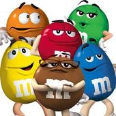
- << If anyone was paid to invent the Red and Yellow M & M's mascots, capitalism should be carted off to the nearest morgue with a tag on its big toe. Hell, they would probably still pass all the quality checks and wind up in a bag of M & M's if you put them on a Mars, Incorporated production line.
- Of course what is the point of trying when whatever mascot you create will be given the advertising equivalent of a foot to the groin by your previous slogan, "melts in your mouth, not in your hand." That phrase managed to pull its way out of the mire of jingles and word play to join the hallowed ranks of almost half the words in the English dictionary as a euphemism for oral sex.
|
Cereals, with their massive chunk of the food pyramid, must be like the blockbuster film of the food because the mascots don't even bother to turn up for every other food group. Instead the prospective company just chucks their design team more photoshop than the cover of a women's magazine and tells them to get the food to look like it is moving.
|
|
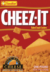
- Humans are naturally hunters. If it runs we want to spear it. If it swims we wish to hit it with an arrow. If it levitates in some kind of magical world of red backgrounds and giant cheeses, damned if we don't want to eat the hell out of it.
|
|
|
- So you wish to convey excitement but no one in the company can create a mascot that looks like it has raped enough people? Just make it appear as though someone is actively pouring A onto B. I mean, what is more exciting than a blatant ejaculation euphemism?
- An image of the product cascading from a place higher than the Empire State building if it stood on stilts seems to be the only way a company can sell a liquid or a syrup condiment.
|
|
|
- Then there is the Goldilocks style of advertisement, specifically, "...who has been breaking my food and arranging it into photogenic positions?" If someone could put in that much effort simply playing with their food, the product must be so awesome you would pawn your kidneys for another bite.
|
|
|
- Finally comes the OH SWEET MERCIFUL GOD WHAT HAVE WE CREATED. Sometimes processed foods just go beyond that line where nature is like, "...damn dude, you absolutely can't do that with a digestive system. This is like a lifetime membership for the explosive diarrhea club."
- The only solution is a massive load of colourful typography that would appear excessive to a kindergarten kid who just discovered the word art button in Word. Just look at the colour scheme of the box, the designers must either be unable to comprehend the notion of eyesight, or they wished to represent a foodstuff that gave so few fucks about anything bar the fact it tastes good that it literally absorbs all the care from the supermarket.
|
Processing the food is only half the battle, the other half is actually getting the thing sold. This is psychological warfare on a scale that would make Goebbels chow down on another cyanide pill in fright.
While fresh foods couldn't care less if they went home with you for dinner or were dumped in a bin for worm feed, processed food does everything short of sexual favours for the consumer in the hope of a sale. They may not even stop there judging by the expressions of these mascots.
|
|
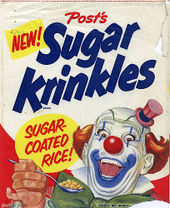
- We also enjoy blue lipstick and premature baldness, but hell. That face can only exist when there are no pants within the next square mile. Seriously, that clown could not be happier if he murdered the universe and stuffed it in his basement.
- Except the clown is that happy about sugar coated rice, a foodstuff that requires only a spoon and a bowl of sugar. Minus the clown, the consumer would be lucky not to have slipped into a coma after a mouthful. We definitely won't be forgetting their product now though, we'll be checking under our beds every night for it. Twice.
|
|
|
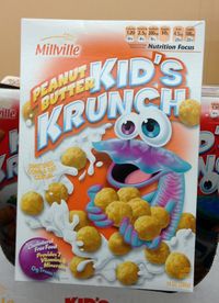
- This kind of mascot also works when you have a product too difficult to sum up in a single phrase. One can call an apple an apple and you would know what they are talking about, but Peanut Butter Kid's Krunch? You'd have an easier time classifying this fluorescent purple mascot-thingy.
- That isn't even the most troubling thing about the mascot though. Either this creature just saw the uncropped image of that clown or he did something awful in that cereal when no one was looking. Seriously, look, a tsunami of cereal is actively flowing across the box and this critter is only concentrating on the customer with an expression of desire that has crept from endearing to a look of you're next.
|
|
|
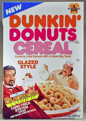
- Any clowns who look like they stuck their dangly bits in a mousetrap?
- What?
- Ok, how about animals who have mismatching eyes for no apparent reason?
- The hell? This is talent audition, all we have are crap magicians and people who have suffered terrible hardships in their life.
- Hardships like what?
- Working in a Dunkin Donuts store.
- Damn.
|
Cereals, with their massive chunk of the food pyramid, must be like the blockbuster film of the food because the mascots don't even bother to turn up for every other food group. Instead the prospective company just chucks their design team more photoshop than the cover of a women's magazine and tells them to get the food to look like it is posing, moving or floating.
|
|
- So you wish to convey excitement but no one in the company can create a mascot that looks like it has raped enough people? Just make it appear as though someone is actively pouring A onto B. I mean, what is more exciting than an ejaculation euphemism?
- An image of the product cascading from a place higher than the Empire State building seems to be the only way a company can sell a liquid or a syrup condiment.
|
|
|
- Then there is the Goldilocks style of advertisement, specifically;
- Who has been breaking my food and arranging it into photogenic positions?
- If someone could put in that much effort simply playing with their food, the product must be so awesome you would pawn your kidneys for another bite.
|
|
|
- Finally comes the What have we created!? Sometimes processed foods just go beyond that line where nature is like;
- Damn dude, you absolutely can't do that with a digestive system. This is like a lifetime membership for the explosive diarrhea club.
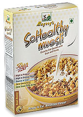
- The only solution is a massive load of colourful typography that would appear excessive to a kindergarten kid who just discovered the word art button in MS Word. Just look at the colour scheme of the box, the designers must either be unable to comprehend the notion of eyesight, or they wished to represent a foodstuff that tastes so good it forces the parts of the brain responsible for taste into a post-orgasm coma.
|
|
|
:If anyone was paid to invent the Red and Yellow M & M's mascots, capitalism should be carted off to the nearest morgue with a tag on its big toe. Hell, they would probably still pass all the quality checks and wind up in a bag of M & M's if you put them on a Mars, Incorporated production line.
|

