Template:Easybox/doc
Jump to navigation
Jump to search
 | This is a documentation subpage for Template:Easybox. It contains usage information, categories, and other content that is not part of the original template page. |
READ ALL INSTRUCTIONS
This is a simple template for making warning (or any) boxes in a page.
Syntax
{{Easybox
 |ID - if you have multiple boxes on a page, each one needs a seperate ID (The ID can just be a number)
 |size - The size of the image in px (just input the number)- default is 100
 |width - the width of the banner (type in number with unit - e.g 75%, 100px, etc) - default is 50%
 |background - The background colour of the box. - default is a dark red
 |colour - Text colour - default is black
 |sign - The type of sign. Options are: warning-red (default), warning, hand, stop, and empty. Images are at the gallery.
 |head - The header text - default is "WARNING!"
 |message - The message - default is "You have been warned!"
}}
Colours can be #hex, rgb() or css colours (red, yellow, etc).
Gallery

warning-red, warning
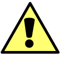
warning

hand
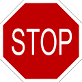
stop

empty


Usage
{{easybox|message=Blah Blah Blah|width=40%|ID=2}}
Defaults will automatically be filled in so you don't have to manually set all the parameters if not necessary.
See also
If you were looking for more practical warnings, then you may go to: