Forum:Game: Logo
I'm gonna adress this on the forum, because most people don't bother to look at The Logo Page.
The other day I ran across the Game: Namespace. I don't normally go there, but I was shocked to discover that it did not have a logo! We have put logos on every other namespace (exept User:, and most of the talk: namespaces). How come we never gave one to Game:? I made two (well one really, the second one just has text) and I encourage people to make some of their own, so that we might come up with a really good logo, and implament it. --The Zombiebaron 17:24, 26 June 2006 (UTC)
Discussion on weather or not a logo is needed
- YES WE NEED A LOGO IF WE DON'T HAVE A LOGO I'LL KILL YOU ALL!!! MUAHAHA! ~ 17:28, 26 June 2006 (UTC)
- Calm down. --The Zombiebaron 17:50, 26 June 2006 (UTC)
- NO! YOU SPELT "WHEATHER" WRONG. YOU... AAAAAAAAAAAAAAAAAAAAAAAAAAAAAAH! ~ 18:04, 26 June 2006 (UTC)
- Its a pun. --The Zombiebaron 19:29, 26 June 2006 (UTC)
- Ok. ~ 14:45, 27 June 2006 (UTC)
- Its a pun. --The Zombiebaron 19:29, 26 June 2006 (UTC)
- NO! YOU SPELT "WHEATHER" WRONG. YOU... AAAAAAAAAAAAAAAAAAAAAAAAAAAAAAH! ~ 18:04, 26 June 2006 (UTC)
Bystanders' (soapboxes') comments on new "GAME" logo
- OK. Let's talk about logo, shall we?
- A logo must be bright and look smart. Zombiebaron made a bad choice of potato and, as you can see, the resultant logo looks just as dull as it can be. The dart board was a nice try, though.
- A logo must convey the theme it carries in a simple but straight-to-the-point manner. All contestants here did a nice job on this, but when it comes to complimenting the old-school text adventure games that the actual "GAME" namespace accomodates, Vosnul's and Splaka's works seem to be better.
- A logo must be clean in design and scalable. Although we seldom get our logos here printed, it is important that we don't use complex features because when the logos go down in size they will get pretty ugly and messy. Vosnul's design seems to suffer from this problem greatly as you can't tell the thing on the LHS is actually Mario without hurting your eyes.
- Did you ask these guys for help? I don't know if they are good at designing logos but I am quite sure they have got a few tricks up their sleeves.
-- Colonel Swordman 14:48, 6 July 2006 (UTC)
References
- How to Create a Logo - not 100% applicable, but still worth a look.
Suggested Logos
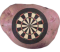
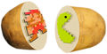
Zombiebaron Target Potato #1
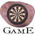
Zombiebaron Target Potato #2
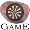
(resized to correct size, and text changed by Splaka per Rcmurphy's suggestions)
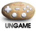
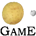
Kaizer the Bjorn SNES Potato (currently implemented on Game:)
Vosnul Classic games stupid idea Potato.. thing.
Ok, comment: it looks a bit better at actual size, and the text is crap because gif doesn't support alpha transparency.


Votes For Logos
- Yeah, the second one's good. ~ 17:28, 26 June 2006 (UTC)
- No, we want UnGame. --Nerd42eMailTalkUnMetaWPediah2g2 18:49, 26 June 2006 (UTC)
- But the name space is called "Game:" --The Zombiebaron 19:29, 26 June 2006 (UTC)
- "game" like a sitting duck in the crosshairs? --205.150.76.4 20:57, 26 June 2006 (UTC)
- Like the second one. - Sir Real Hamster {talk} {contribs} 21:42, 26 June 2006 (UTC)
- A new option has arisen. Reconsider your vote. --
 Kaizer the Bjorn takkun
  (nya nya) (1961 model!) Check out T61! 02:29, 27 June 2006 (UTC)
 - For. The third option. As much as I love darts, video games are alot more ubiquitous than before and this pic would be insantly recognizable. --Wit (tawk) 03:36, 27 June 2006 (UTC)
- For. Splaka's, for now at least. I like Kaizer's idea.. but I'm just not feelin' it. I also like what 205 said, maybe we should have a duck or something with a dart board on it...

 t o m p k i n s blah. ﺞوﻦ וףה ՃՄ ண்ஸ ފއހ วอฏม +տ trade websites 20:36, 27 June 2006 (UTC)
 - I like Zomb's with Splarka's text. The dart board looks like it's actually part of the potato, whereas the SNES controller-esque one looks like its buttons are floating over the spud. Like the concept though. —rc (t) 21:40, 27 June 2006 (UTC)
- Against. What you guys may not realise is that the "games' in the Game namespace are not video games or arcade games but computer games. Thus logos 4 and 5 must be rejected. --L
- What is this.. kompjuter you speak of ?..seriously ? , -- Vosnul 09:44, 28 June 2006 (UTC)
- But Mister, all games are games, are you gonna be racist about which one can be on the logo? --The Zombiebaron 13:25, 29 June 2006 (UTC)
- For Splaka's, cause its the closest thing to having my image as the logo. --The Zombiebaron 13:26, 29 June 2006 (UTC)
- Oh man, I'm torn between User:Kaizer the Bjorn's version and the Pac-Man one ... couldn't we arrange some kind of combo of the two? --Nerd42eMailTalkUnMetaWPediah2g2 21:43, 29 June 2006 (UTC)
- For the snes potato. No potatos were harmed in the making of it. And the Pac-Man one isn't detailed enough. --Sbluen 21:49, 29 June 2006 (UTC)
- For the one by Kaizer the Bjorn. -- 00:56, 4 July 2006 (UTC)
- Honestly, I like the Uncyc logo better than any of these. But, since that doesn't seem to be the popular opinion, I'll go for the SNES potato. --Algorithm 02:07, 5 July 2006 (UTC)
- I'm for the joystic potato.---Asteroid B612
 (aka Rataube) - Ñ 13:43, 6 July 2006 (UTC)
Are the votes done? If so, someone should count them up, move the votes the the logo page, and put up a logo. --The Zombiebaron 00:13, 4 July 2006 (UTC)
um, just because its the wrong kind of game doesnt disqualify a logo. The wronger the better, the more uncyclopedic --Nerd42eMailTalkUnMetaWPediah2g2 21:22, 6 July 2006 (UTC)